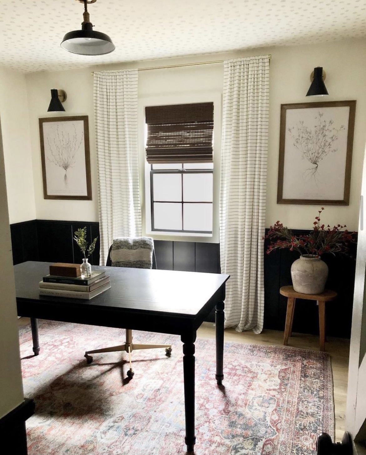
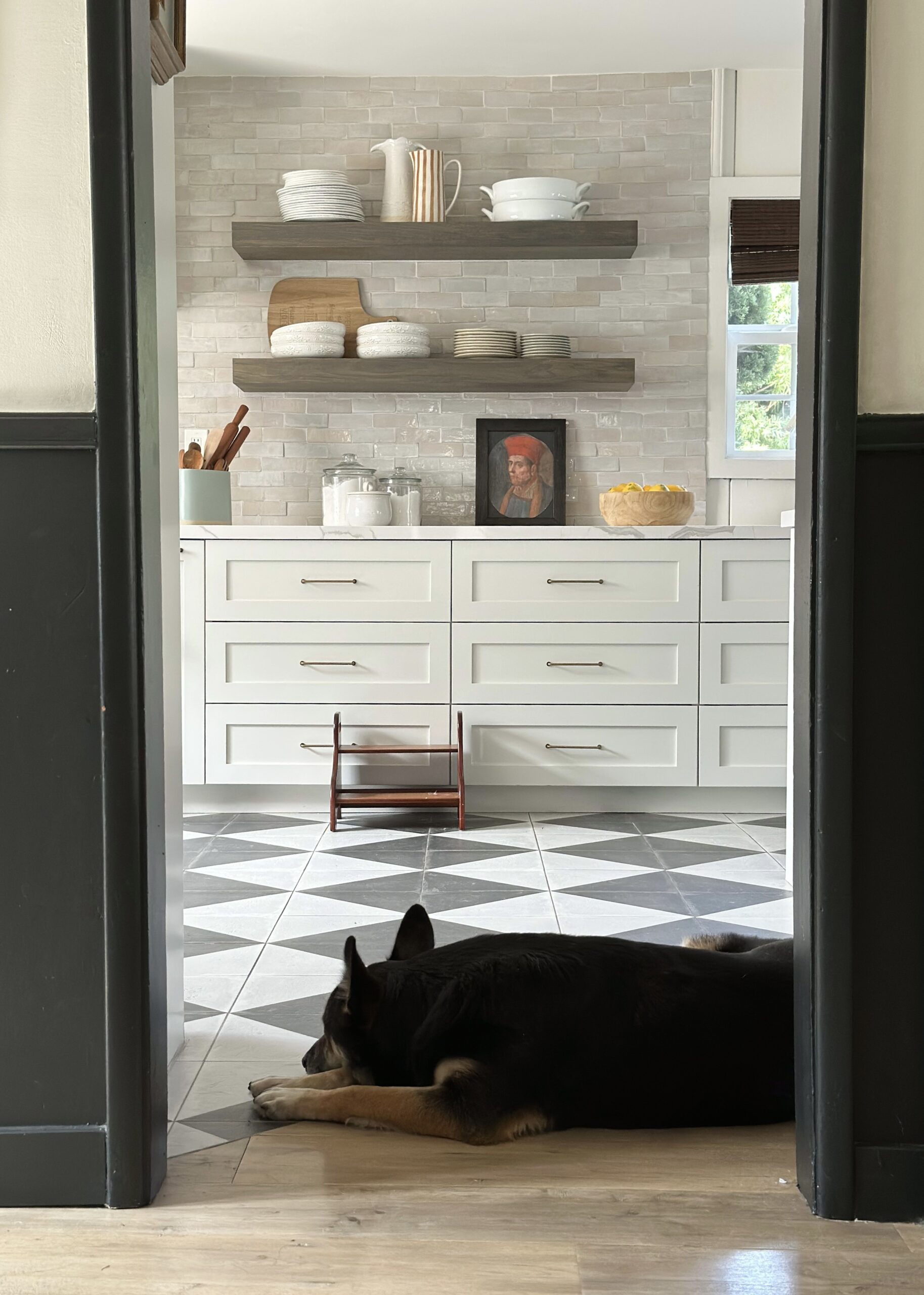
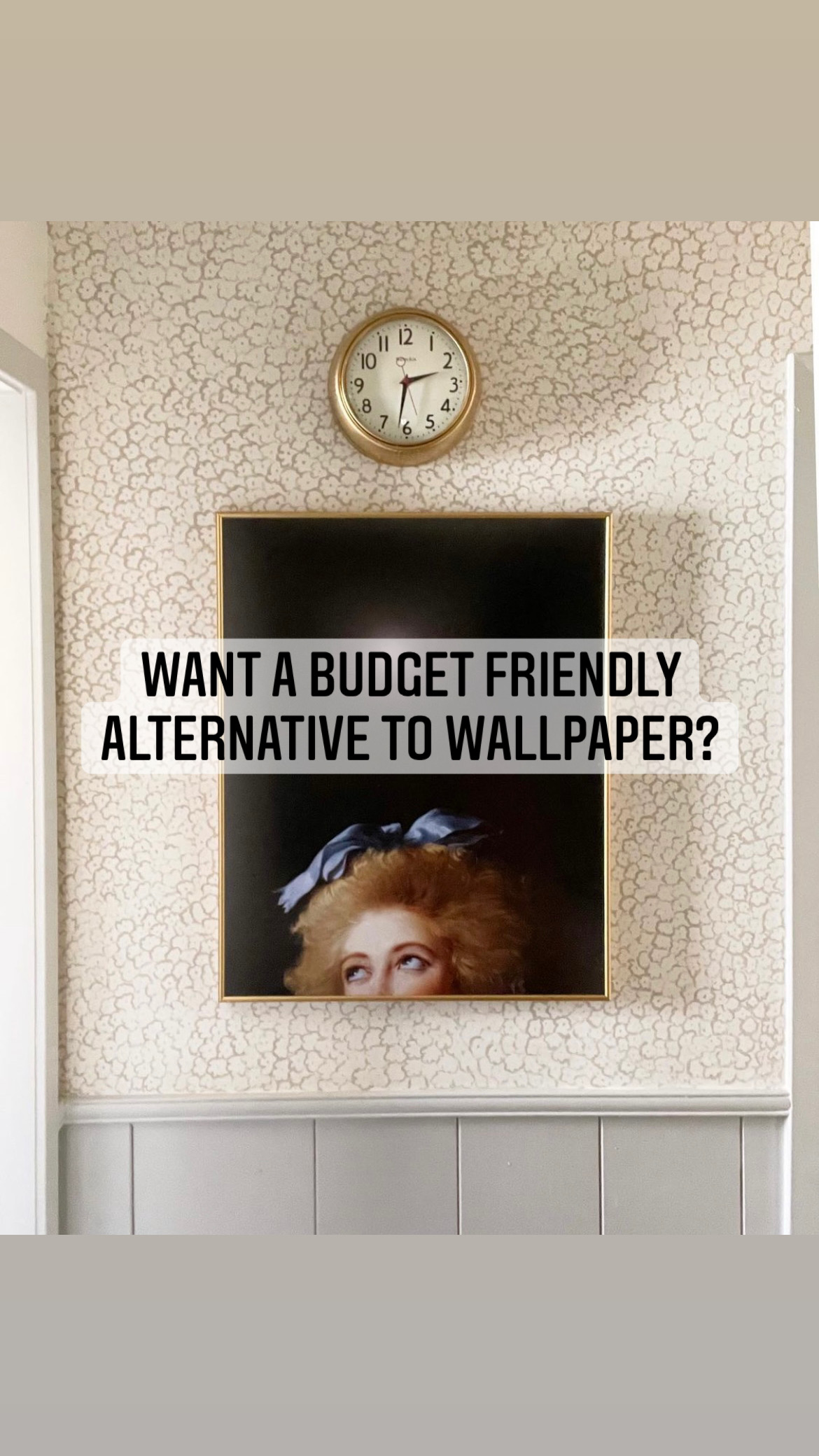
The high I get from creating and designing spaces is even better than, dare I say it, a steaming hot plate of nachos. Something as small as a new lamp or a frame can give me such a sense of euphoria that I’ll fake trips to the bathroom in the middle of watching a show just so I can glance at it ONE. MORE. TIME. And as much as I like to pretend I know what the hell I’m doing, I really don’t and it’s all trial and error. One of my biggest disasters, in my mind anyway, was my office. I rushed to finish it in a matter of weeks and the day I finished I cried like a baby. I hated it, and I wanted to burn that room to the ground. I’ll admit that was dramatic, but I did rip everything down and start over. And now? I love that stupid room so much. And for what it’s worth, I’ve shared some lessons I’ve learned along the way.
- SKIPPING A MOOD BOARD CAN BE A DEATH SENTENCE
When I started planning my office, I compiled a bunch of things I loved like a crazed maniac, ordered them, and didn’t even stop to think how they would all look together. **Cue Julia Robert’s voice from that scene in Pretty Woman when she tells those retail ladies off** BIG MISTAKE! BIG! HUGEEEE! If you followed along my office, I had a bunch of random ideas like a mural, floating shelves, and an accent chair, and none if them went well together. Had I started with a mood board like I did the second time around, I would have known that I was making a bunch of mistakes. Just because I loved three things, didn’t mean they would all go well together in the space I was creating.
And if you’re wondering what a mood board is, it’s basically a collage of the items. That’s it, nothing fancy. I personally like to use Canva–it’s free, and really easy to use. Here’s an example of the mood board I made for the office.
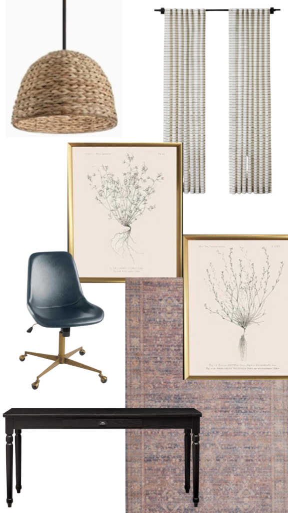
I love how it allows you to really visualize all the elements together, and especially love the background remover feature. I will often swap out things like rugs and art pieces to see what combo really goes well together best. It has completely transformed how I plan out my vision for a space I’m creating.
2. RUSHING TO BUY THINGS JUST TO FINISH A SPACE
Take the office for an example, I bought a random rug because I needed “a” rug and just wanted to finish the space and be done with it. Well, I didn’t LOVE the rug, and a few months later I tossed it. Buying things JUST to finish a space faster, and not because I loved it or it fit well in my space, is one of the biggest design mistakes that I have made–and if I’m being honest, I still make. I’ve done the same thing with paint–I’ve picked a paint color based on what I already had in the house, as opposed to ordering the color I REALLY wanted because it was faster. When I look around my house at the spaces I’ve loved for a long time, it’s usually ones that I took the time (and patience) to create. This is something I remember my mother saying many years ago, and apparently it’s taken me years to finally understand. Thanks mama.
3. CALM DOWN. TOO MUCH OF A GOOD THING IS TOO MUCH OF A GOOD THING
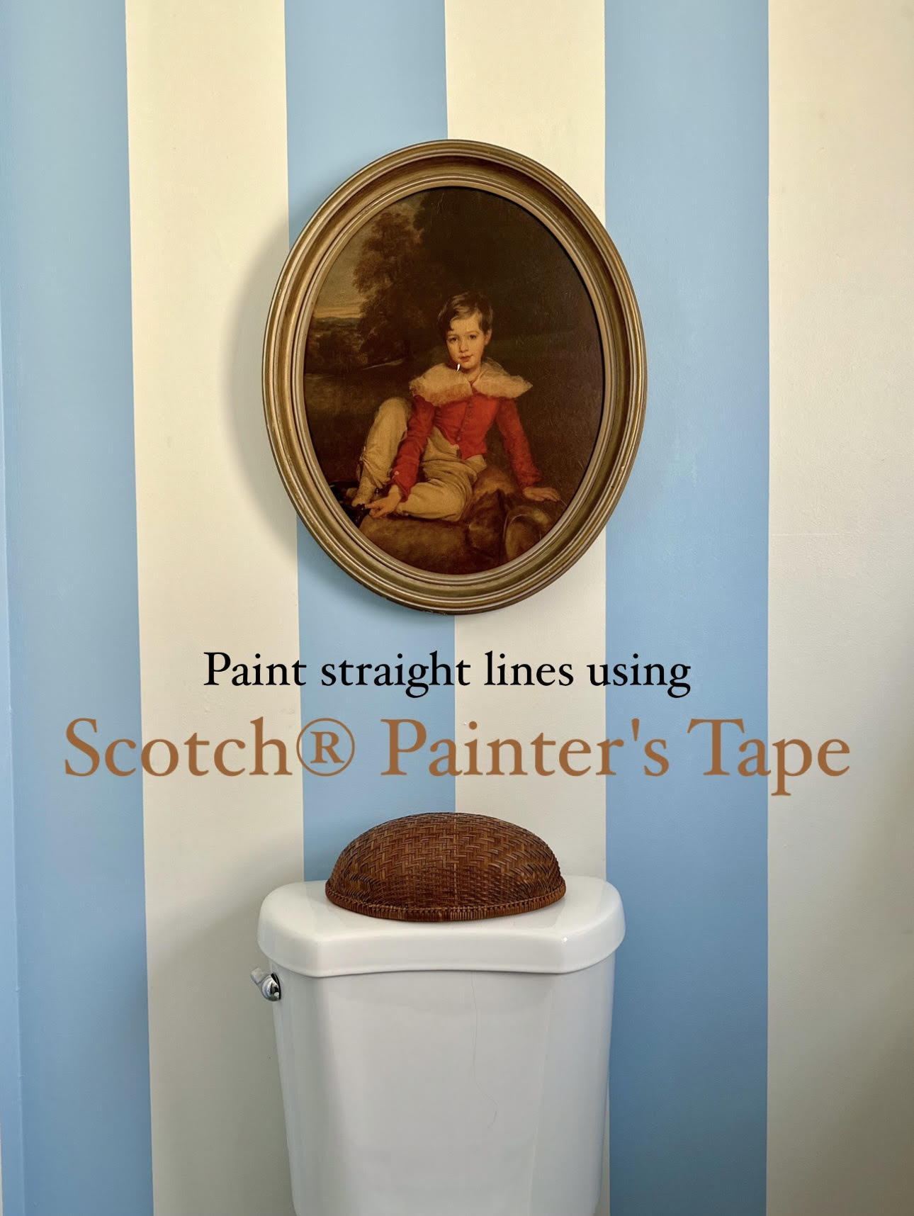
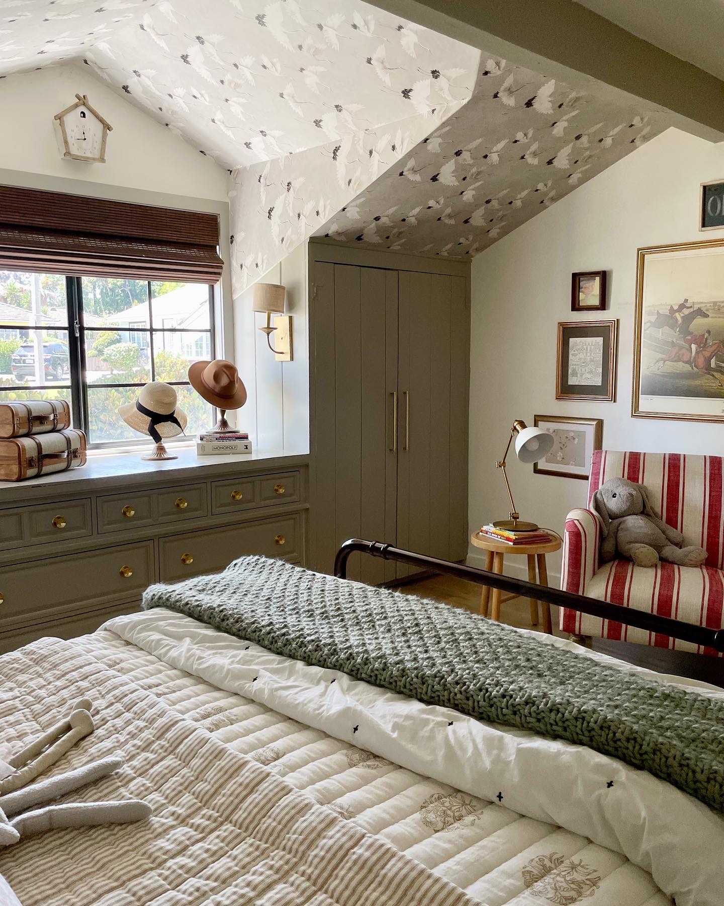
I still remember the first day that I painted something black. I LOVED it! But then I wanted to paint everything black. In retrospect, I really loved doing a black accent wall, but regret painting the entire living room. If there is anything I’ve learned this past year, is that if I love how something turns out, I should stop while I’m ahead–OR wait at least a week and see how I feel about it first. I think this can relate to so many things we do in design. When I started to DIY with washi tape on my office and playroom windows I really loved it and I continued to the kids bedroom. Little did I know I would actually hate it because it felt really busy in the kids bedroom where the wallpaper was. Just because something looks good in one space, does NOT mean it will look good in others.
4. APPARENTLY GRAY CAN LOOK PURPLE. AND LIGHTING MATTERS. (I guess this is a two in one mistake?)
I bought this huge beautiful mural in my office that I found on Pinterest and I was so excited to put it up! The only thing I didn’t realize, is the picture I had saved had the mural in a room with direct sunlight and large windows. The day I had it installed in my office I was horrified at how purple it looked. Apparently gray can look purple sometimes. Like, really purple. And lighting can make it worse. I’ve learned to not only pay attention to the lighting (both natural sunlight, and light bulb choices), but also the undertones of the colors I put in spaces–especially colors like gray.
5. STOP! TAKE TIME TO FIGURE OUT WHAT YOUR STYLE IS
And this may be my biggest lesson of all. And though you likely won’t fit into a single “design box,” this will still help guide what design choices make you happy. It took me awhile to realize that I lean more modern traditional. For the longest time I was experimenting with different styles and it felt like I was in the middle of a design identity crisis. I’ve paid close attention to what I pin on Pinterest, and what pictures I save on Instagram. This has really helped me hone in on what my “style” is, and what spaces will make me happy. I’ve also noticed that although I may love and appreciate a space in someone else’s home, it doesn’t mean that’s my style and will make ME happy. Ya feel me?
And this isn’t a recipe for perfect design, just a few things that have helped me along the way. If you make these mistakes already, I promise stopping them will help you design spaces that last longer and make you happier. And if you did find this helpful, hit that damn subscribe button, and follow me on Instagram, we can be best buds.
Love,
Deema
Feedback? Comment below, or email me: (Deema Tabbara Lopez) at prettyonfridays@gmail.com
