My son’s soccer room is finally complete! It was a labor of love and really pushed my creativity. And even though I’m not a huge fan of themed rooms, I wanted my son to be happy. It was important for me to design a room that expressed his needs and his style, all while looking beautiful. So while I checked all the boxes he wanted, I was able to find some balance and still design a beautiful space.
*This post contains affiliate links. That means if you purchase something through my link, while it’s the same cost to you, I get a small commission for me and my family.
Kendall Charcoal paint by Benjamin Moore
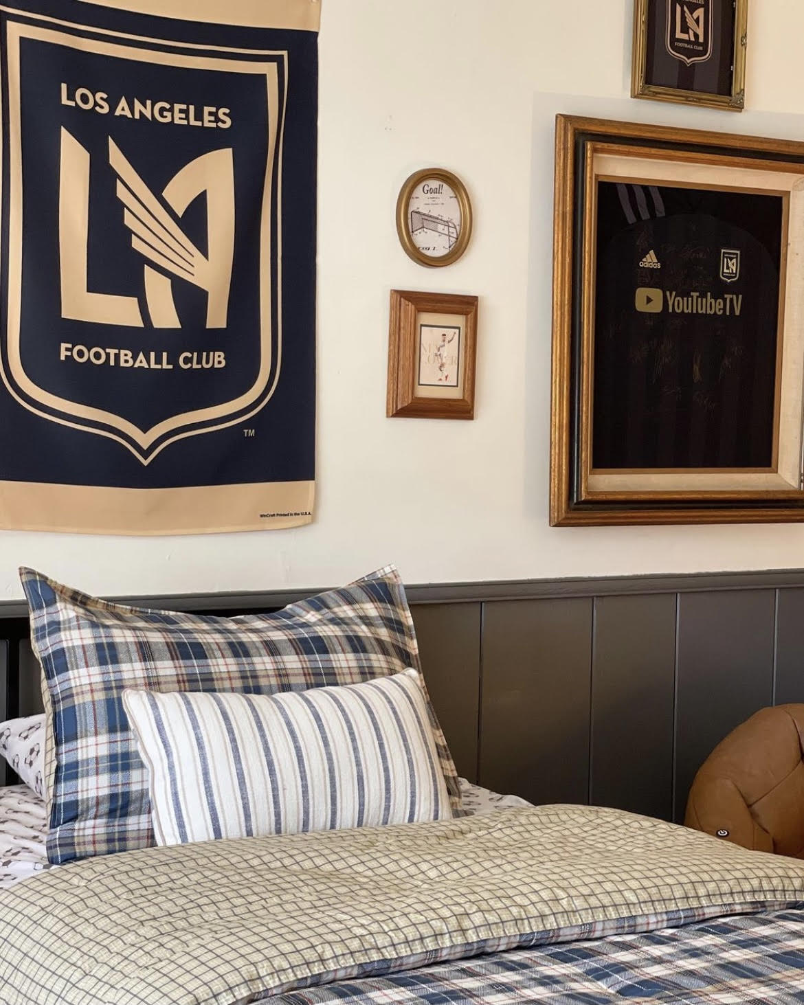
Because my son loves the soccer team LAFC, the first thing I did was paint the room a shade of black. (team colors are black + gold). This rug was in the playroom previously and looked beautiful with the new paint color. And I couldn’t recommend these wooden woven shades more. These are in TIbet Oak.
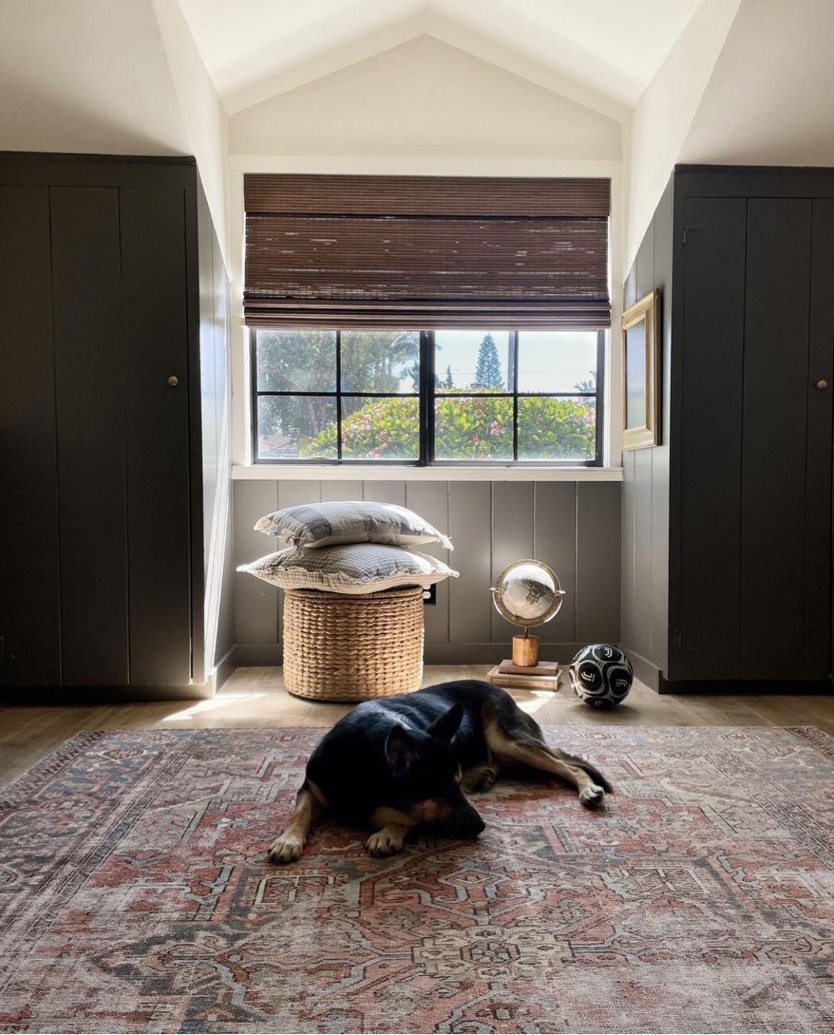
Once the room was painted, I was able to do all the fun stuff. And once it was all done, my son was happy and it looked beautiful. First, let me show you the room, then, let me break down the details, the DIYs, and some tips I think you may find useful when designing a kid’s space.
Soccer Room Reveal (Heavy emphasis on LAFC team!)
This room was an explosion of soccer. Everything from the art, to the sheets, to the memorabilia, to the soccer lamp.
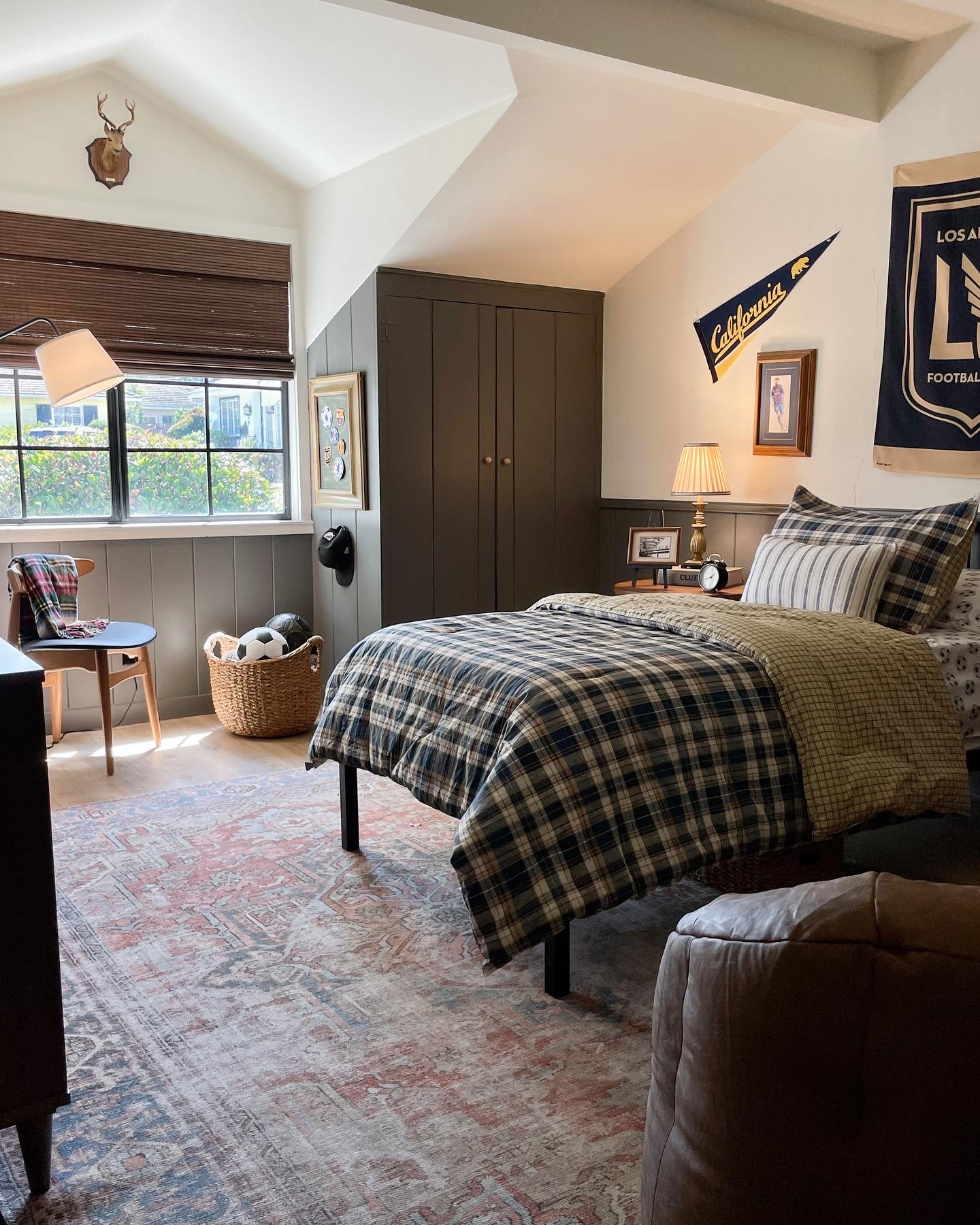
This gallery wall was a mix of all his favorite teams and players. And because I used thrifted frames, many of them didn’t match the exact size of the art. My solution? I grabbed a ribbon to bridge the gap, and it really elevated the art. You can watch that here.
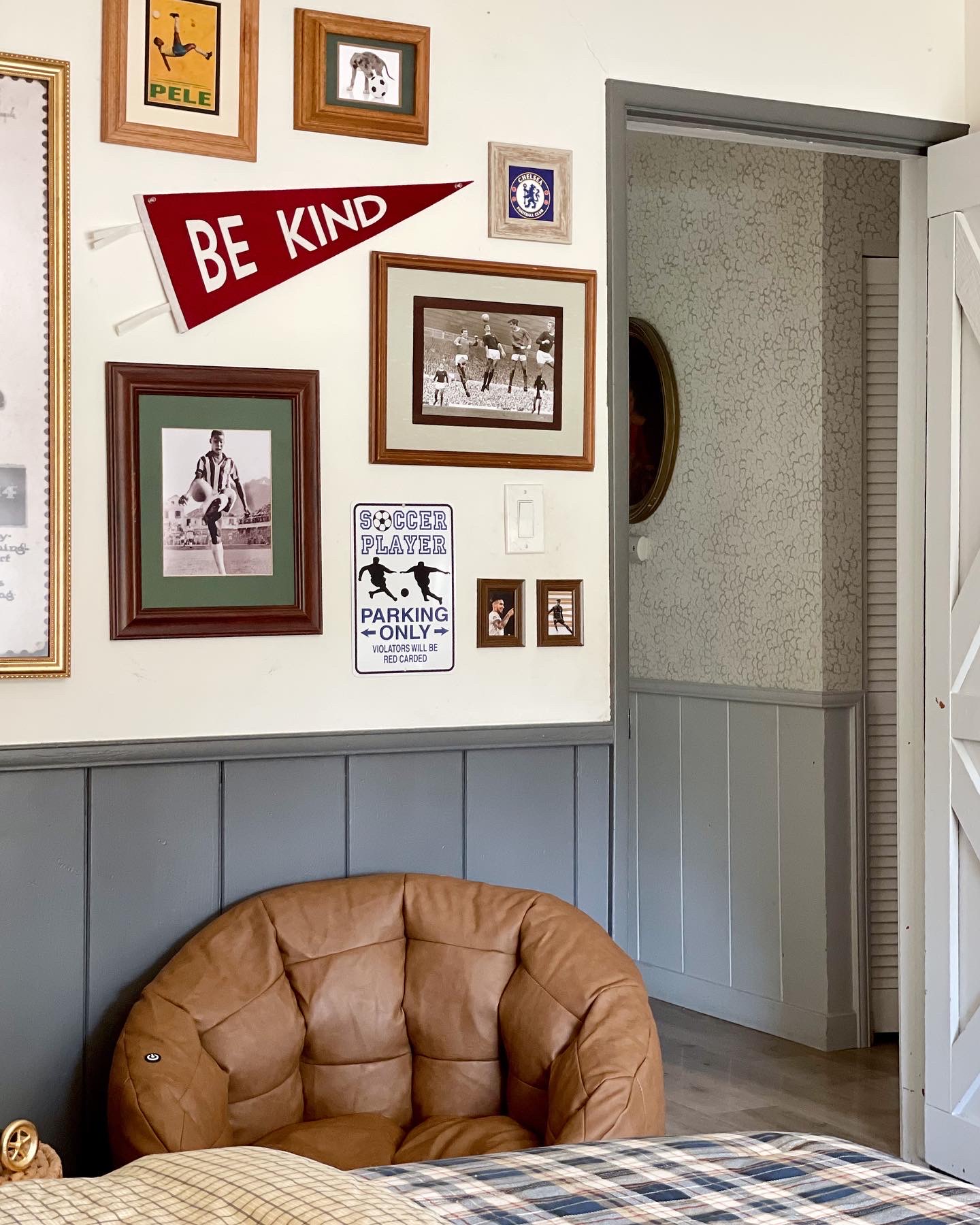
I added a black and gold banner for his team colors, framed his medals, framed his soccer sheets, his favorite signed jersey..etc. I mean, I got everything he wanted up on those walls.
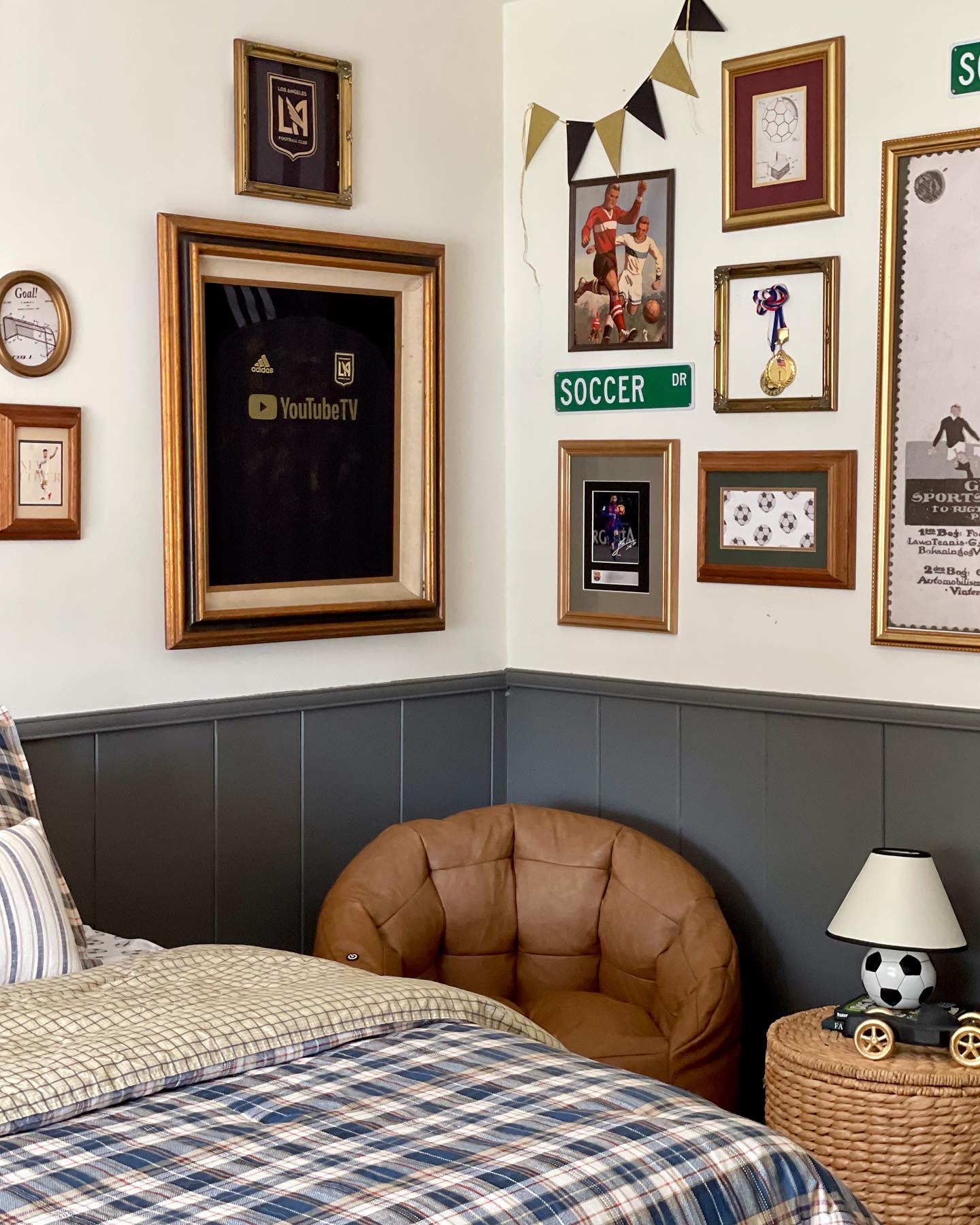
This dresser was such a beautiful addition.
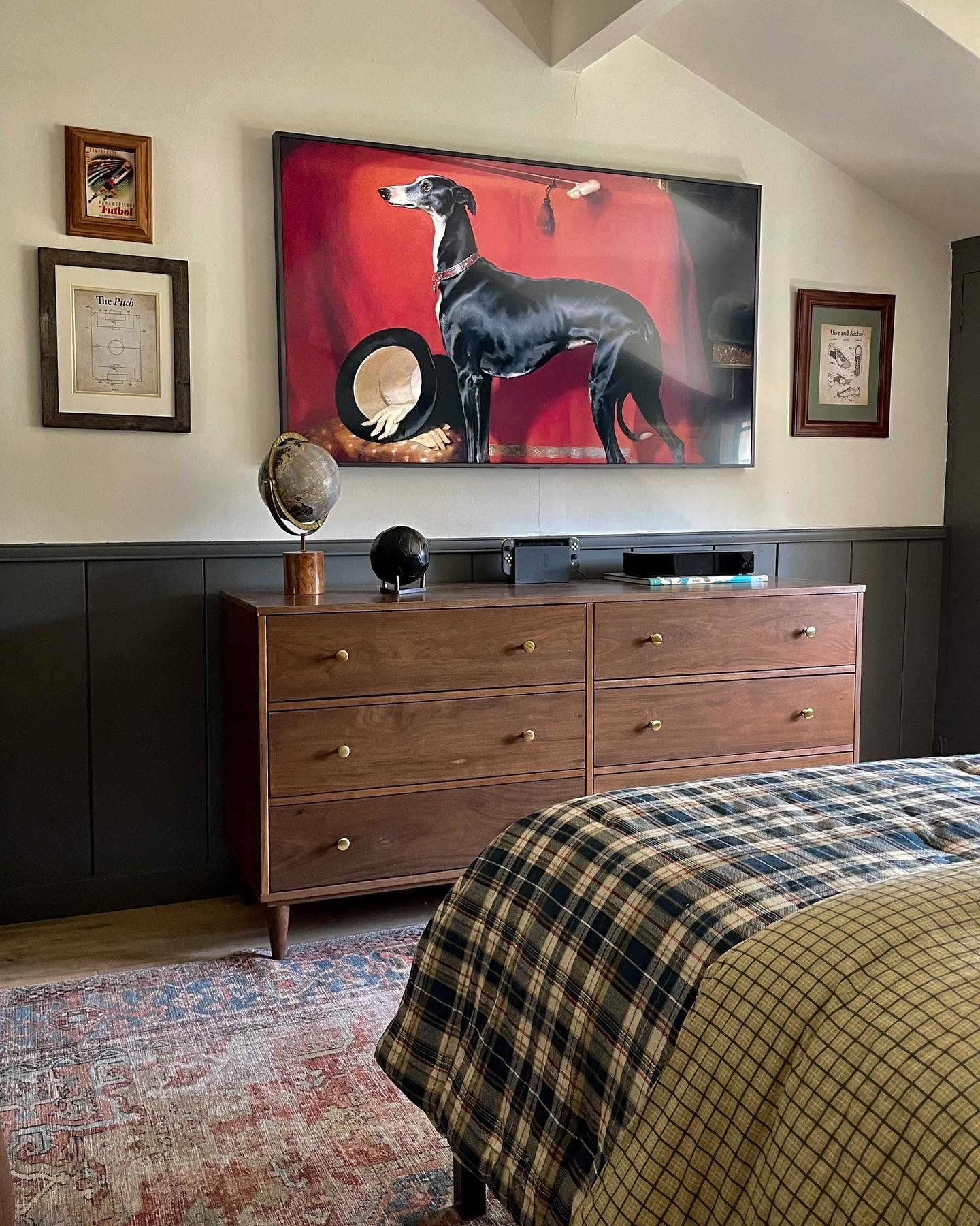
Lots of DIYs in these pictures, be sure to check them out below.
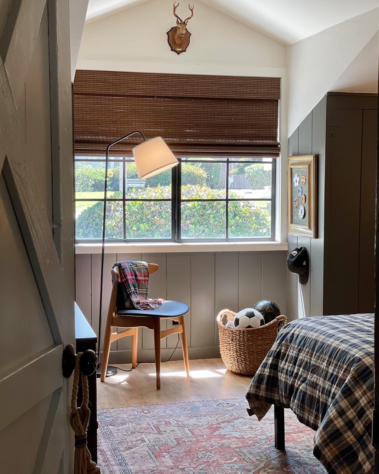
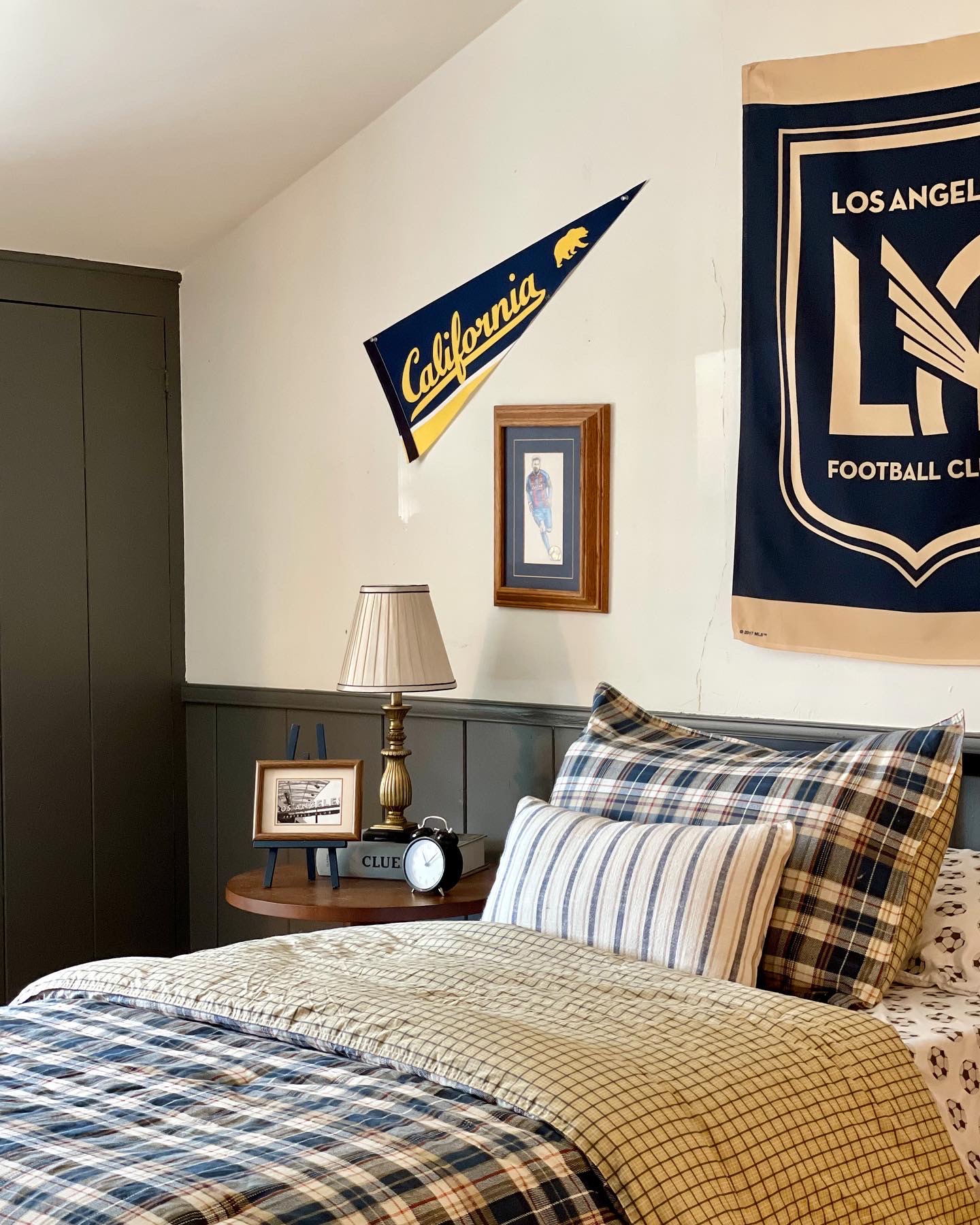
This room is incredibly small and difficult to photograph, so you can see a better view/video on my Instagram post HERE. He loves this little seating area so much.
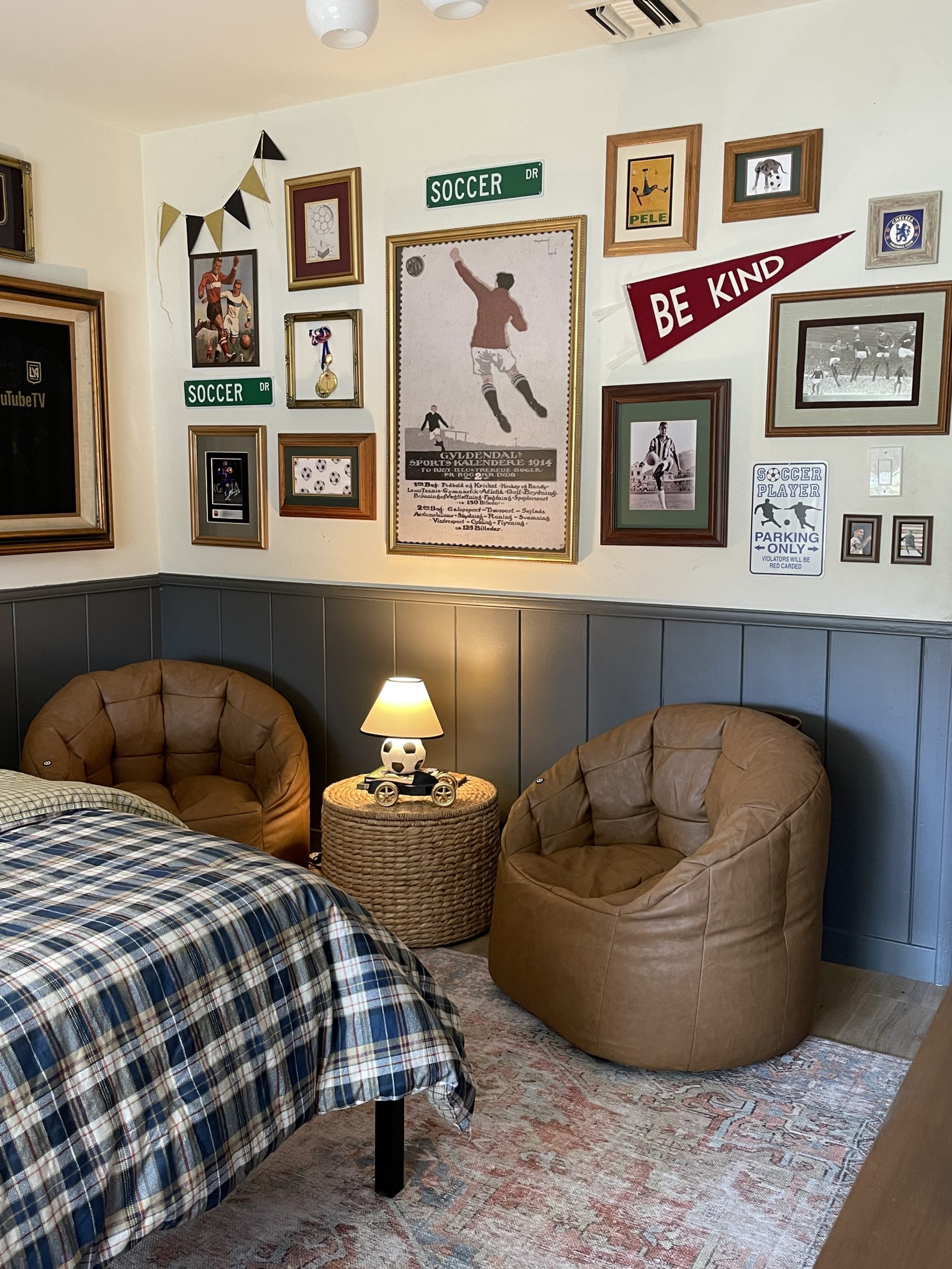
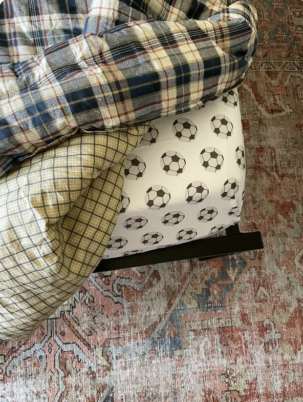
Soccer lamp linked HERE. And these chairs (that have a massager inside) are linked HERE. I had a lot of fun getting him as much soccer stuff including these sheets below.
Alright, so a few tips that I think you can apply to your kid’s rooms, that I felt helped me balance the look of a kids room while keeping it visually appealing and sophisticated.
Tip 1: Elevate art using thrifted frames
You can use any frames, I personally love how unique and affordable thrifted ones are. They helped me take some very basic prints and make them shine using beautiful frames. A distinctive frame can truly transform any piece.
Tip 2: Balance “kid” pieces with more “adult” pieces
Meaning, try to add more sophisticated pieces for a good balance. My son had a soccer lamp, but he also had a beautiful antique lamp as well. He had a ton of soccer memorabilia on the wall, but he also had a beautiful vintage rug and modern dresser. I paired his soccer sheets with a more sophisticated comforter. You get the point, just make sure you have a healthy balance.
Tip 3: “Hide” things
I hung up so many posters in my son’s closet. So while he still enjoyed them and was happy to see them, they weren’t out on the walls for me to see. Same with his bedding. I got him soccer sheets he loves to see every night when he gets in bed, but it’s masked with a more sophisticated comforter. And when you can’t “hide” things, follow my last tip below.
Tip 4: Get creative with displaying things
Look, there are some (ahem, many) things I couldn’t hide. And I didn’t want to get in the way of my son’s happiness. And just like I did with the art above, I got super creative displaying a lot of the things he wanted up on the wall. All were pretty easy and affordable and you can check them out here:
Framed Jersey/T-Shirt: Two Easy Ways To Use A Thrifted Frame
4 Creative Ways To Use Thrifted Frames
Up next is my daughter’s room, and I cannot wait to share the process!
Feedback? Comment below.





I love those chairs so much! The room turned out so good. The colors, the plaid, the frames and special pieces for him! Bravo!