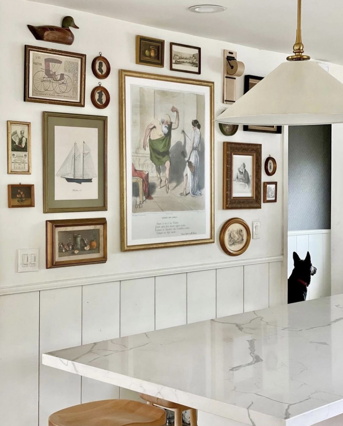
While I have loved branching out and finding creative ways to display art, my heart will always have a sweet spot for a beautifully curated gallery wall. My kitchen gallery wall is hands down my favorite one in our home. And as I start to gather all the art for my son’s room, I’ve noticed I have certain gallery wall tips I follow for each one.
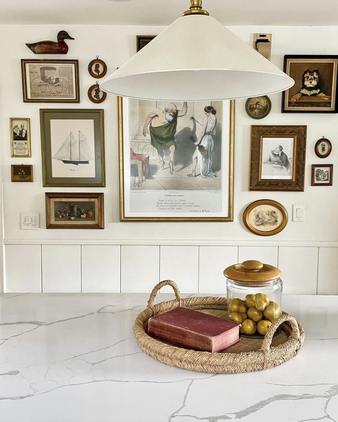
Important to note, these tips don’t apply to more structured gallery walls, like a grid. I share the love for both kinds of gallery walls, and have a grid gallery wall in my hallway that was inspired by my friend Brittany, from @thegoodmanhouse. Hers is beautiful and cohesive (below).
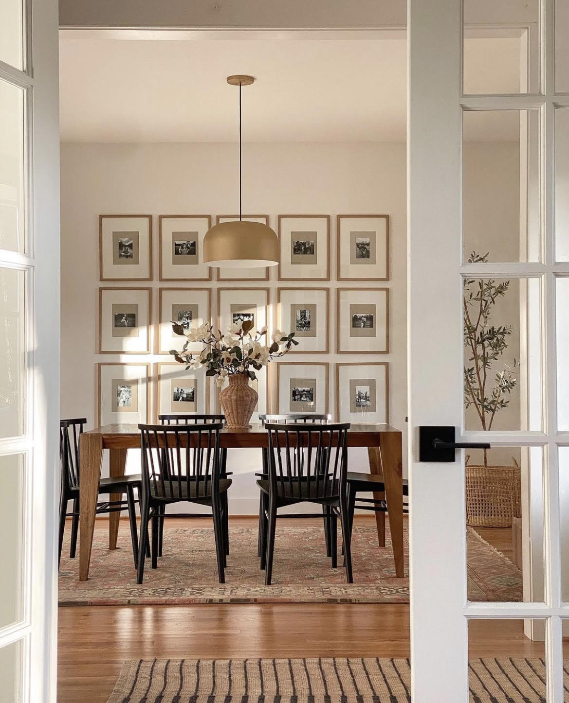
The tips below are more for free flowing gallery walls like the one in my kitchen. I don’t always follow each and every one, but these are definitely things I keep in mind when I’m gathering all the pieces and laying them all out. So the next time you’re at a thrift store, or shopping for a gallery wall in general, these may be some helpful suggestions to keep in the back of your mind.
THINGS TO CONSIDER WHEN PURCHASING FRAMES FOR A GALLERY WALL
Mixed style frames
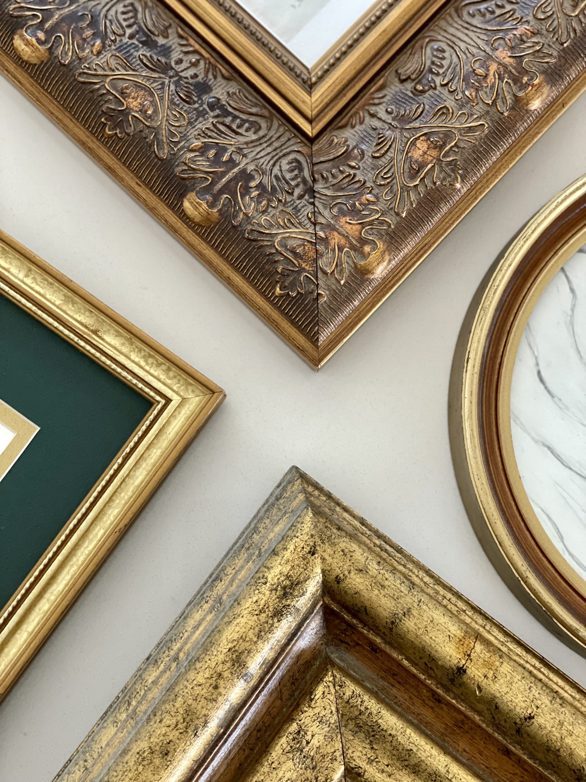
Look for different styled frames. Maybe a detailed one next to a modern clean frame. Even if I have two gold frames, I like the style to be different like the ones above.
Mixed metal frames
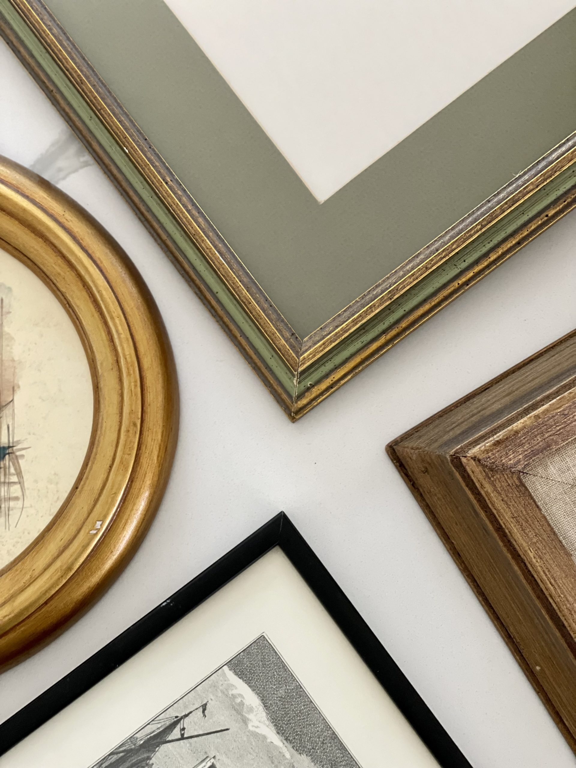
Just like mixing the styles of the frames, I love a good mix of metals/materials. Meaning wood frames, black frames, gold frames..etc
Hot Tip: Don’t be afraid to use spray paint! When I’m out looking for frames, I ONLY look at the shape. Because if I love the shape, I can always spray paint it another color. And if you still want a wood frame but don’t love the stain, you can always stain it.
A mix of frames with and without mats
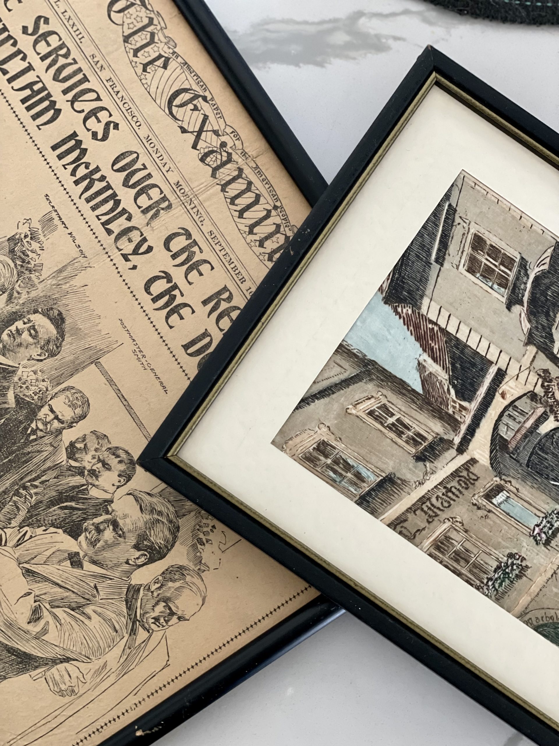
I typically like to make sure I have at least one of each. Even better if I find frames with different colored mats like below.
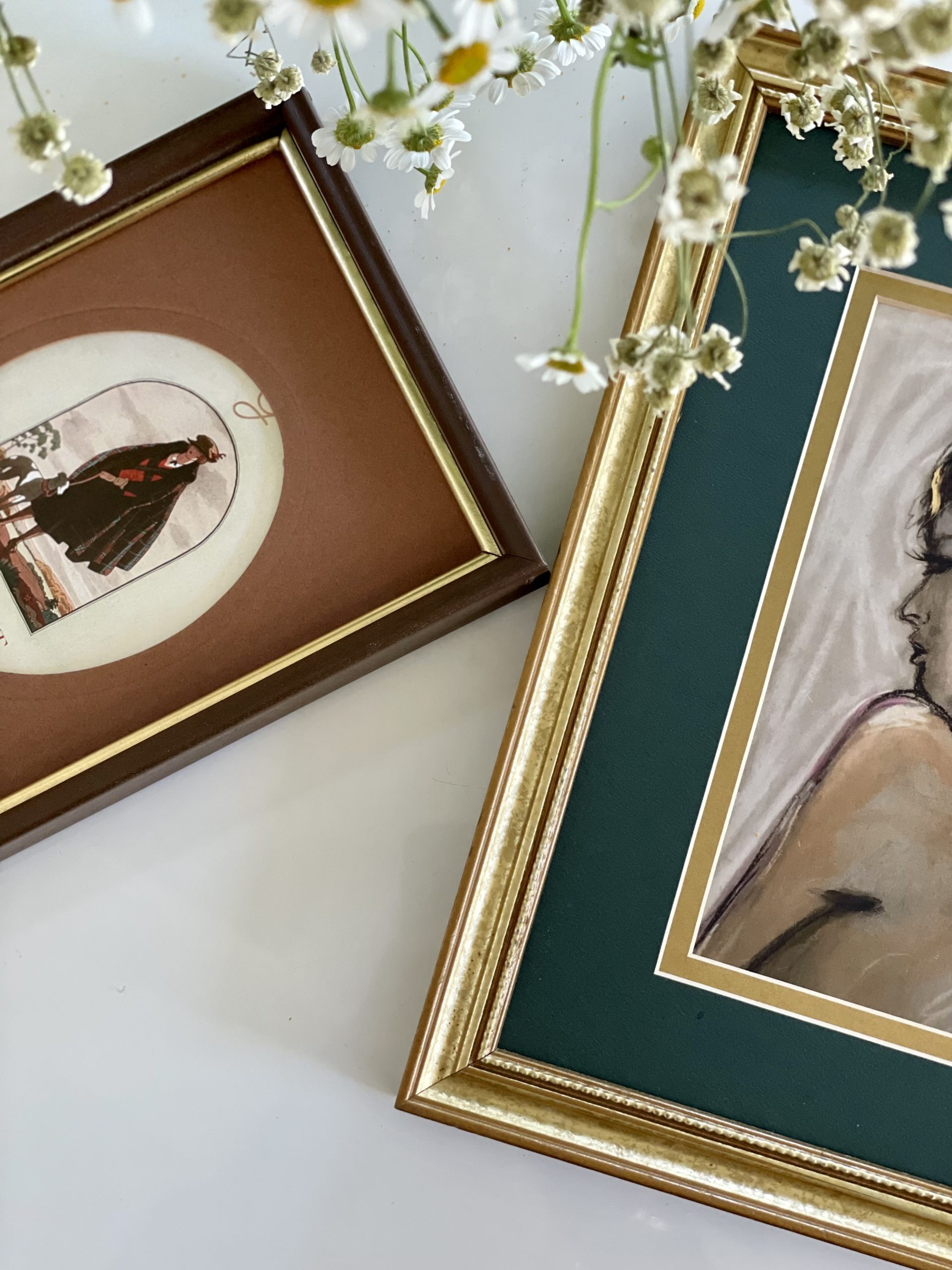
And not to state the obvious here, but you can always remove mats from frames OR buy mats for frames that don’t have them. It is amazing what a beautiful mat can do to a frame.
Different shaped frames
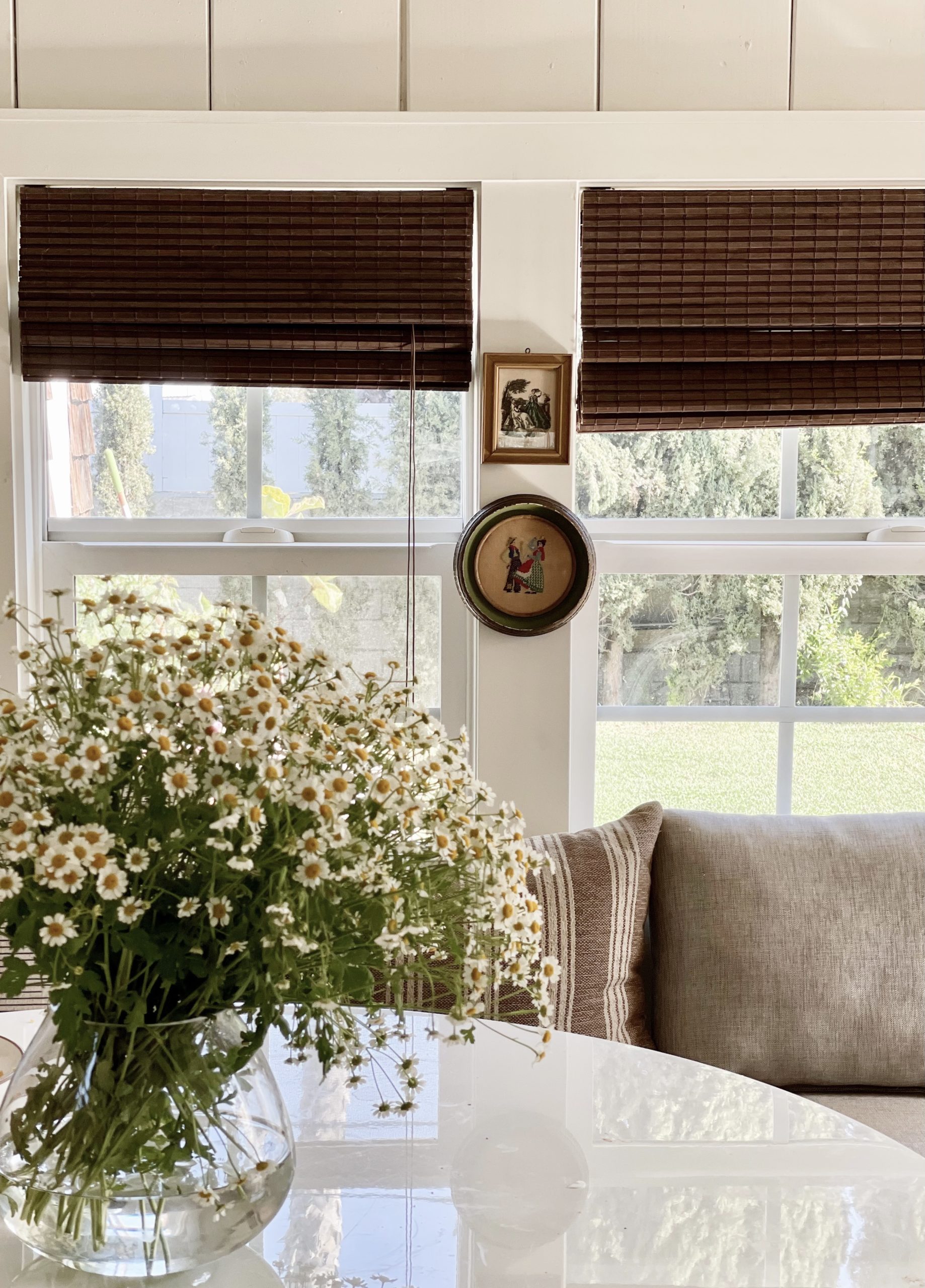
Meaning, ovals, circles, rectangles, squares….etc. I especially love those that have different shaped openings. So for example, a rectangle frame with an oval opening. The key is a good mix.
Different sized frames
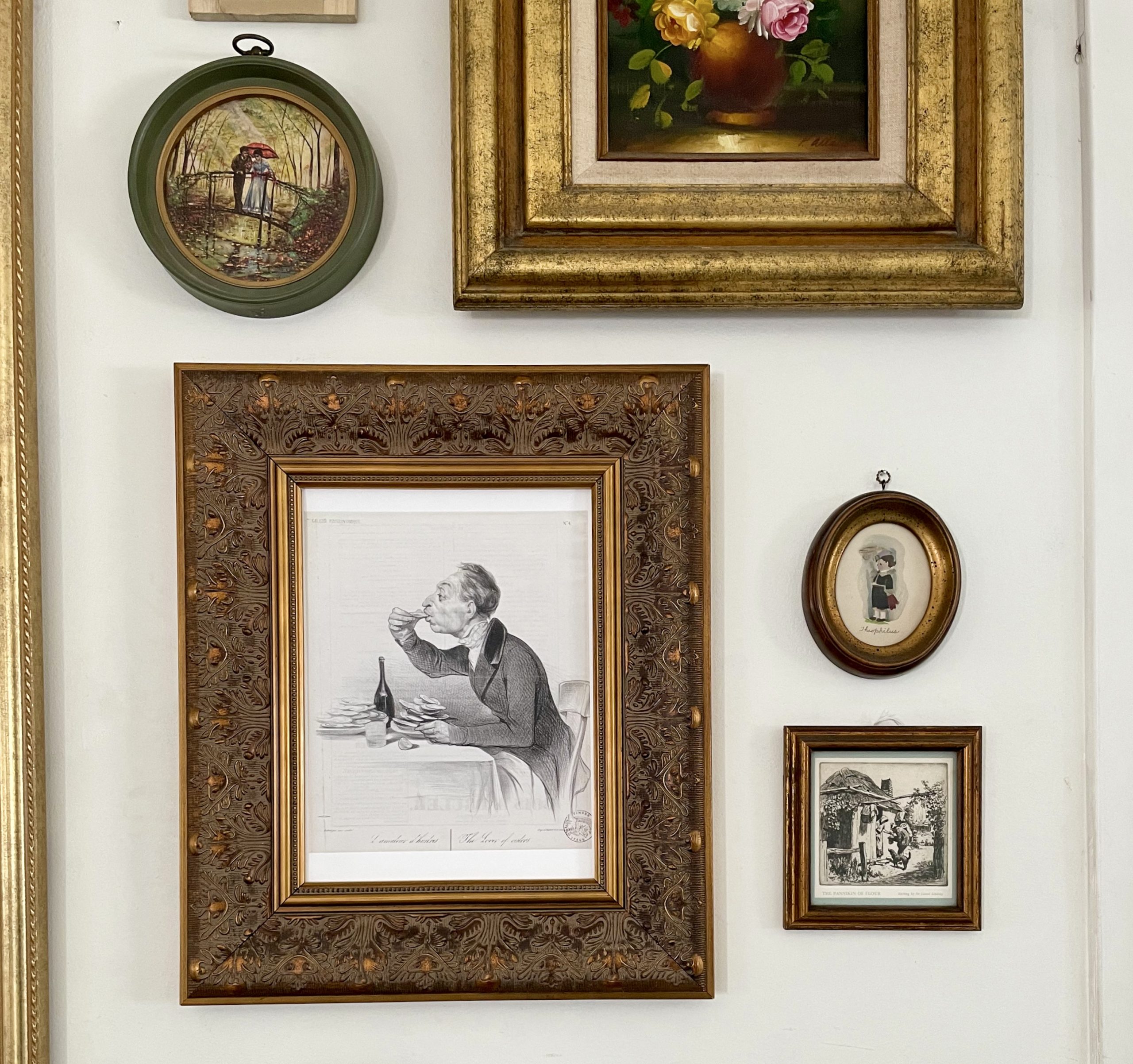
I love a good balance of large, medium and small frames all together. I also find that the small frames are great fillers when you have some awkward gaps in between frames. Whenever I see little frames at the thrift store, I always grab a bunch.
(pssst, they’re my favorite to hang on windows and in front of shelves.)
THINGS TO CONSIDER WHEN PURCHASING ART FOR A GALLERY WALL
A good balance of different orientations (landscape/portrait)
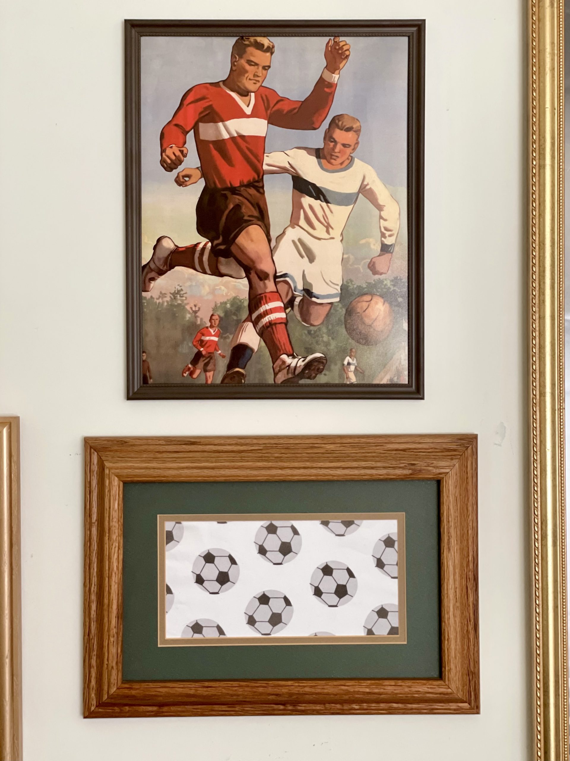
As I’m putting together my son’s gallery wall, I’ve noticed I had too many portrait prints and had to take some time to find a few more landscape oriented prints to balance it all out. It’s also WAY easier when you’re hanging the art and creating organic spacing.
Different sized prints
Just like I look for different sized frames (mentioned above), I look for different sized art.
Including other objects
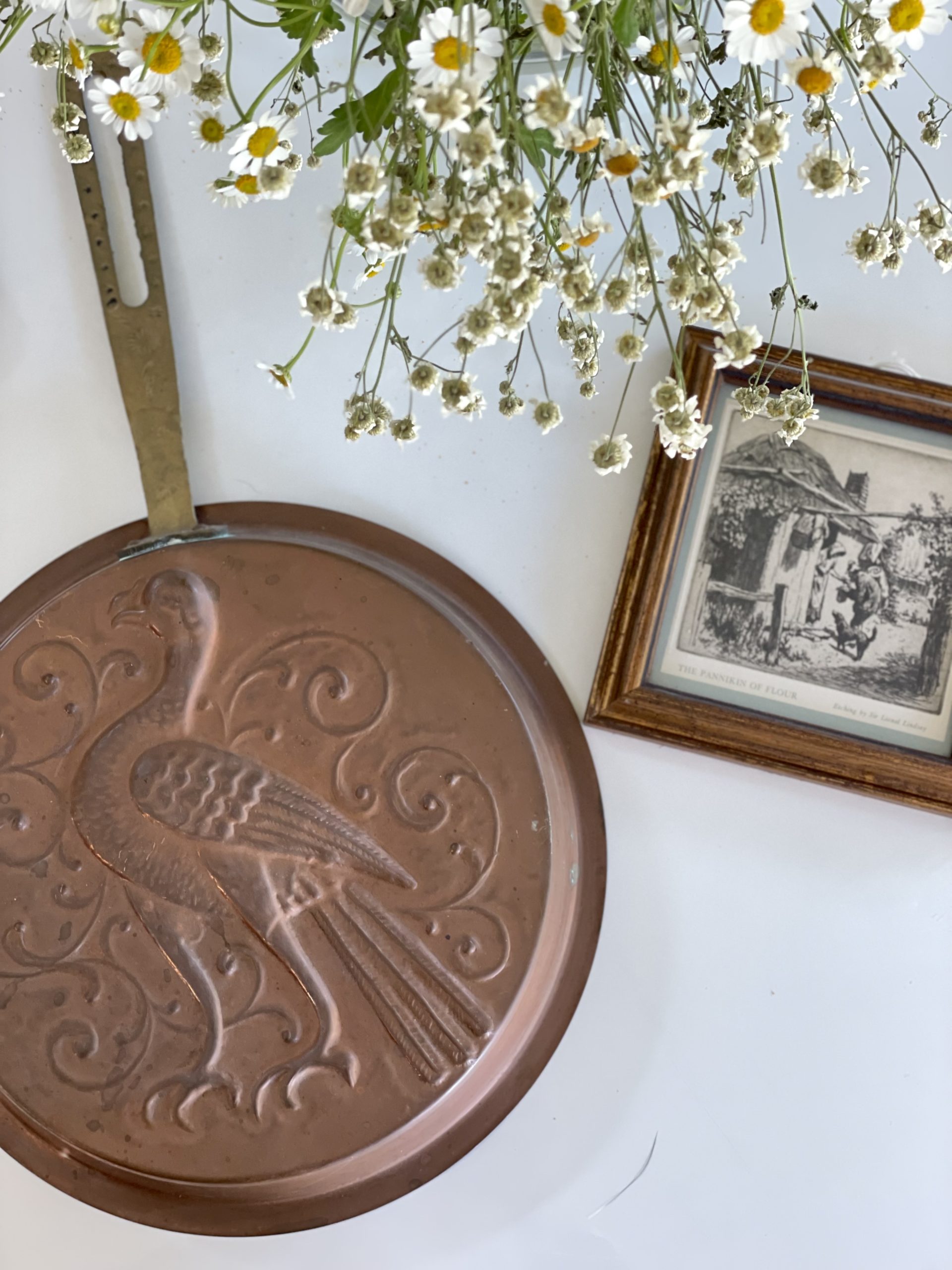
So for example, in my kitchen, I have a wooden duck and a brown paper roll holder.

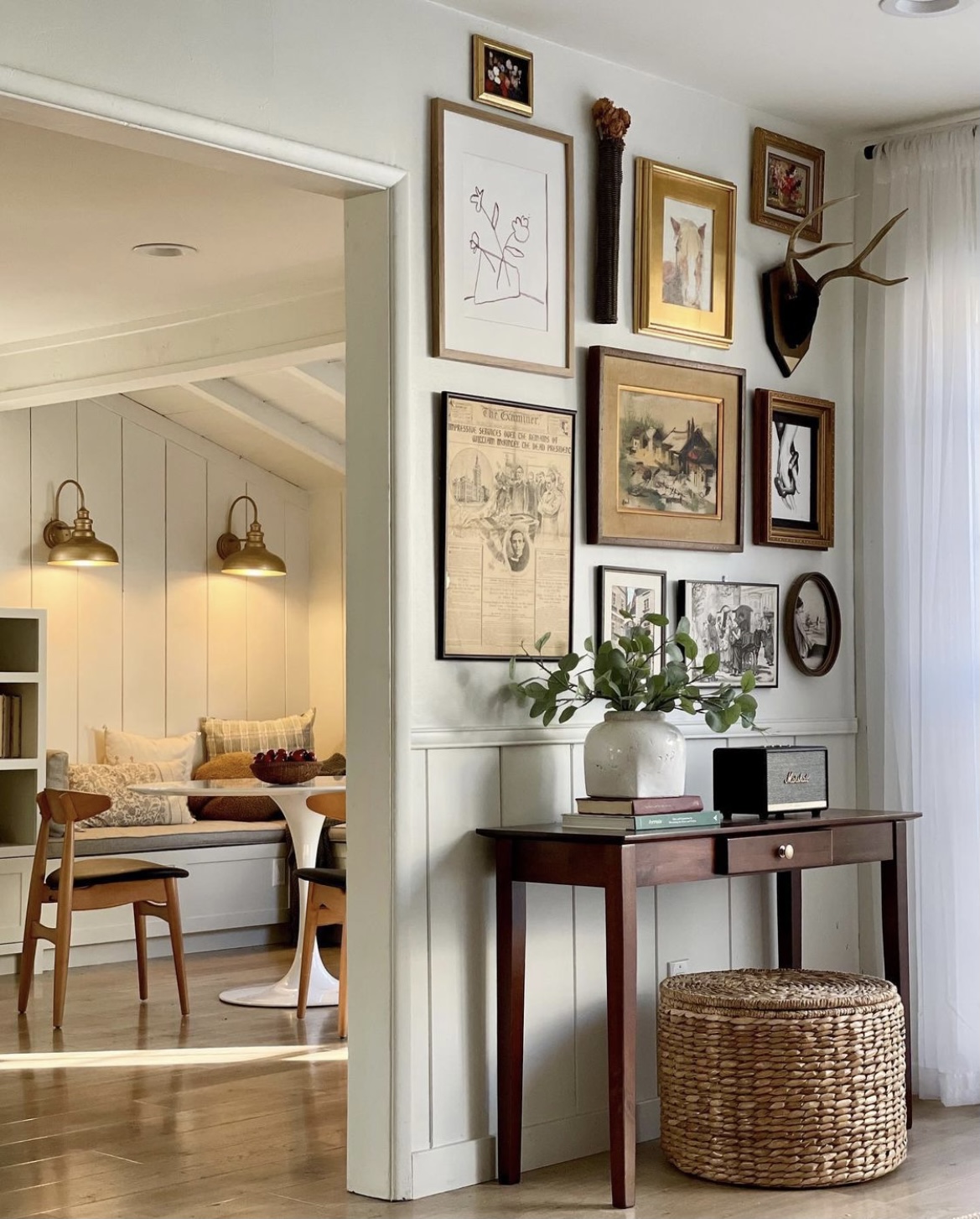
In my living room, I have antlers and a flower holder.
In my kid’s room, I had candlesticks and stuffed animal heads.
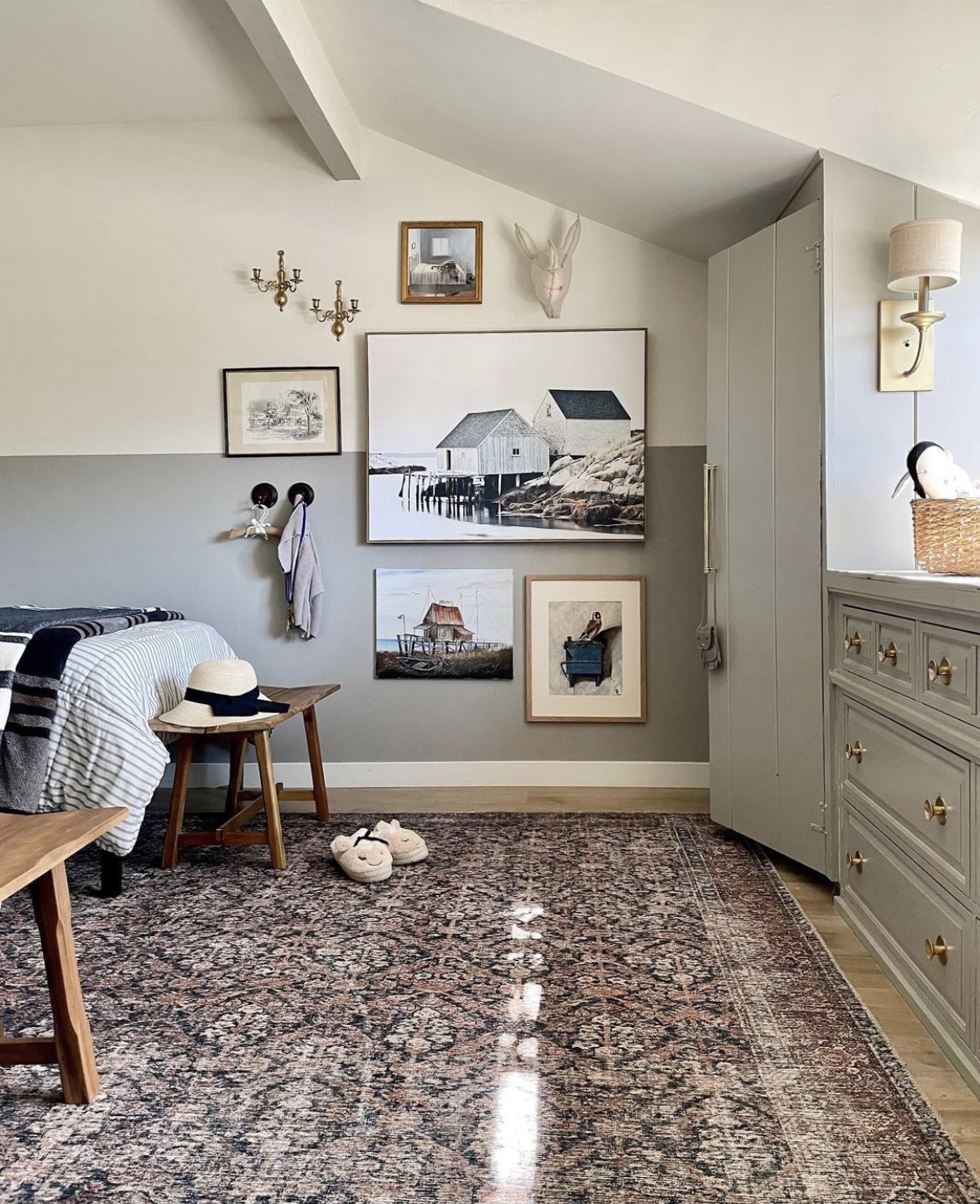
You get the point. Anything would work, it just provides some nice contrast with the frames when possible.
Mixing art styles

So for example, placing an abstract piece right next to a vintage oil painting, or a pop art piece next to a figurative sketch. I love the magic of mixing art styles.
Mixing subject matter
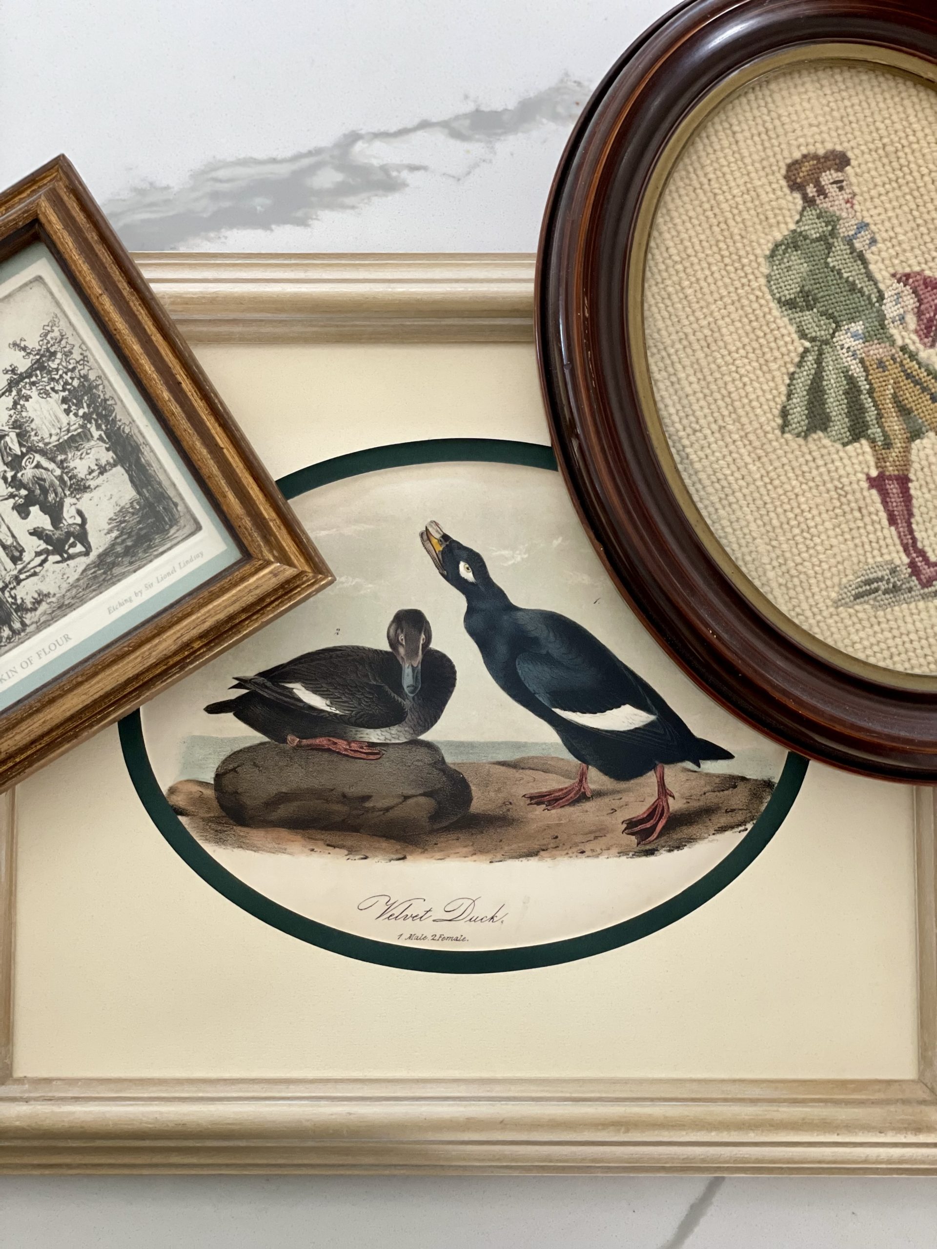
Obviously my son’s room has a soccer theme, but in general, I prefer mixing subject matters. Meaning florals mixed with ducks, mixed with houses..etc There’s nothing wrong with having the same subject matter, however, I personally love the collected look that comes with mixing subjects. I will say, I’ve seen some pretty amazing single subject gallery walls.
Pictures with color vs pictures with no color
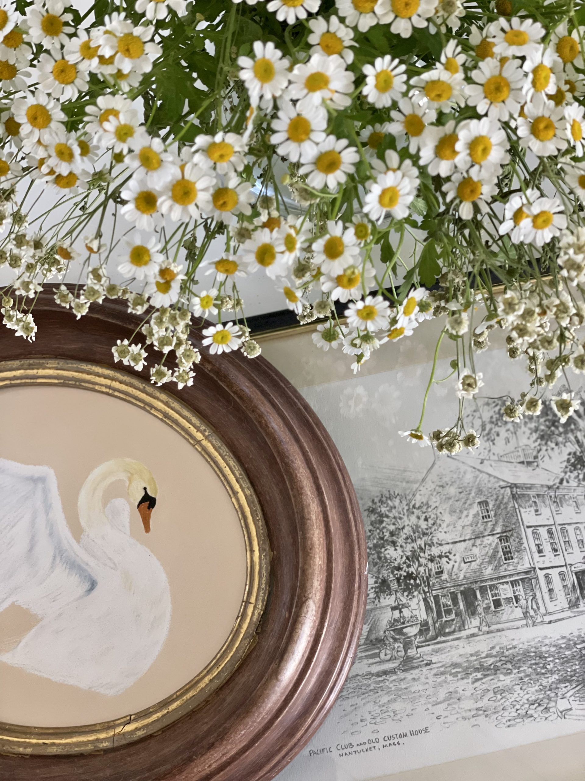
On the note of mixing subject matter, I always like to have at least one black and white photo and one with color when possible. It really provides that balance I crave when pulling everything together. When I was looking for art in my son’s room, I was really trying to find a good balance of this and it was so hard because everything my son picked had color.
And if all else fails, or if this list was overwhelming, the three I try to stick to the most are: mixing metals/materials, frames with and without mats, and pics with and without color. Having at least those three, will definitely give you that collected look.
If you liked this blog post, you may like my other one: 10 Ways I Display Art (In unconventional Ways)
Feedback? Comment below. I’d love to know if you have anything to add!
