OUR KITCHEN RENOVATION IS FINALLY DONE. *cue the obnoxious screaming* I have never cooked and cleaned more in my entire life. My new favorite hobby is finding an excuse to walk in the kitchen. I stare at it constantly, spend the majority of my time in it, and if it wasn’t frowned upon, I would probably sleep in there every night (sorry baby). Ok, you get it, I love my kitchen. But once upon a time before our kitchen renovation, I did not.
*This post contains affiliate links. That means if you purchase something through my link, while it’s the same cost to you, I get a small commission for me and my family.
Why did you do a kitchen renovation in the first place?
Our kitchen wasn’t exactly a nightmare story, and the previous owners did do quite a few updates. However, there were several reasons (besides cosmetic) why we decided to embark on a major kitchen renovation about 2.5 years after we moved in. First of all, it was so tight. We could barely fit two people in it comfortably.
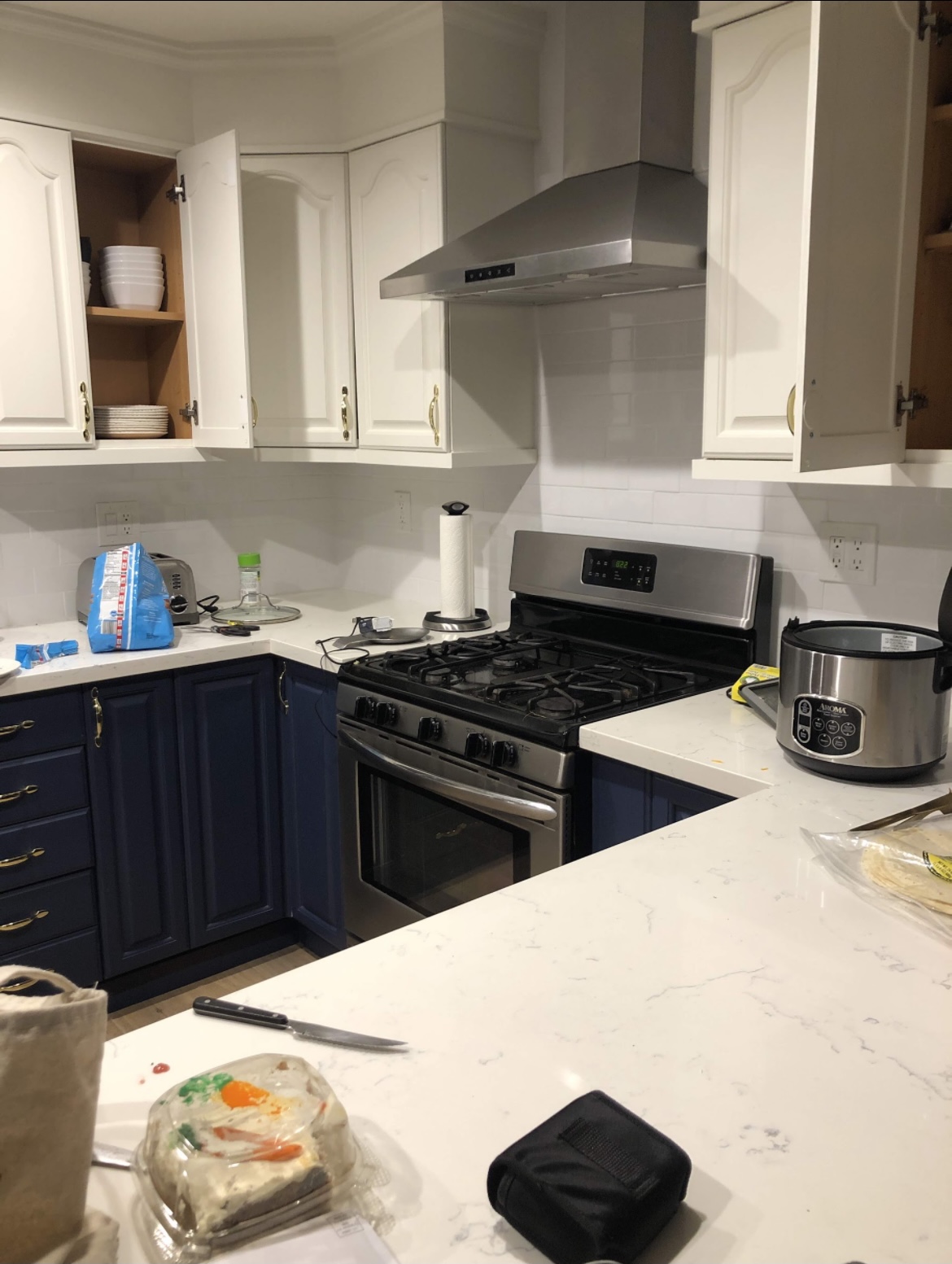
Second, our cabinets were so tiny and impractical that we could barely fit anything in them. They were not in good condition, and we barely had any storage space. We couldn’t even fit a tray in our cabinets, that’s how tight they were.

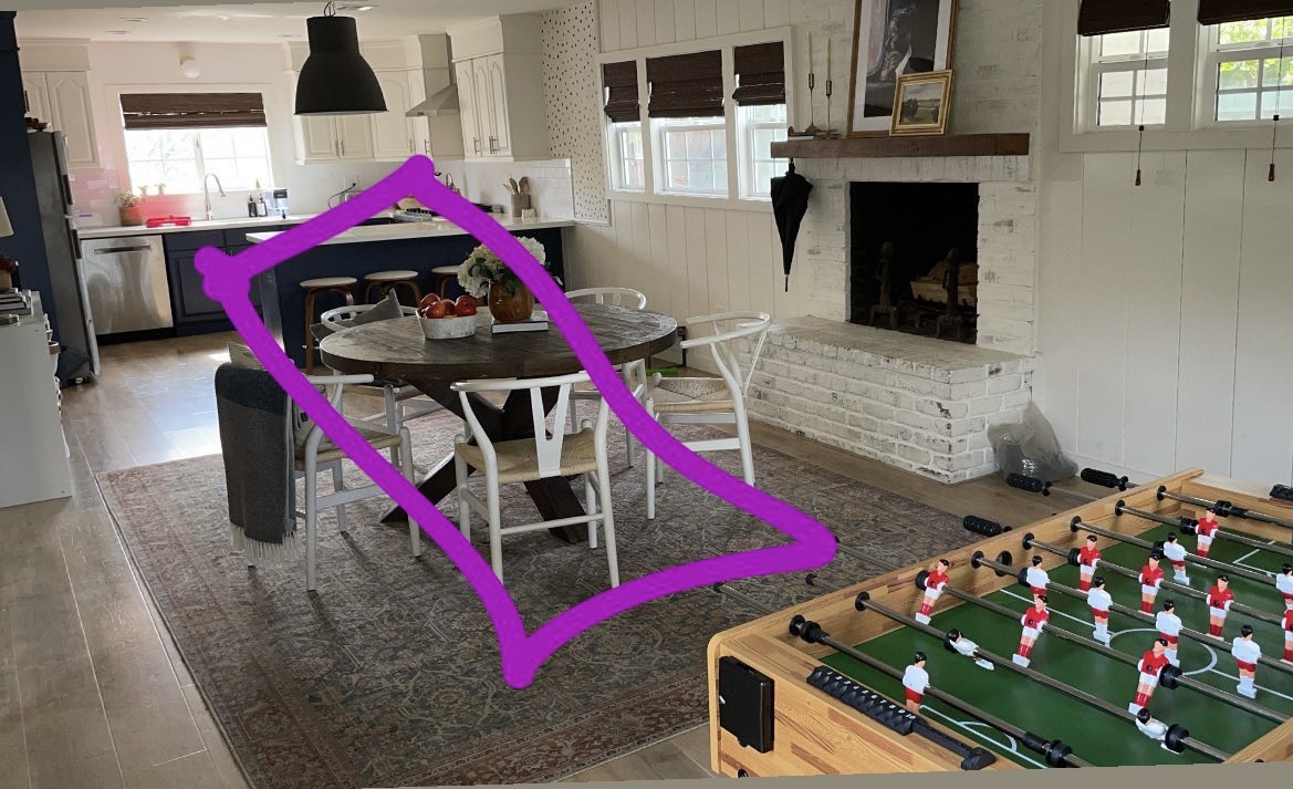
Lastly, we had this entire space right next to the kitchen with nothing in it. It was screaming for a kitchen island.
Where did you start for the kitchen renovation? And who designed it?
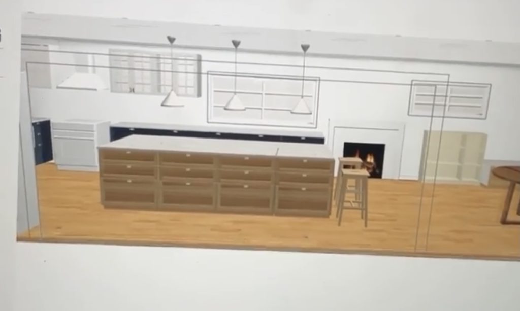
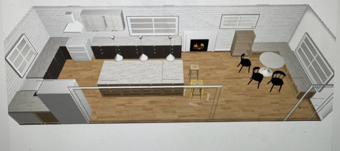
Before I reached out to a contractor to start the kitchen renovation, I wanted to have solid grasp of what exactly I wanted done. Meaning, big picture stuff–think layout, cabinetry, flooring. I had never designed something of this magnitude before, so I was a bit overwhelmed. If you’re a newbie like me, I highly recommend using the Ikea kitchen planner tool. I’m sure there are many programs out there, this is just one that I found to be incredibly user friendly (and free!). It was instrumental in the design of my kitchen renovation, and really helped me solidify many of my layout decisions. What’s great is it allows you to enter the measurements of the room, add in windows, walls, and other features…etc. I played around with the space for weeks! Here’s an example of a version of the room I designed for the kitchen renovation
What about the design elements and finishes for the kitchen renovation?
I knew I wanted my kitchen to feel like a Nancy Meyers movie (I’m so cliche I know). I also knew that I wanted a good mix of modern and vintage. I wanted it to feel aged and lived in. I’d say one of the best decisions I made to balance out the new and modern finishes, was utilizing tiles (both on my floor and my walls) that gave it that nice balance. And of course all those thrifted pieces and art that I ended up bringing in to give the kitchen some soul. I used the Canva app to map out my mood board for the kitchen, and to really test out a lot of the elements I was thinking about. It took a ton of trial and error, here’s an example of one below (this wasn’t the final):
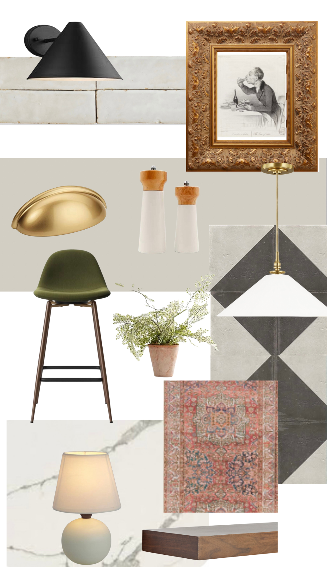
I put a lot of thought into how all the elements went together. I’d highly recommend keeping samples of everything in your purse! I always had a sample of my wall tiles, slab, paint samples, and really anything I had so that it was easier to make decisions when I went to the store shopping for other elements.
How did you pick a contractor for your kitchen renovation?
I searched on Google for several general contractors. I looked at their work online, and requested a meeting and a quote. Thankfully, one of the contractors was a recommendation from a friend. I met with a few, asked them questions about timeline, staffing, past projects…etc. I ended up picking the contractor I felt like was looking for solutions, was being honest with me, and overall had a good gut feeling about them.
Ok, let’s get to the good stuff. Before and Afters of the kitchen renovation..
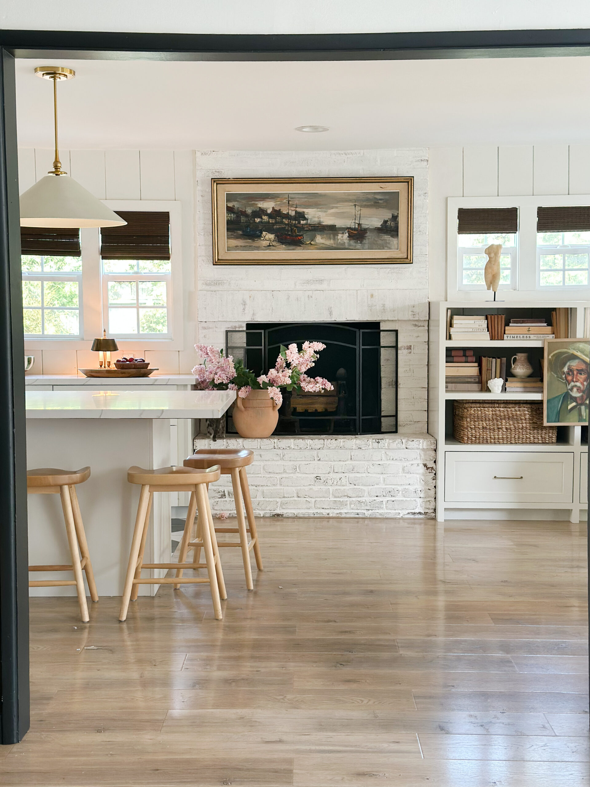
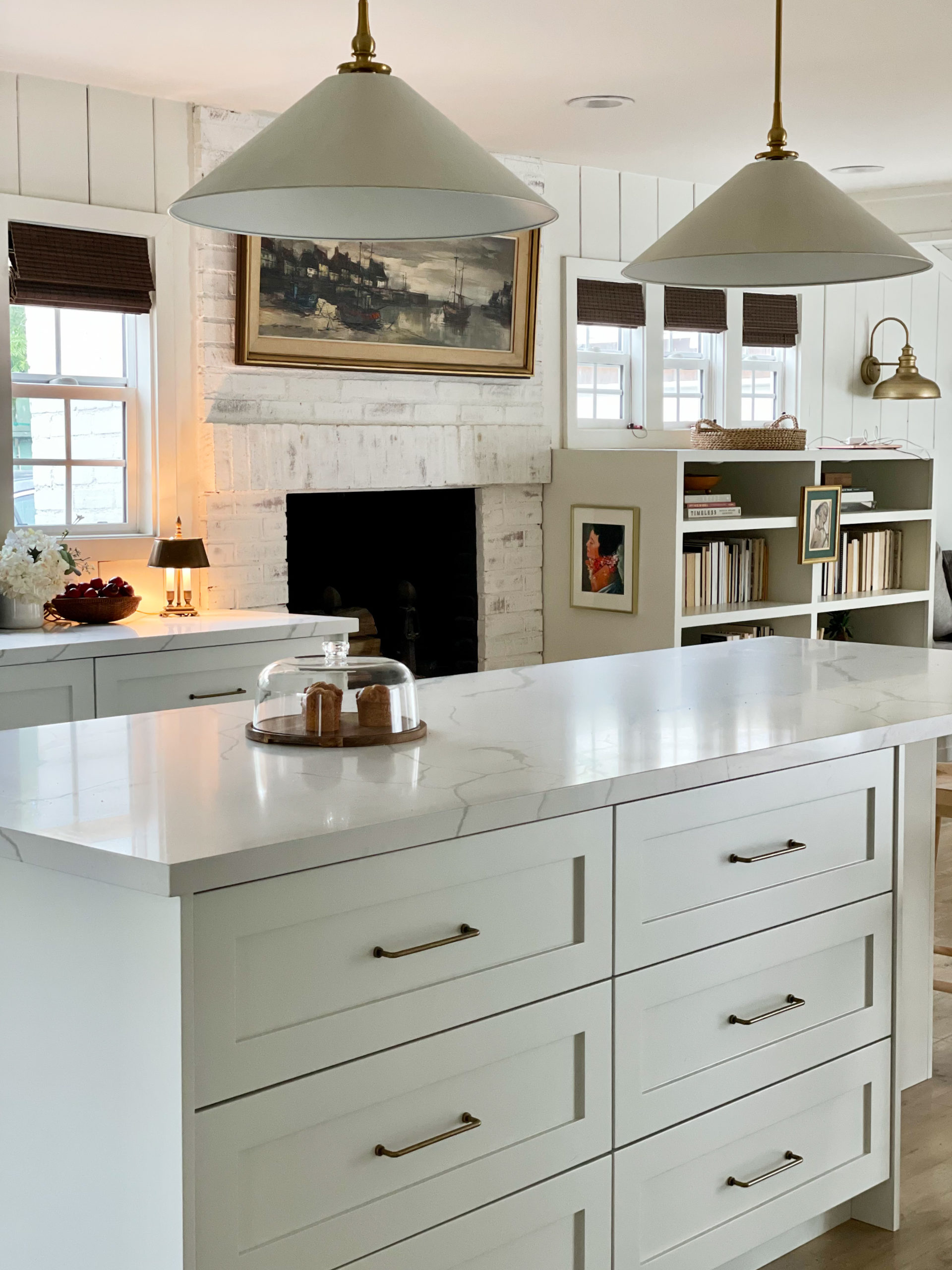
One of the spaces I spent the most time thinking about for the kitchen renovation, was this space below. A few things: 1) I love the windows below, and they were original to the house. However, I also love symmetry. And building something on both sides while making the windows look intentional was a struggle. Getting new windows was definitely out of the budget. 2) Since we moved in, this was such a dead space. The kitchen was on the far left, and the dining table was on the far right. It never felt connected or cohesive. 3) That hearth on the fireplace was bugging the crap out of me, and I was unsure how it would look with cabinetry on both sides. But, we didn’t have it in the budget to remove it for the kitchen renovation
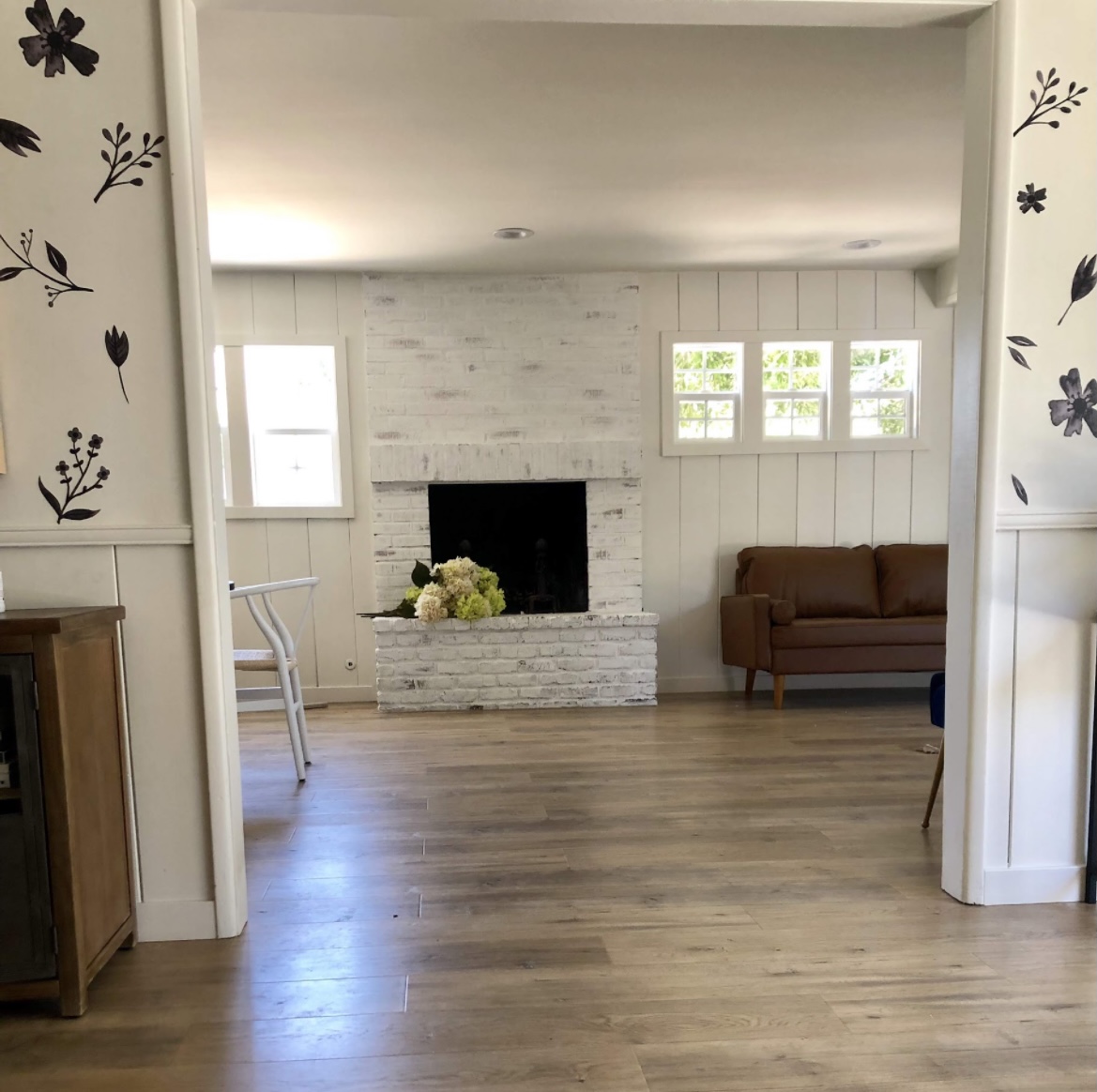
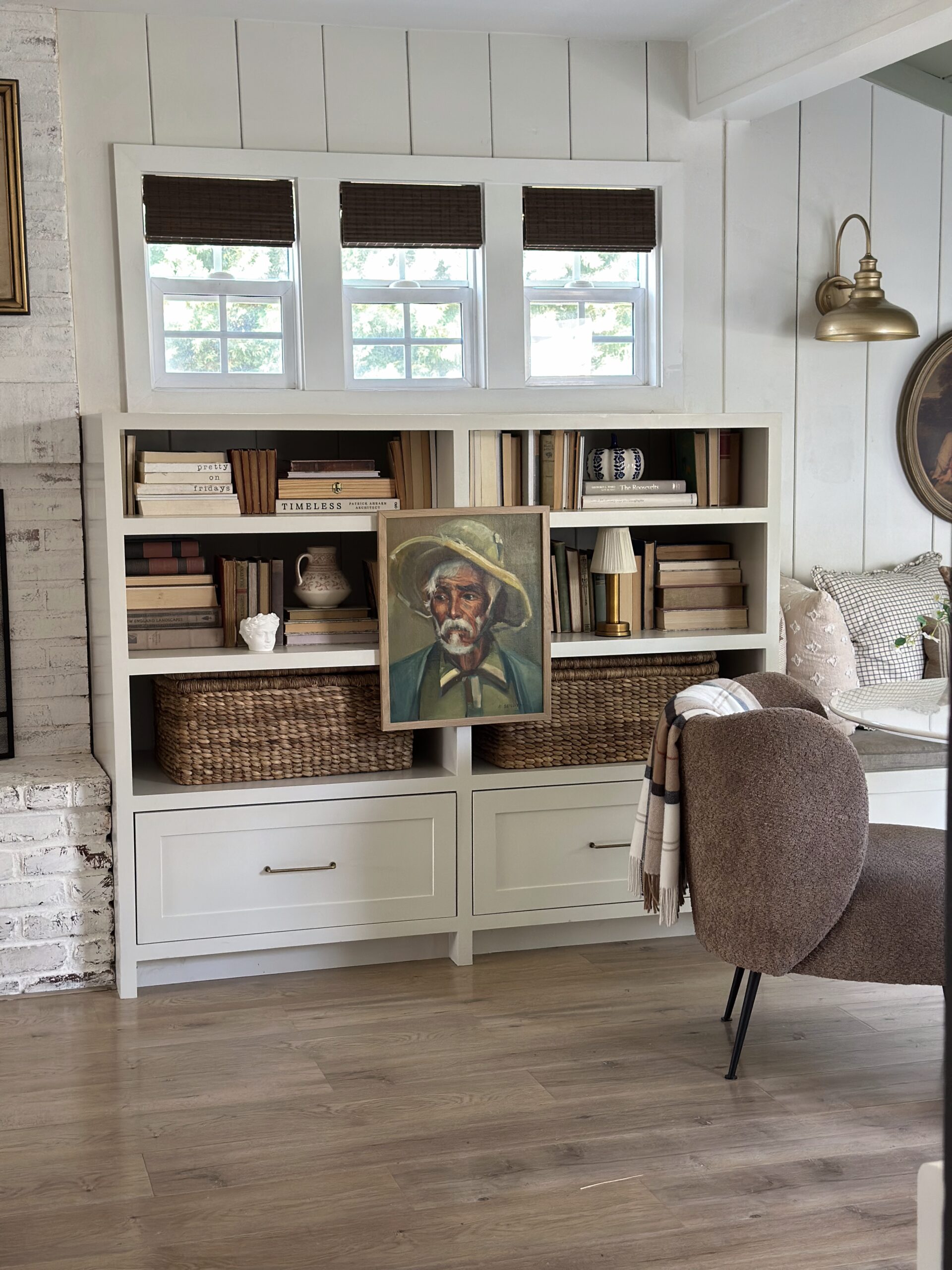
I decided to keep the cabinetry the same depth on both sides of the fireplace, but designed a bookshelf to go all the way up on the right, so the windows looked intentional. I also pushed the island so that the seating was in front of the fireplace, and the two spaces looked connected. I am so happy with how this turned out, and the hearth actually ended up looking great.
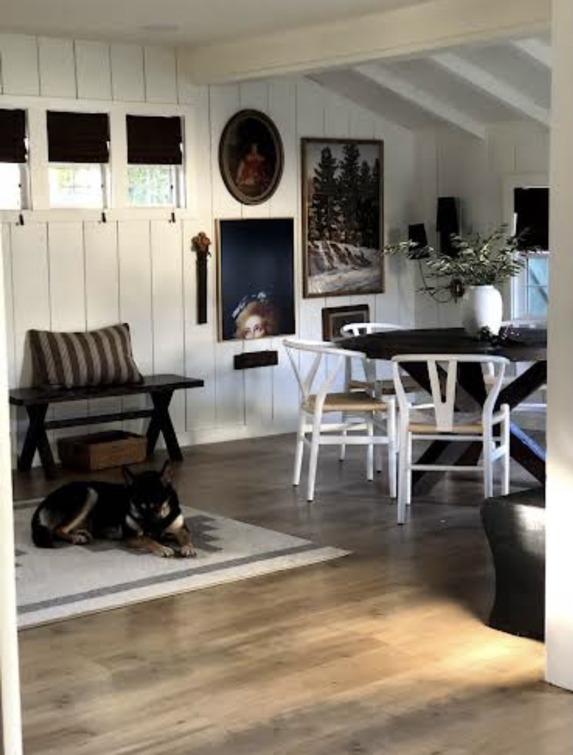
If you move to the right, we used to have our dining table there. It was a cute corner, but that table felt heavy and bulky. I’ve also always wanted a dining banquette. So when we planned the kitchen, I just knew we had to put one in.
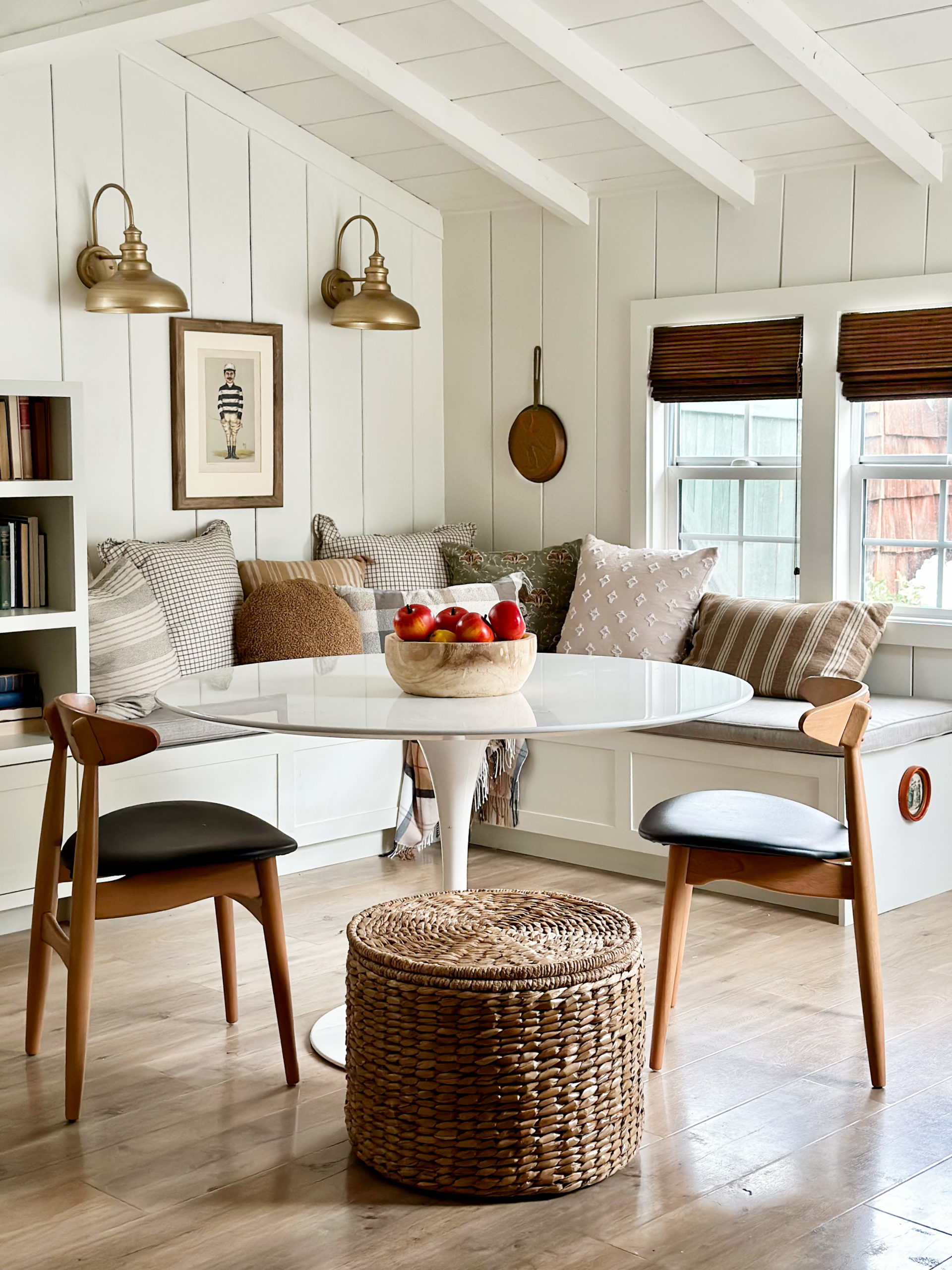
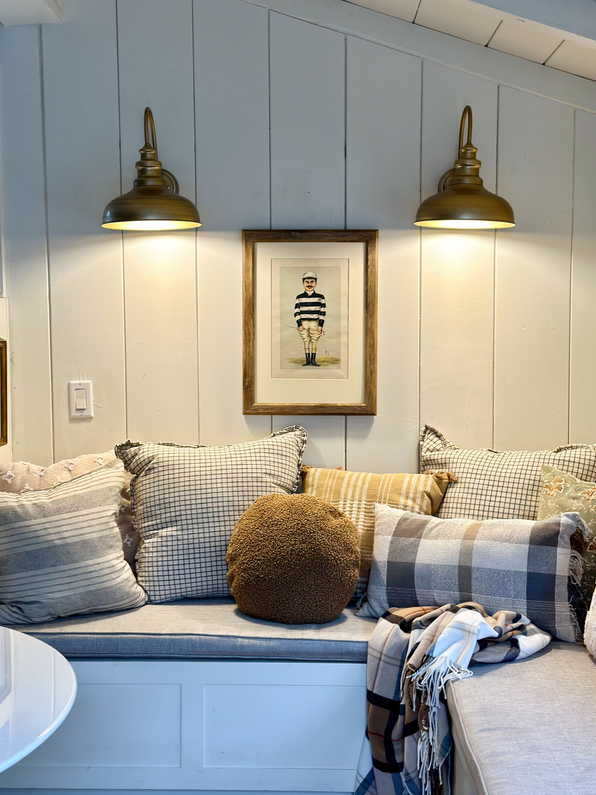
And with the bookcase, it all feels so intentional now.
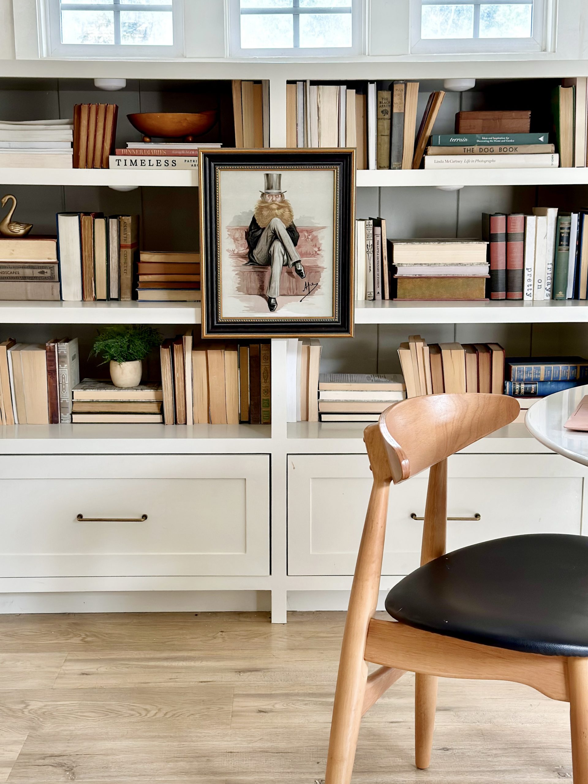
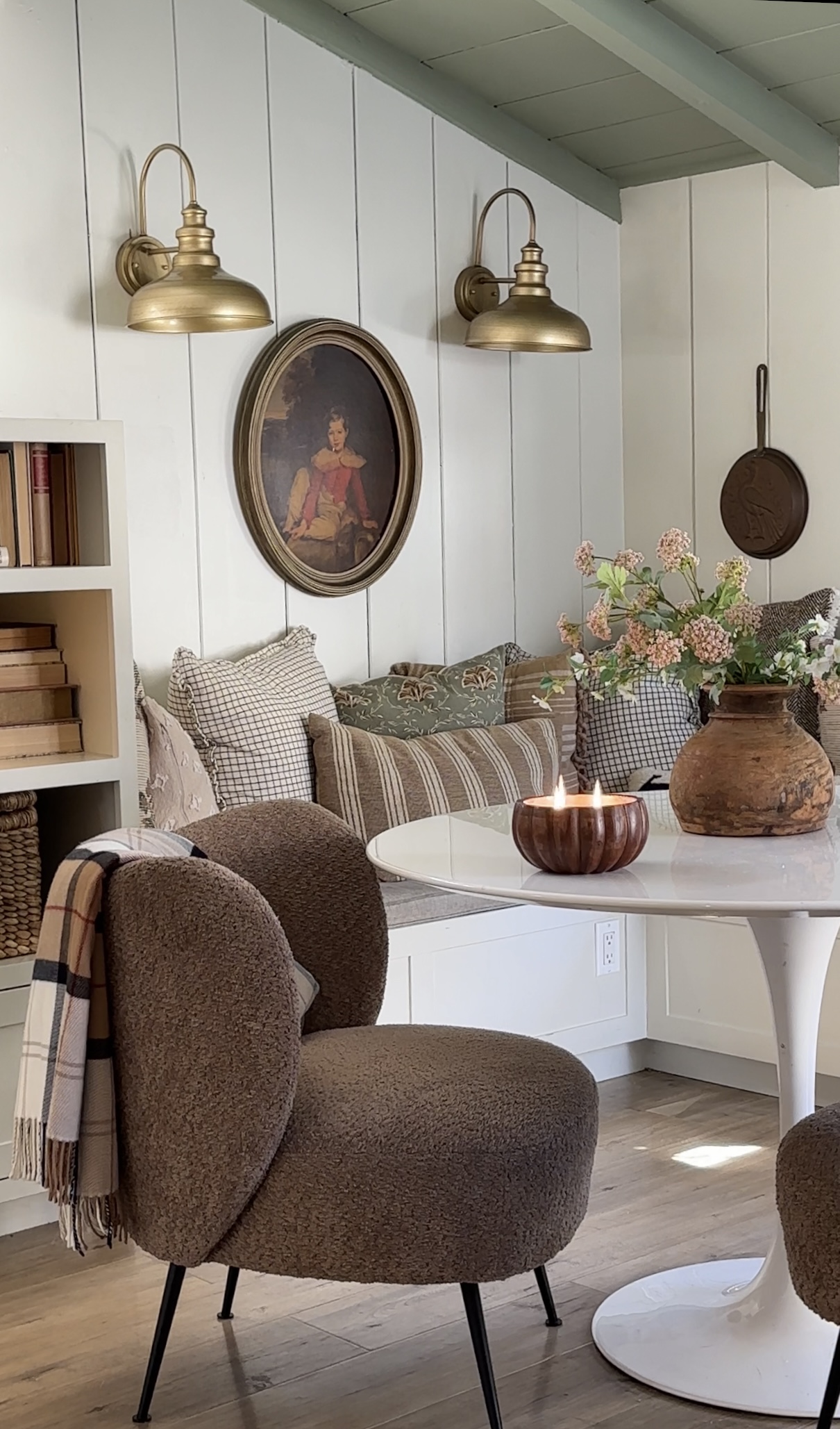
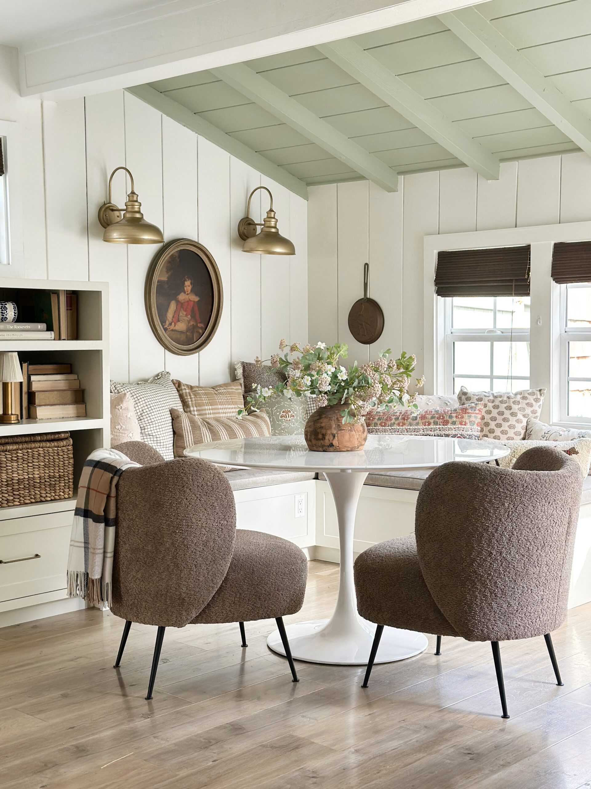
We also have a ton of storage in that dining bench, and it’s now our favorite spot to sit! I opted for a top storage (versus drawers that pull out) because I wanted to maximize all the storage space. I also didn’t want to constantly move the table if I wanted to get something out. I had the seat cushion made separate, and it actually just sits on top unattached. It has a removable cover that I can send to the dry cleaners if I need to. If you do decide to attach your cushion, I would recommend attaching it in the back and not the bottom. This way you can flip the cushions every now and then to keep it from sinking or getting too flat.
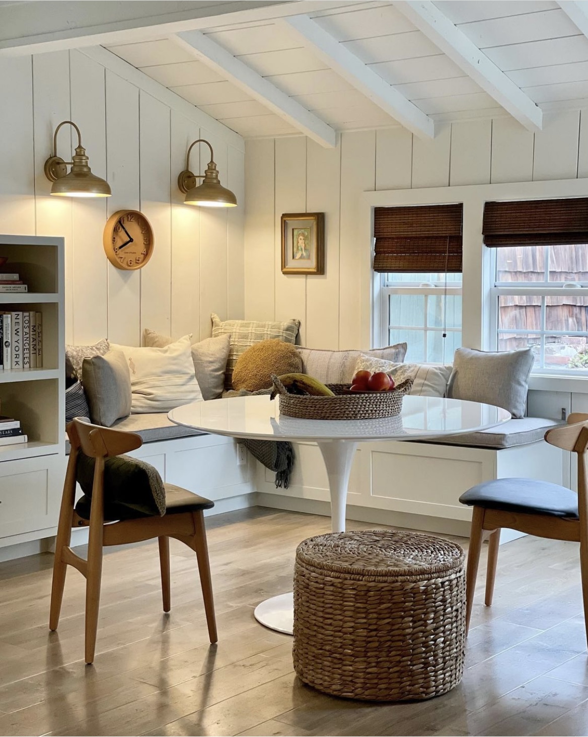
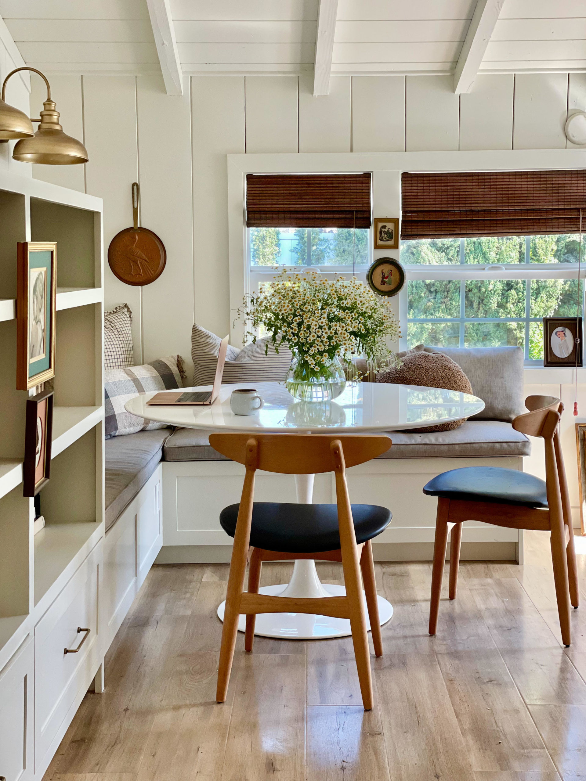
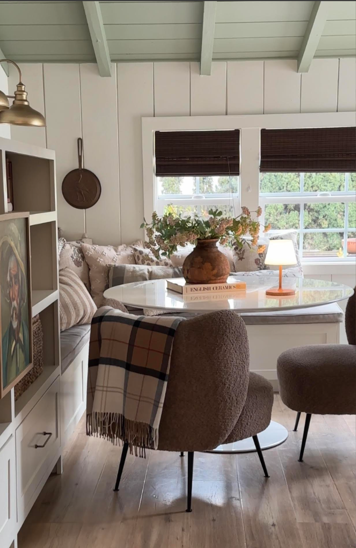
At one point we even tried doing a living room in that spot.
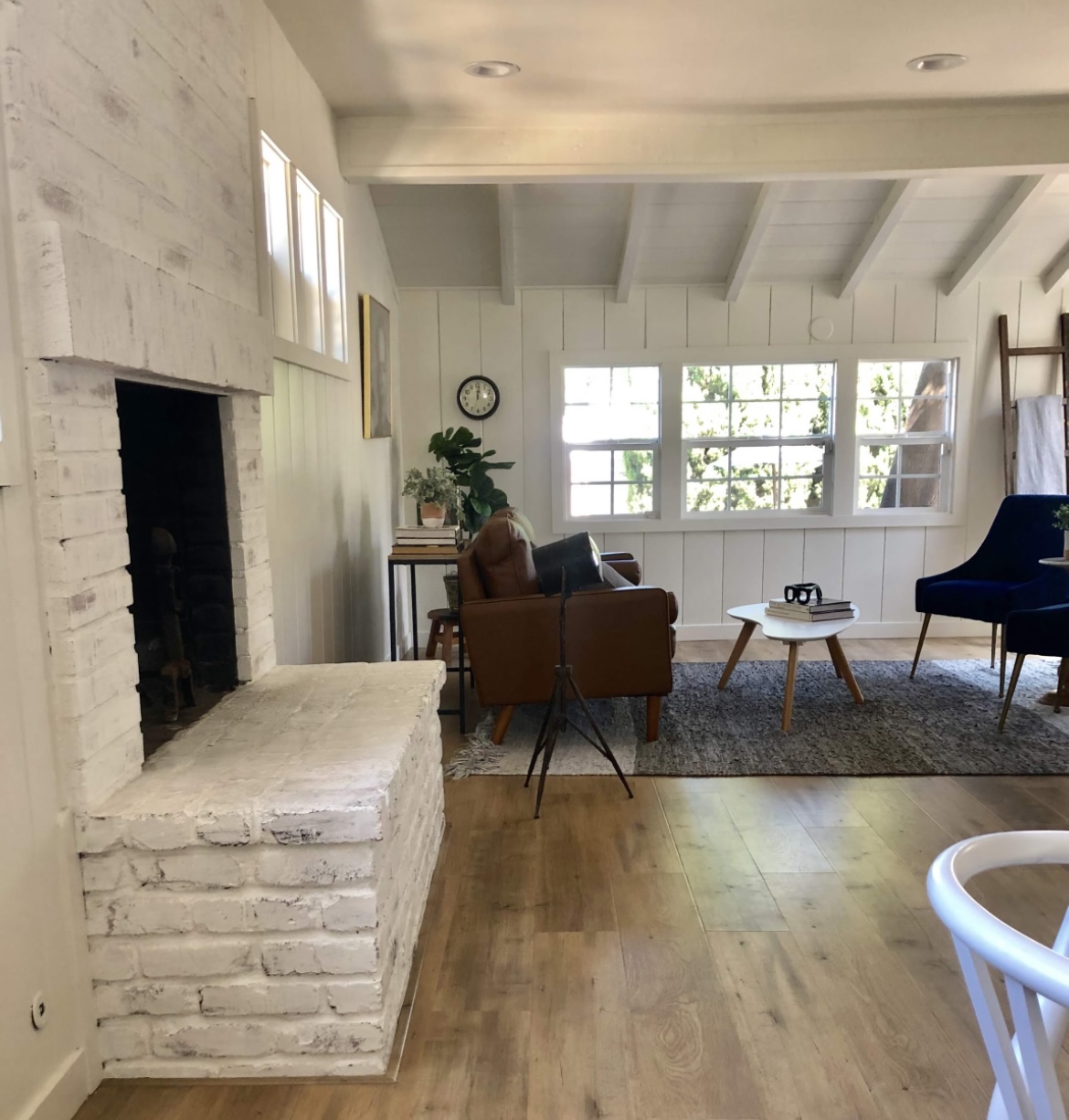
But now it feels more cohesive, and intentional.
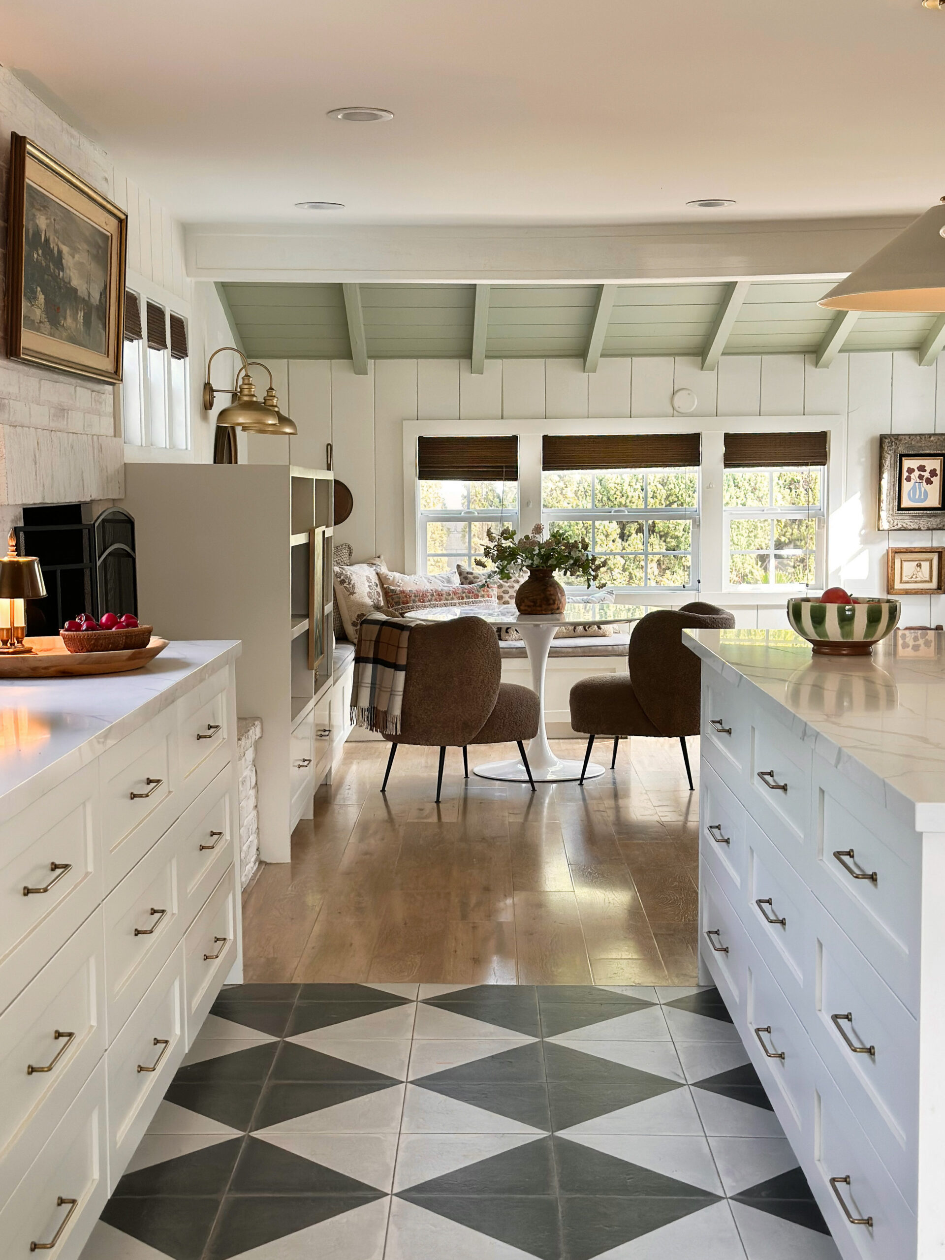
And that bookcase double serves as a sneaky booth.
You can often find me hiding behind it.
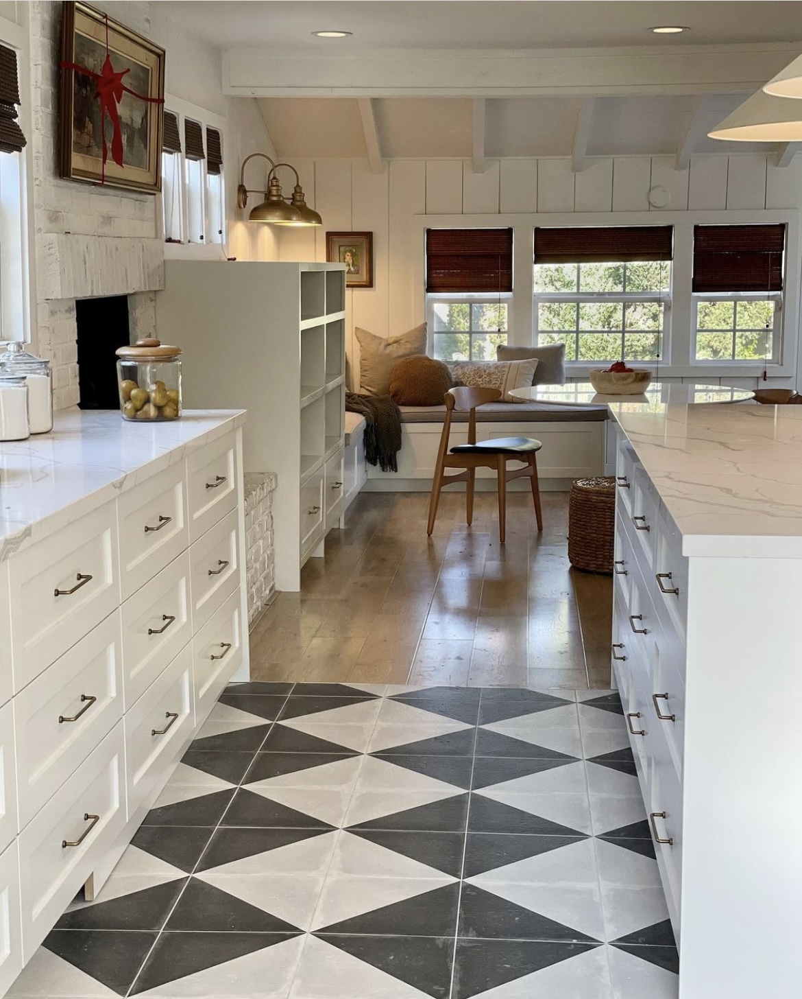
Moving on to the main view of the kitchen.
We definitely got rid of that dead space!
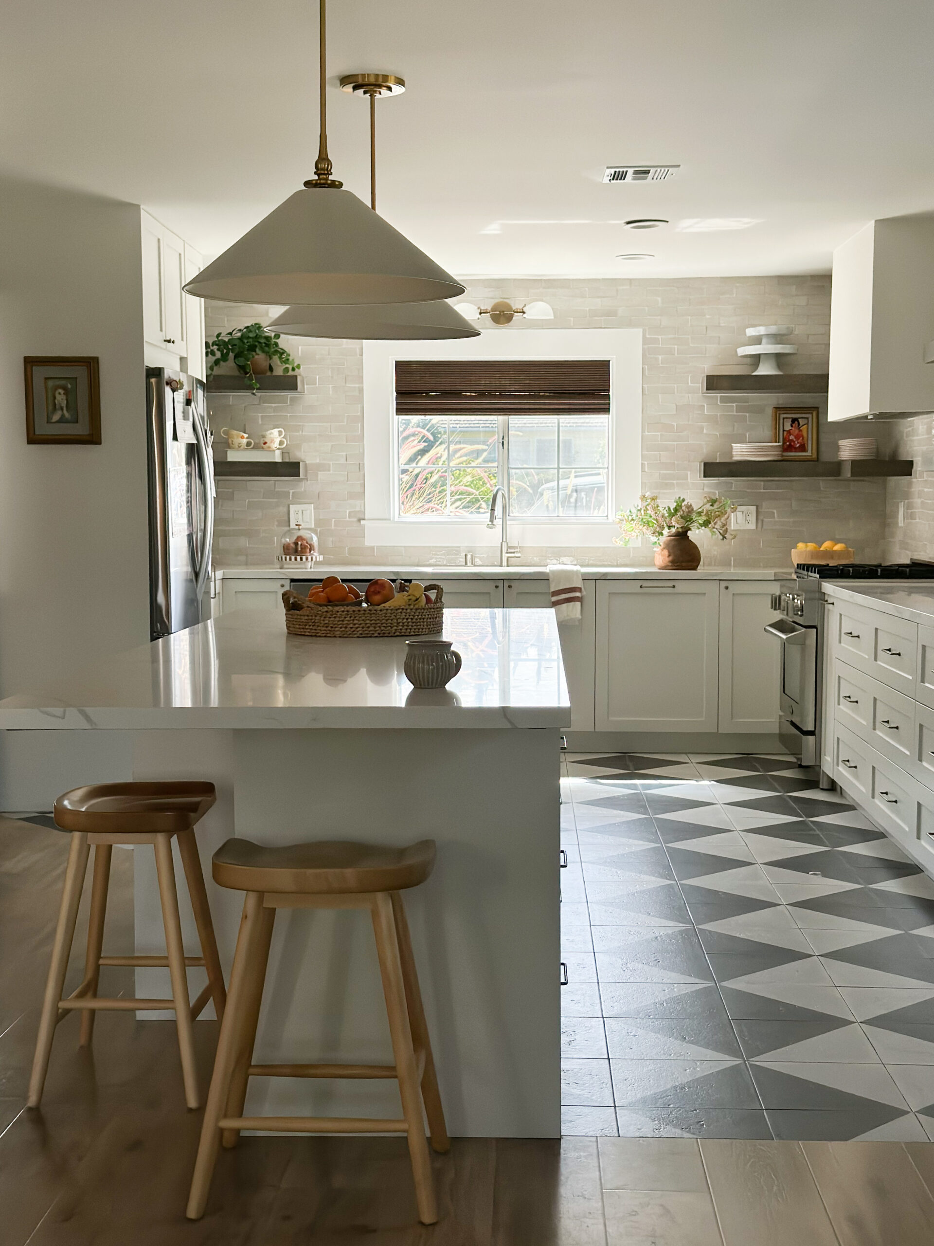
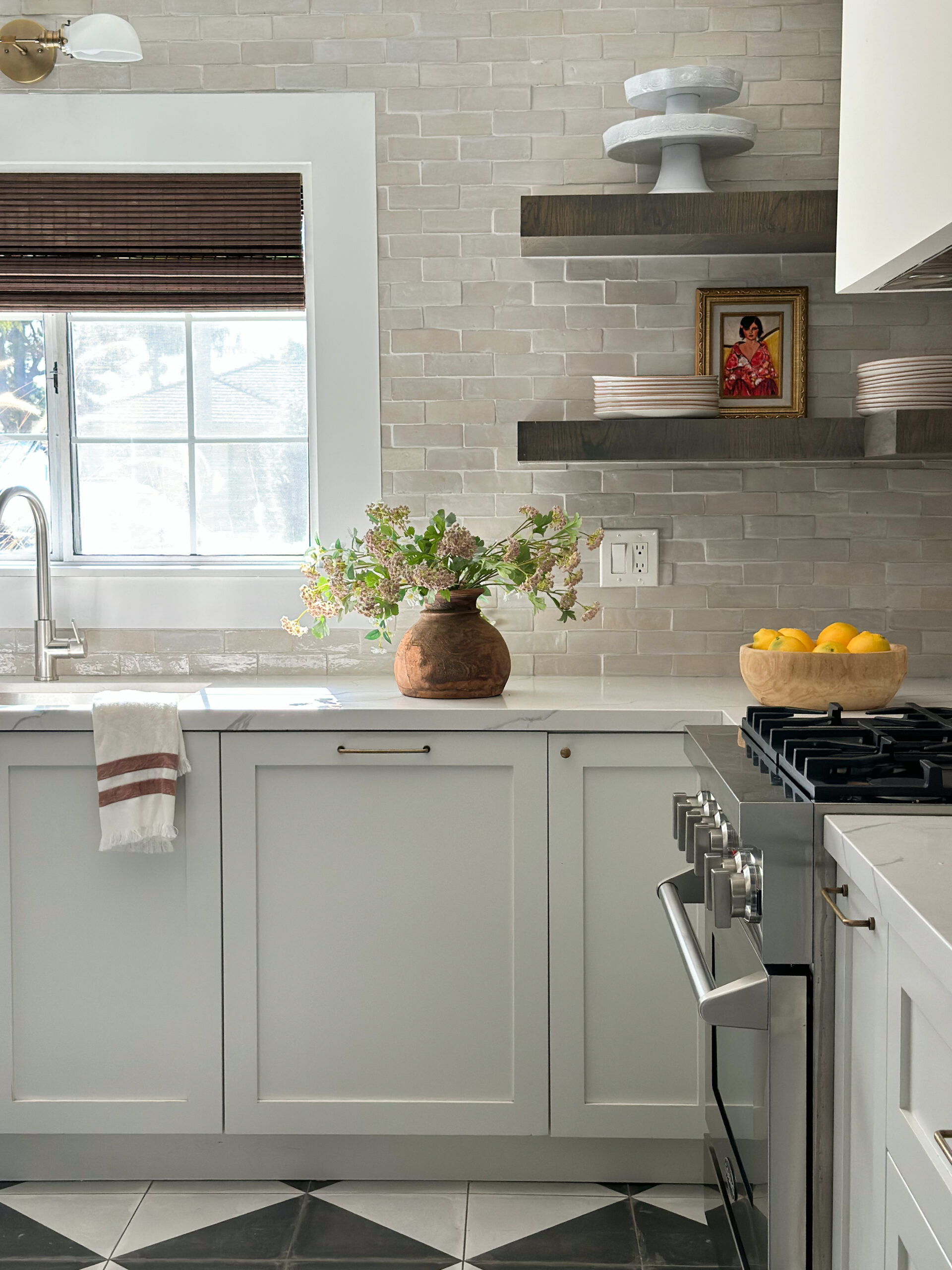
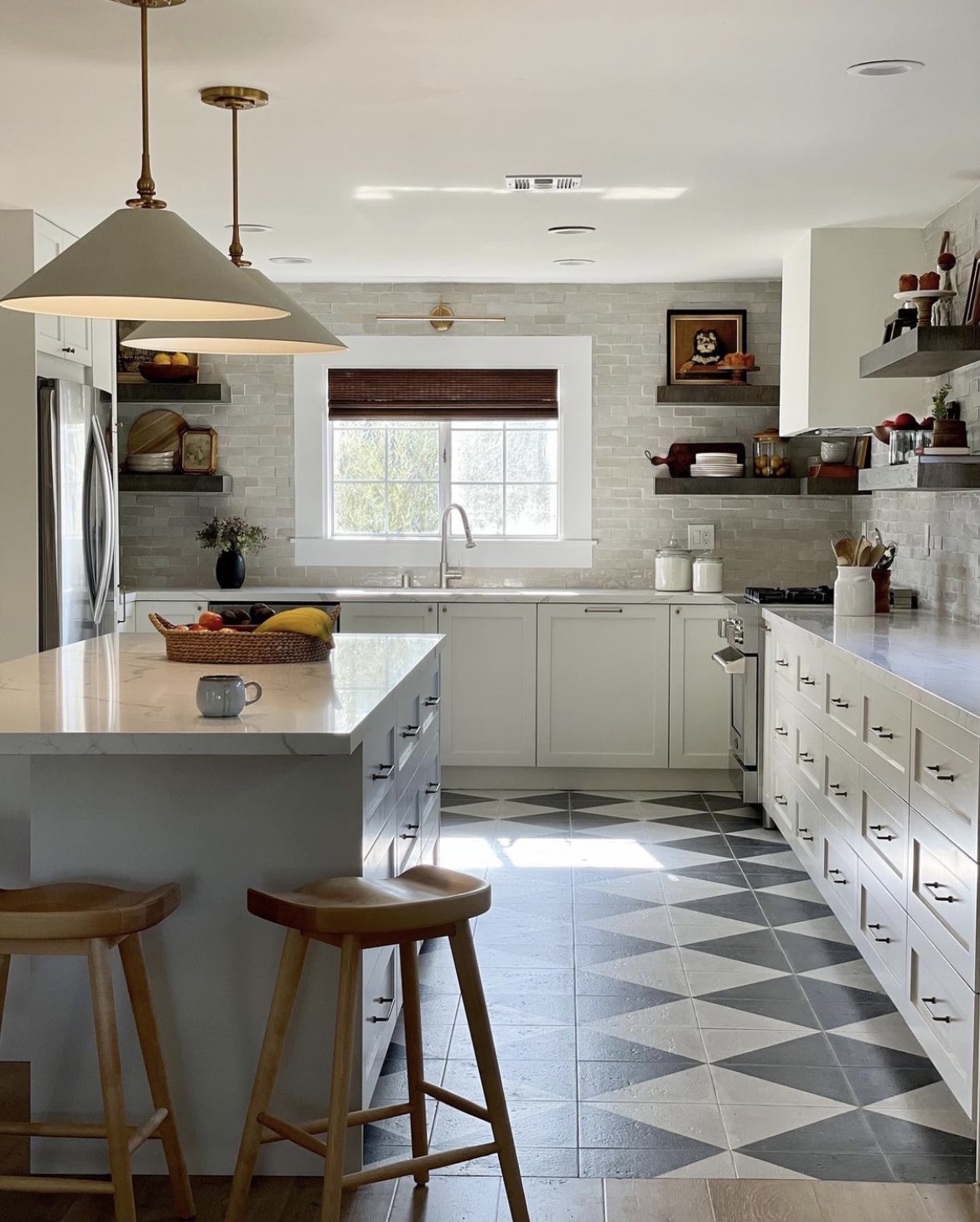
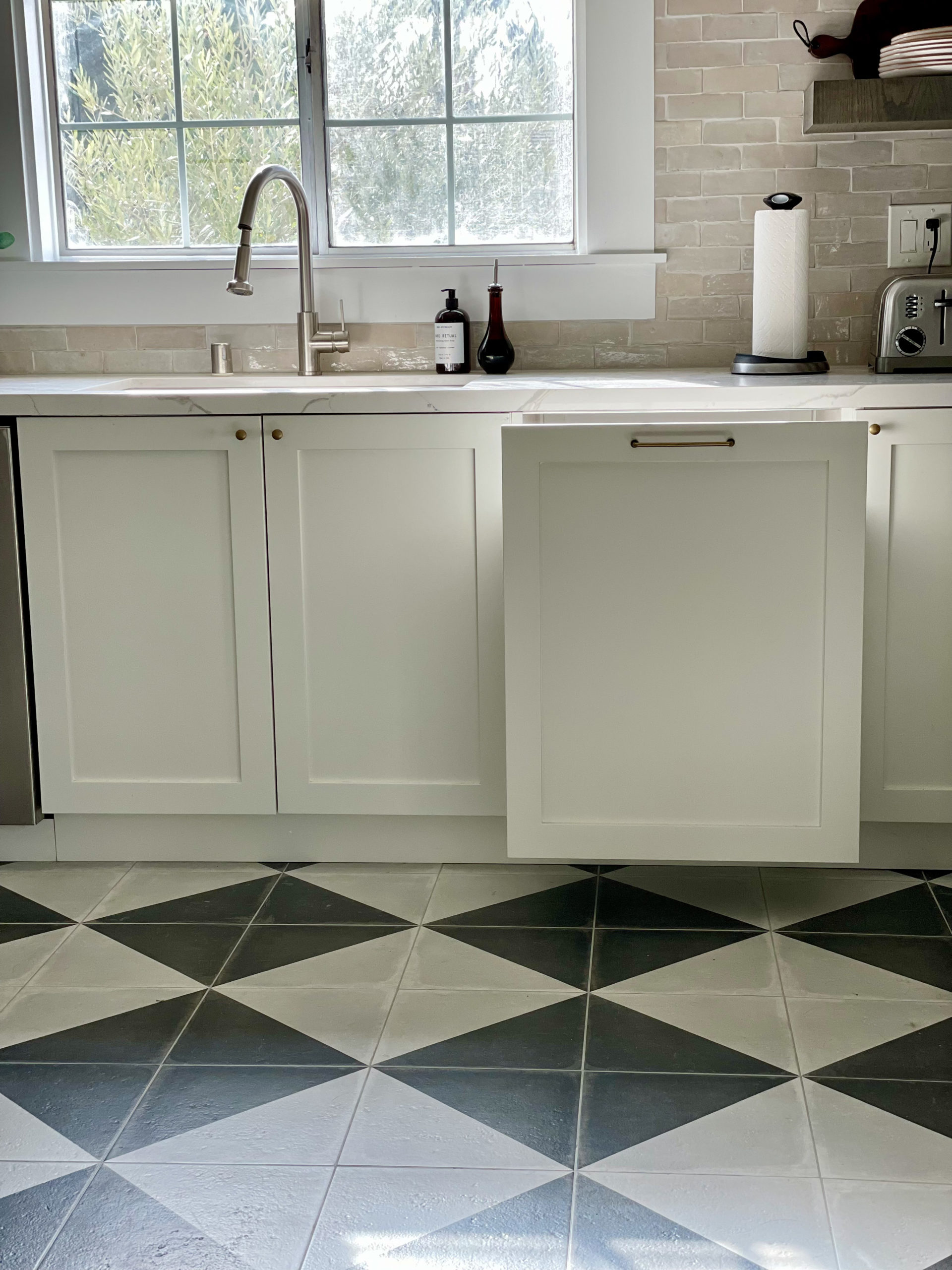
And those checkers? They were such a happy accident. I’ve always dreamt of having checkered floors. When our contractor removed the peninsula in our original kitchen, there was no hardwood underneath. I could’ve tried to find a matching floor, but instead decided that having a mix of wood and tile would be such a fun surprise.
The next decision I needed to make was where to end the tiles. Do they go to the fireplace? Past the fireplace? Then I thought why not do the tiles on the “working area” of the kitchen? And then a follower on Instagram sent me this image below.
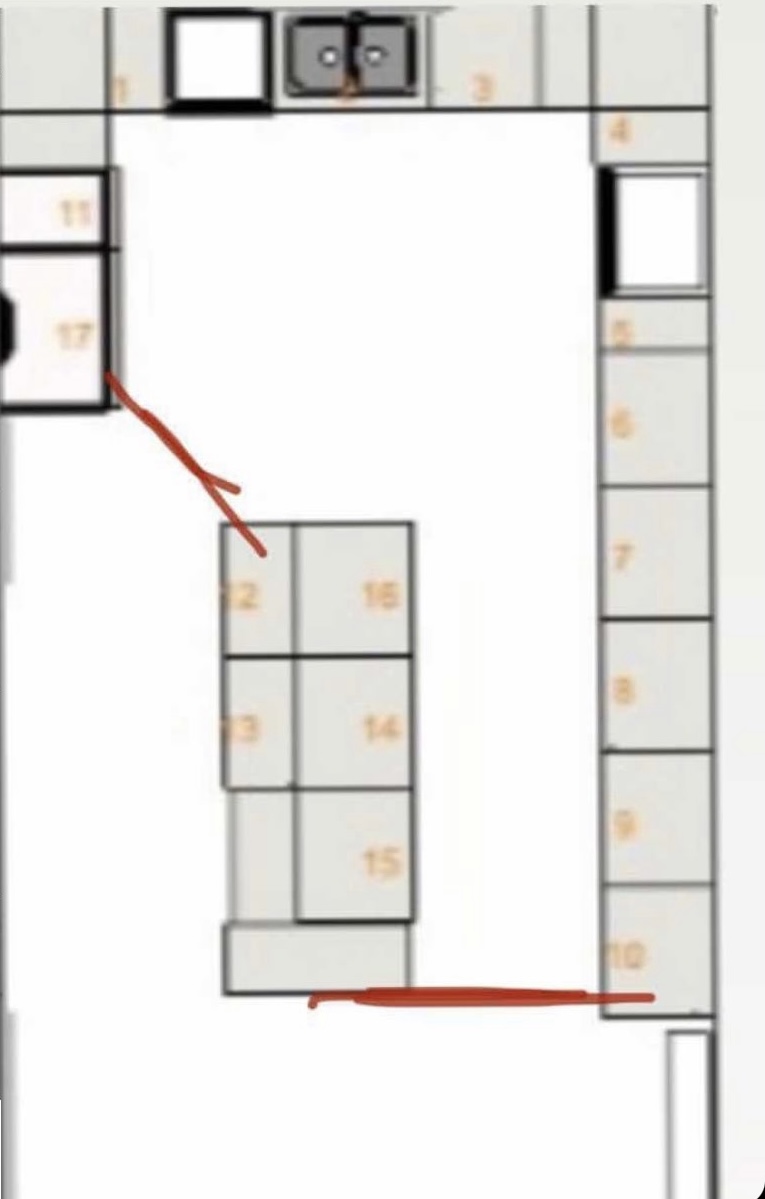
I was like THAT IS THE ONE. It was so controversial (both having a mix of tiles/wood AND doing the slant). People said it would look dated, but I couldn’t love it more.
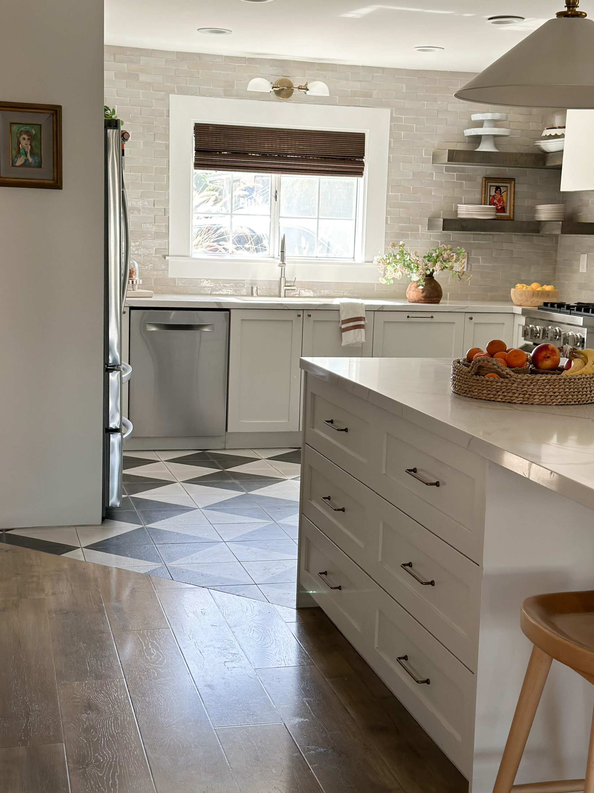
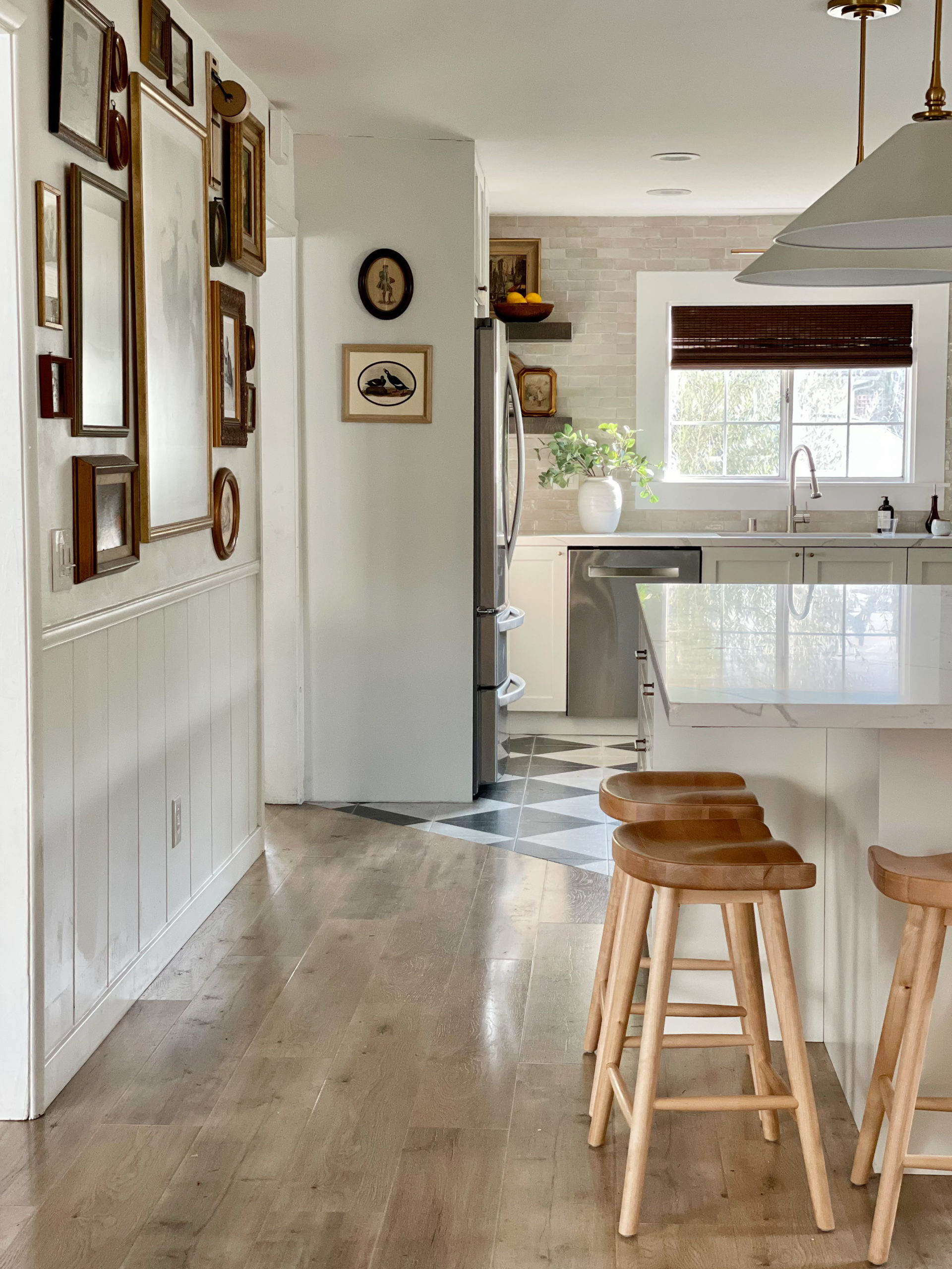
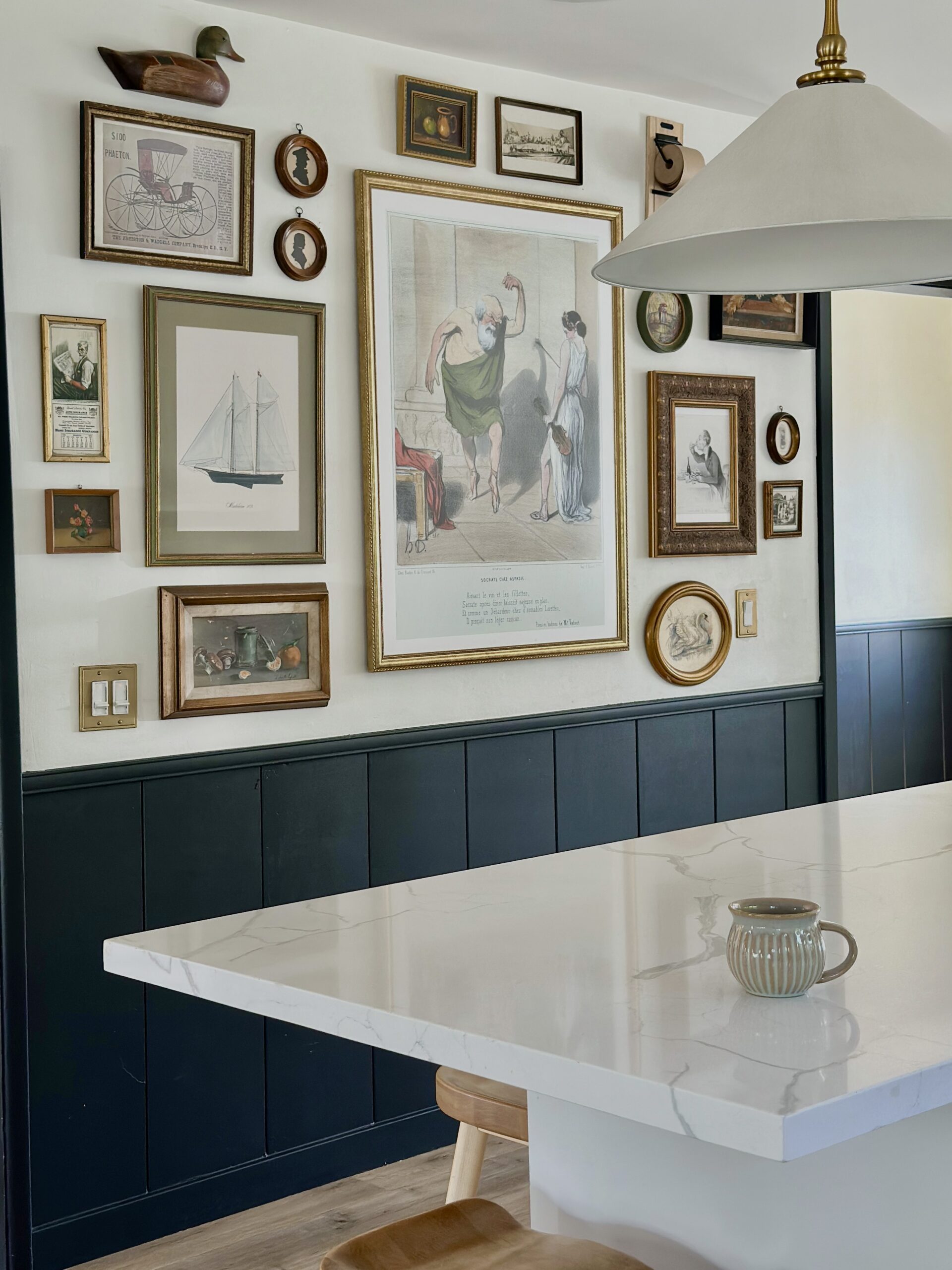
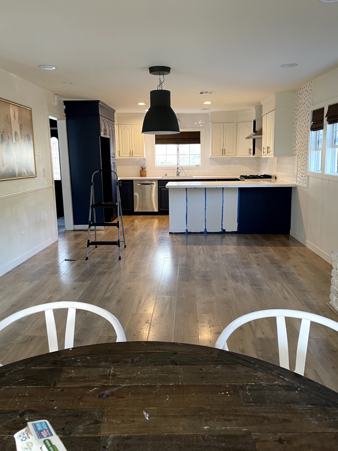
Because we had so much storage space now with the expansion, I really wanted the space to feel wider. I decided to opt out of upper cabinets. See how tight it was below?
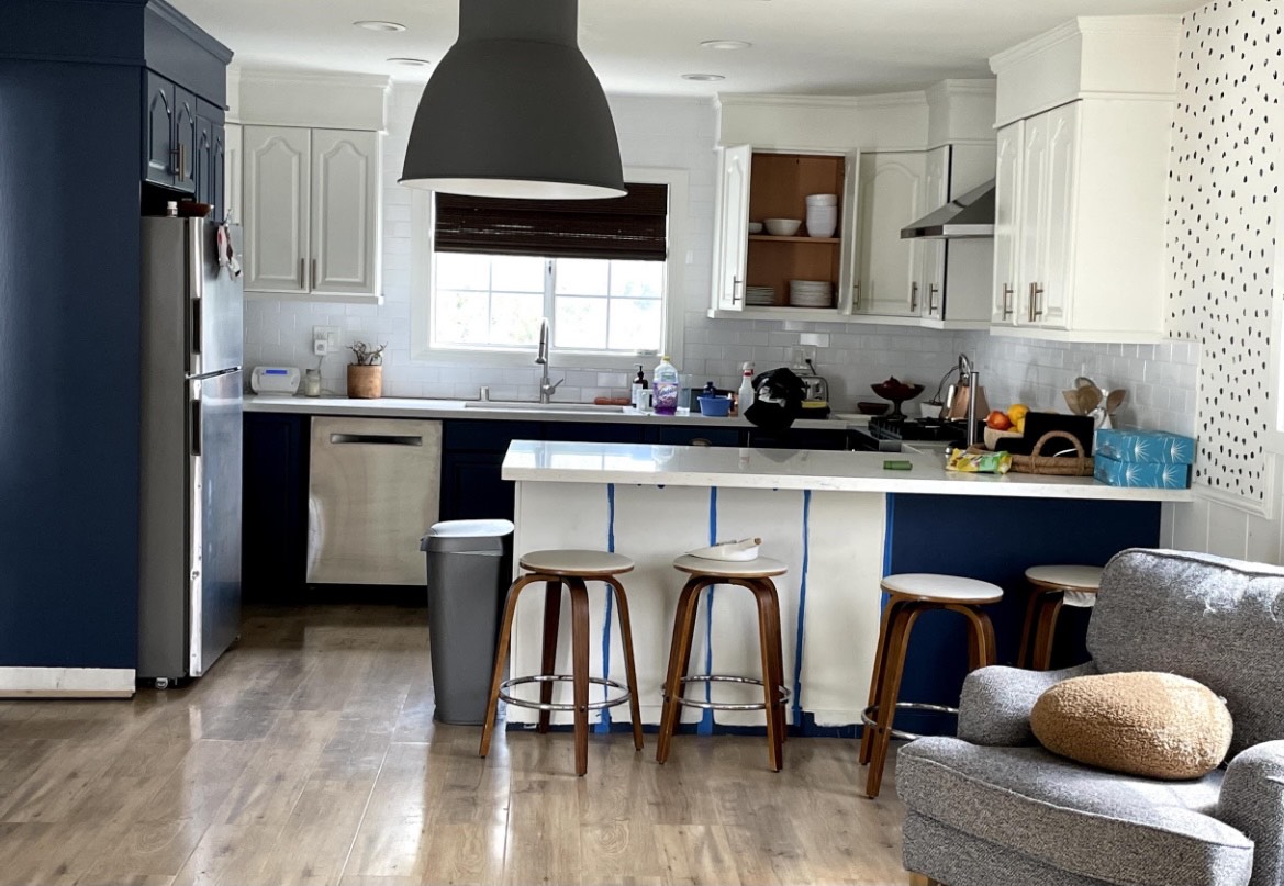
Just feels so much wider and airy now.
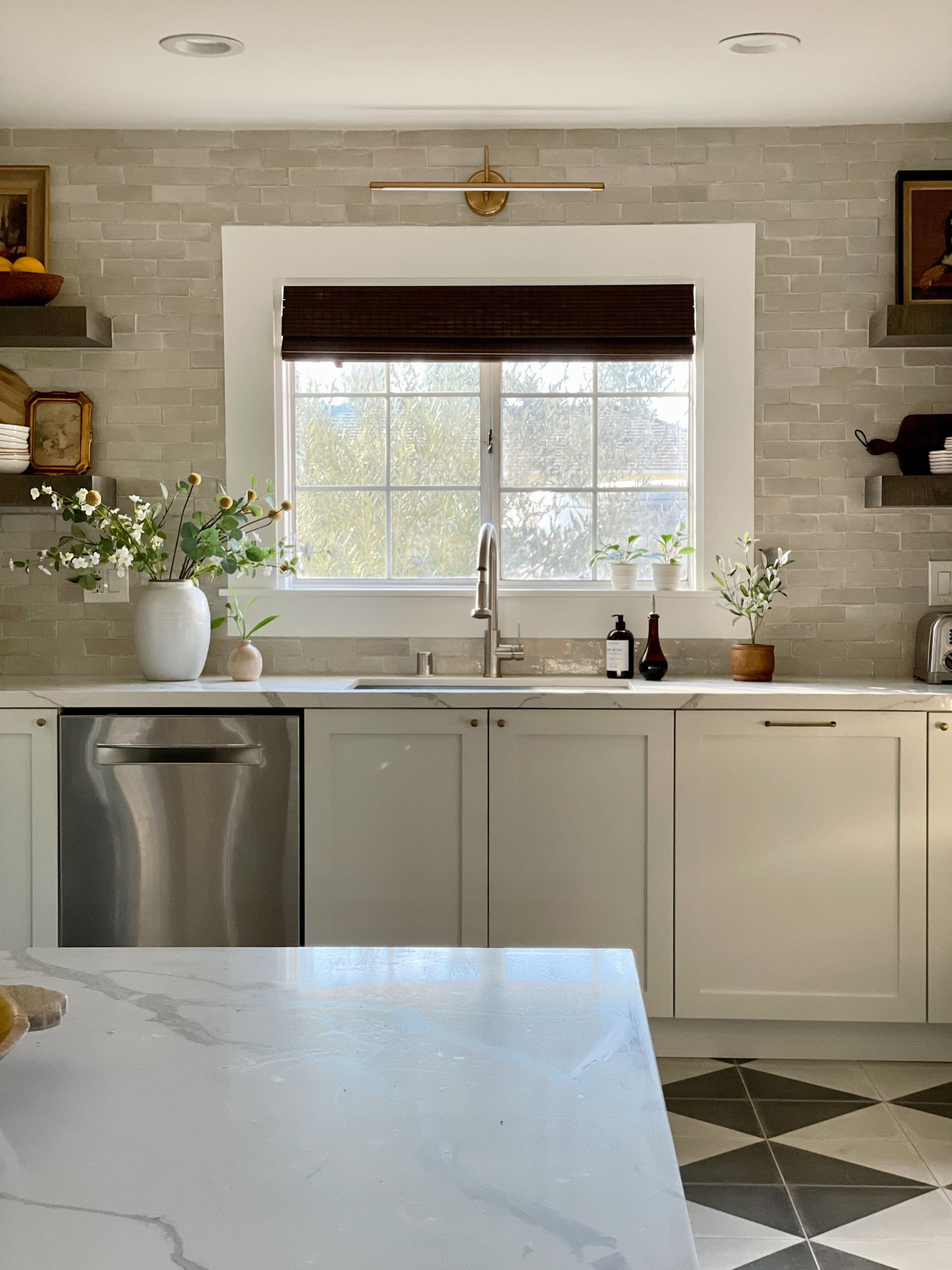
And did you notice the window? We didn’t have it in the budget to replace it with a larger one, so I designed a window frame that would give the illusion it was larger.
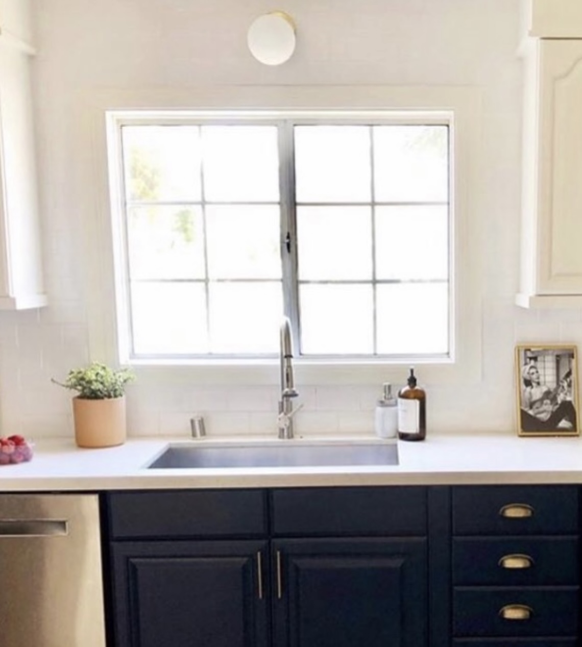
So much better right?
I HATED this corner. The fridge didn’t fit, and those upper cabinets were so cramped in that corner.
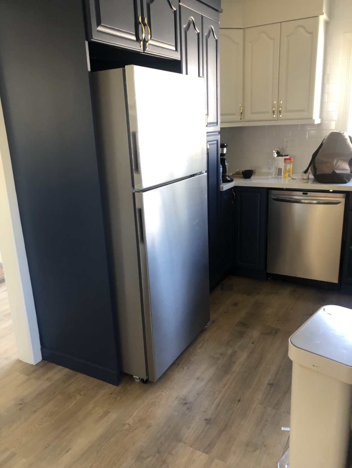
So in love with it now.
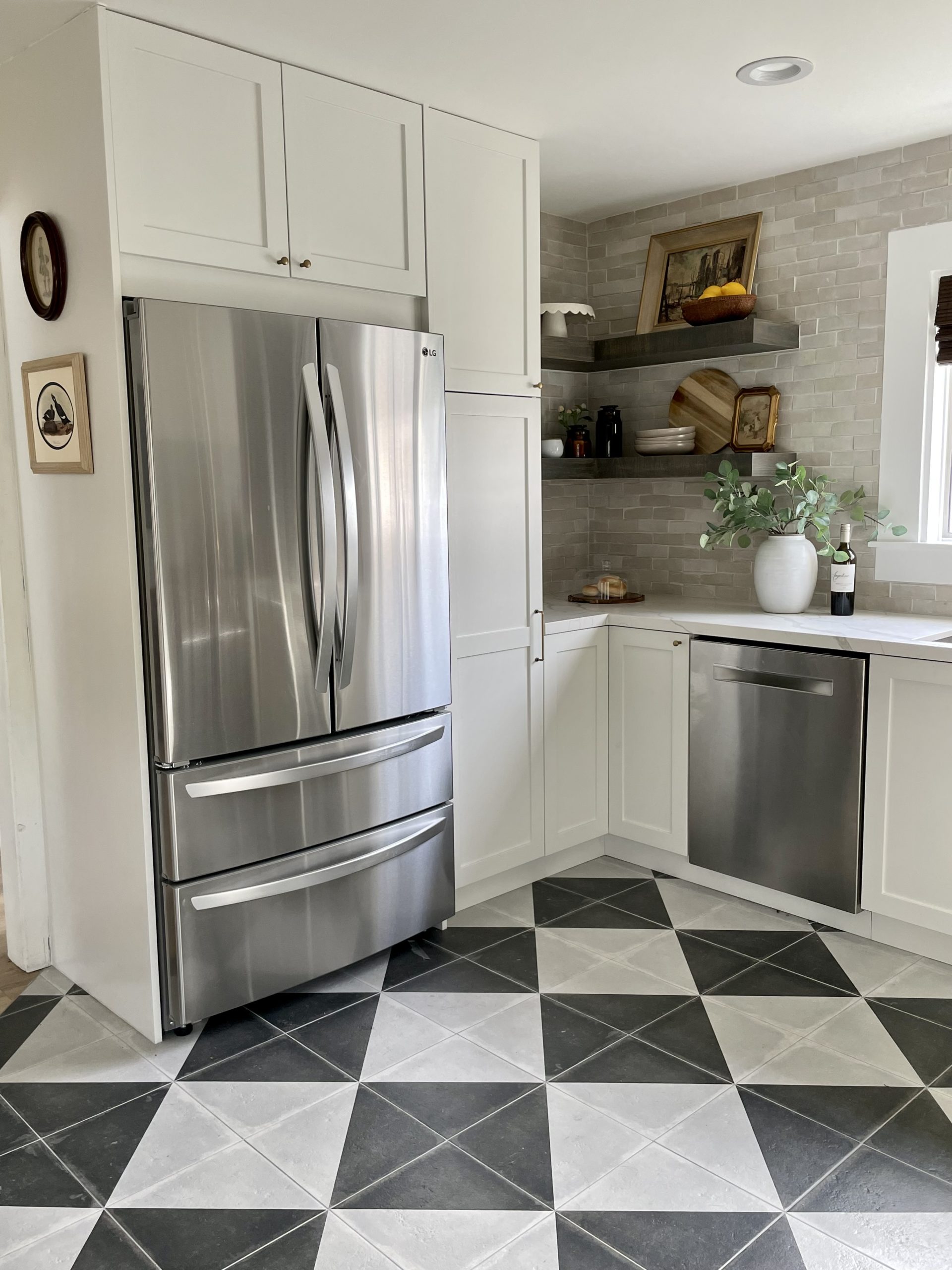
And the view from the hallway before.
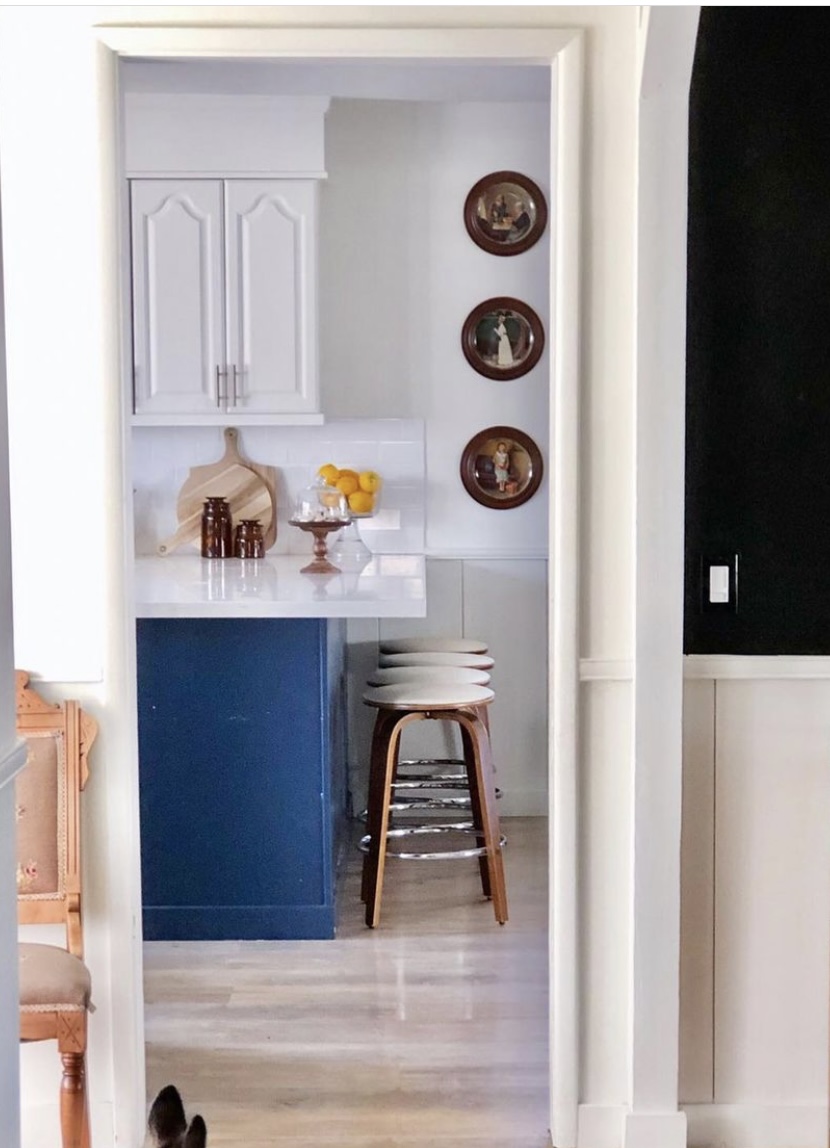
Just feels so much bigger! And that peninsula no longer blocks the view.
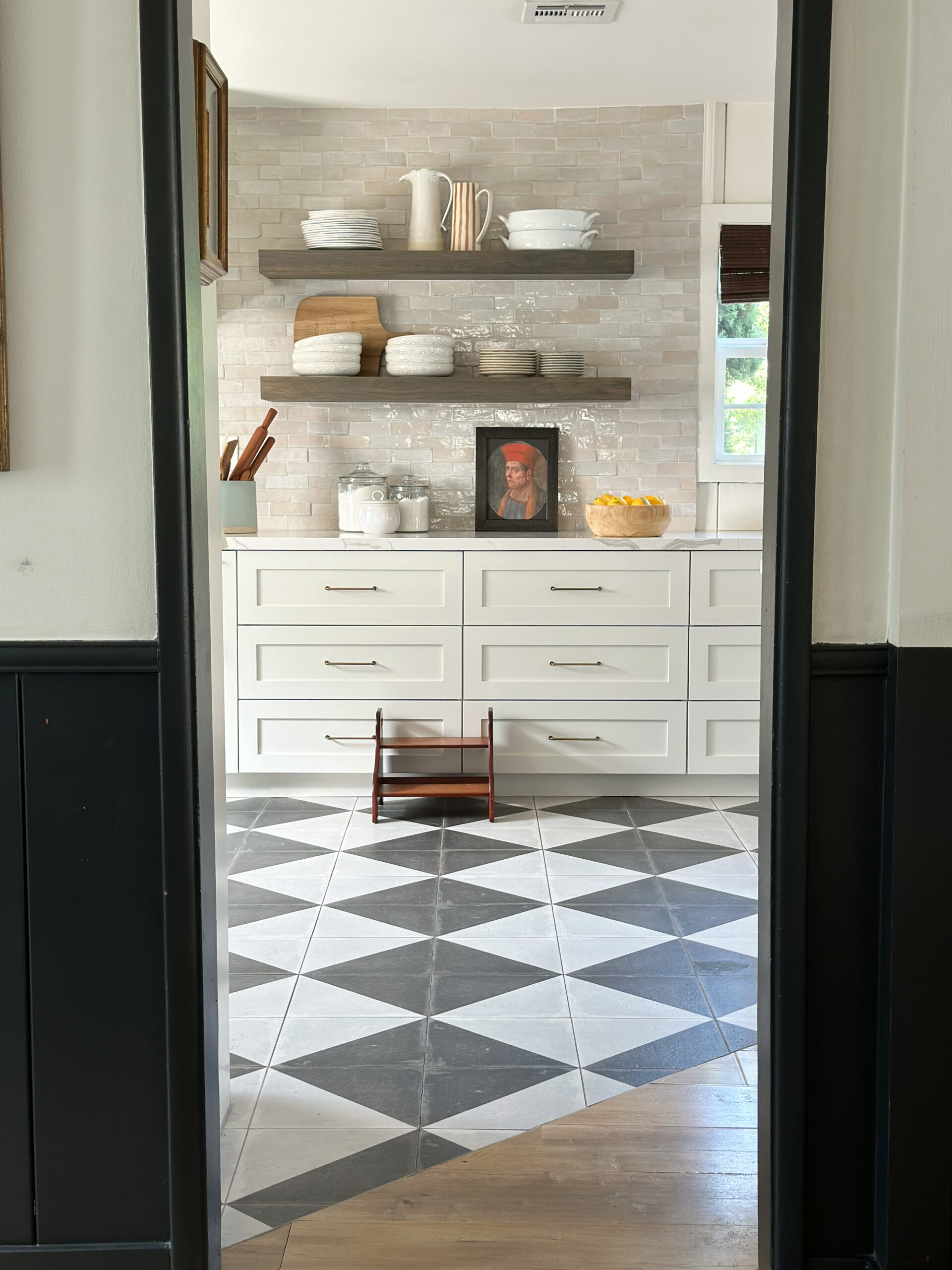
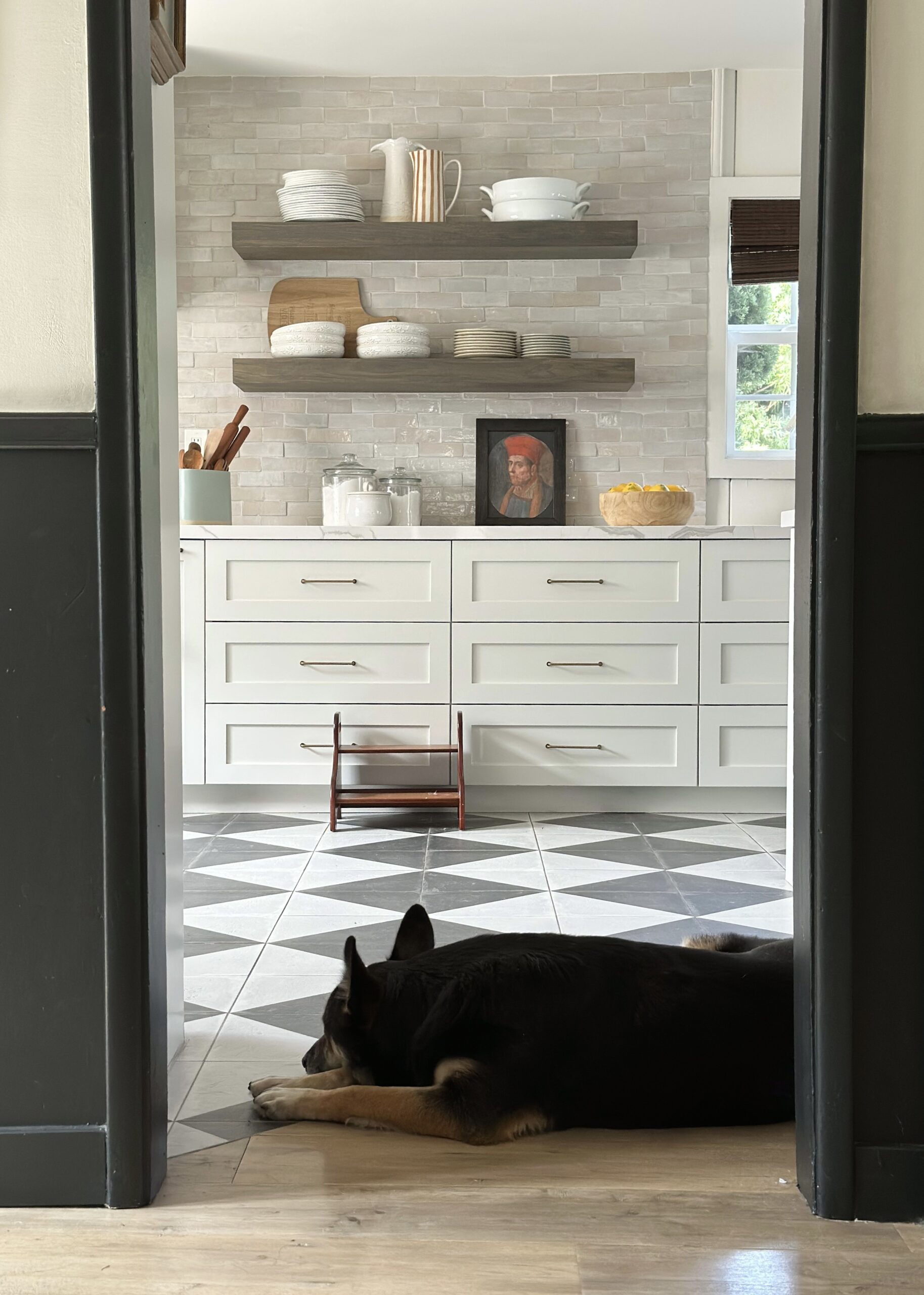
Another angle..
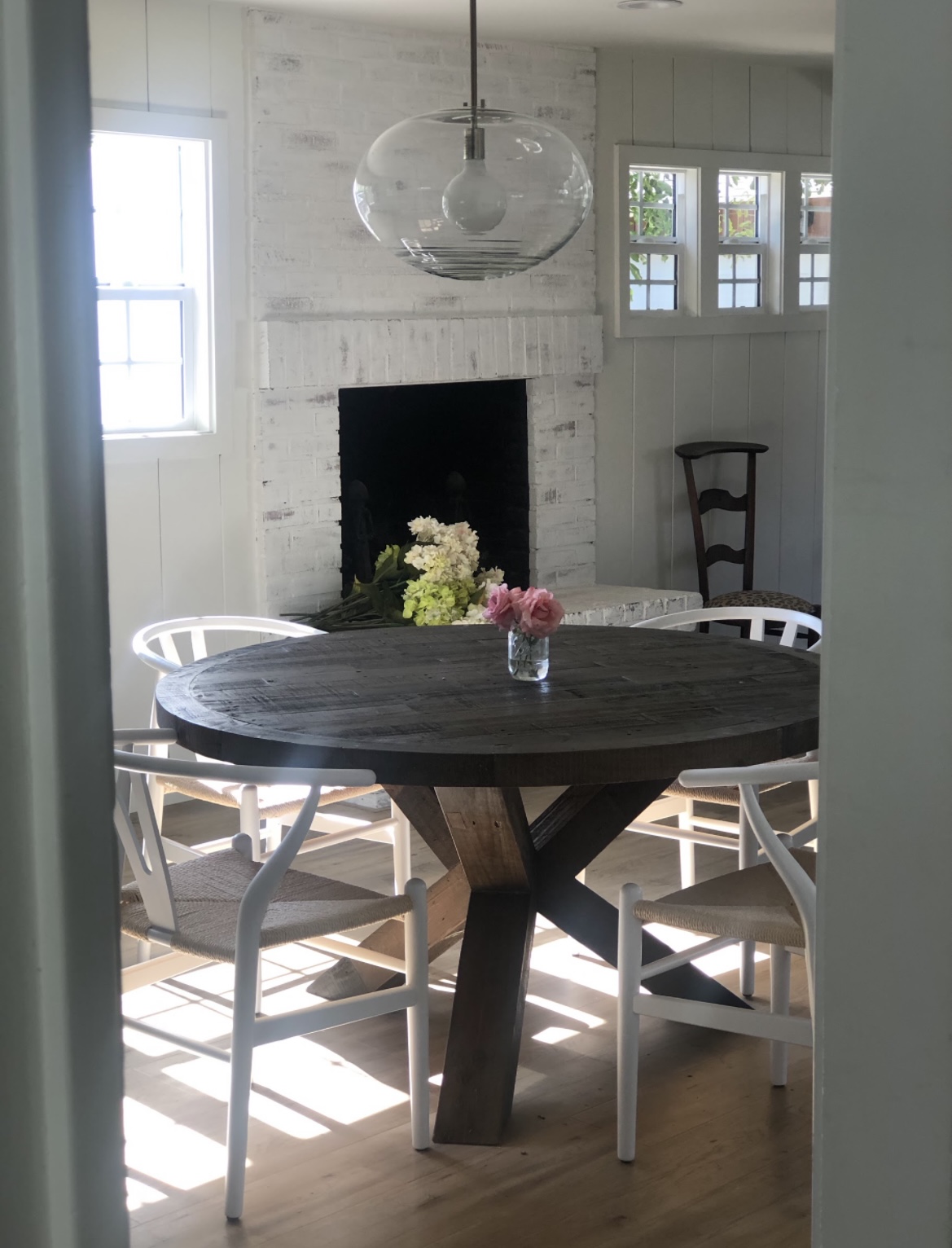
I can’t even believe it’s the same space.

The oven was so cramped, and that hood was squished in between those upper cabinets.
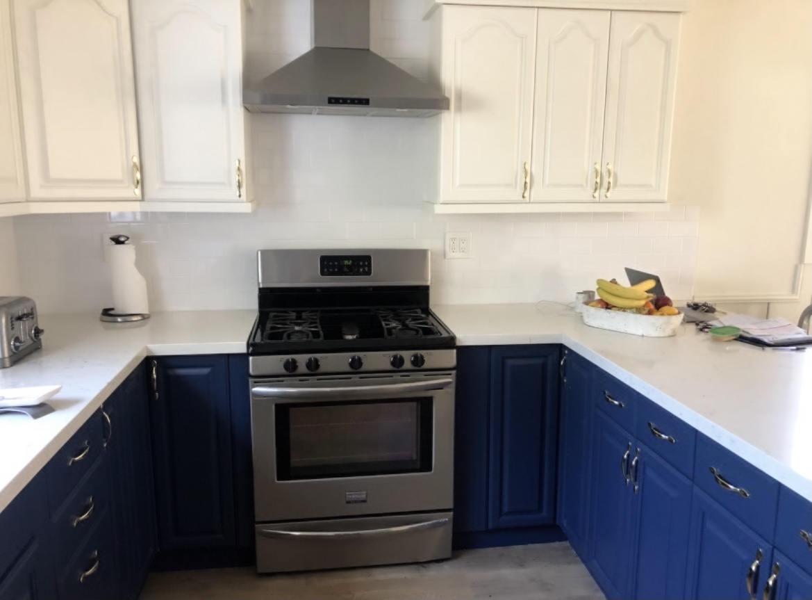
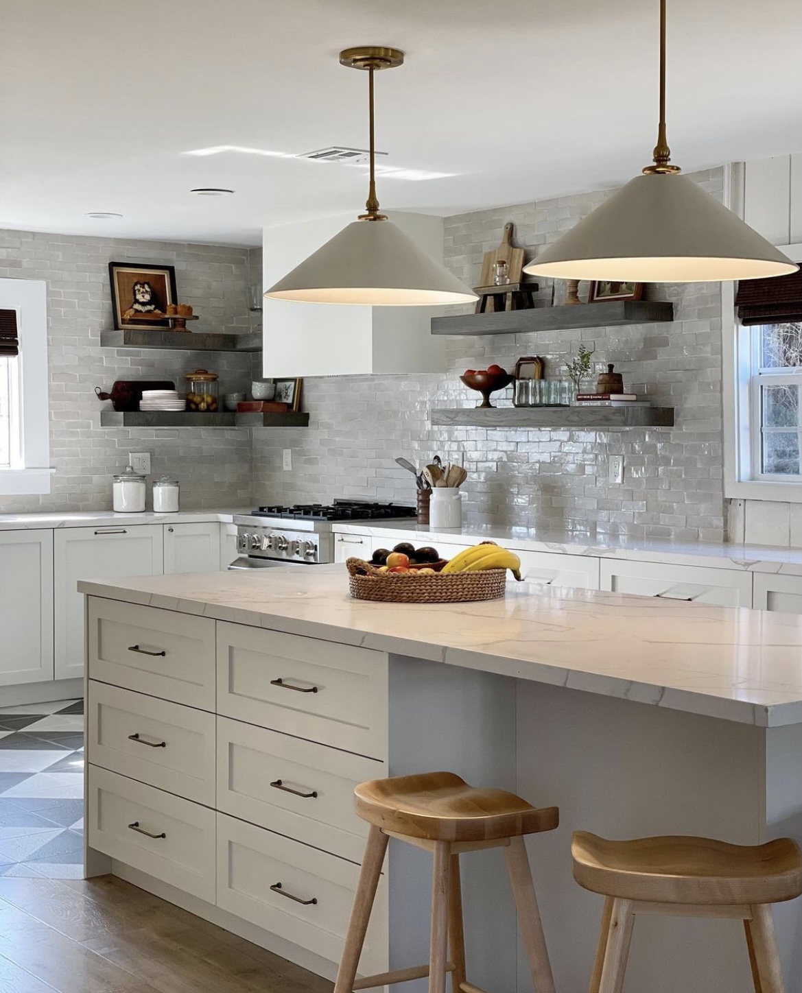
Updated the oven, added a plaster hood, and kept some spacing from the hood to widen the space.
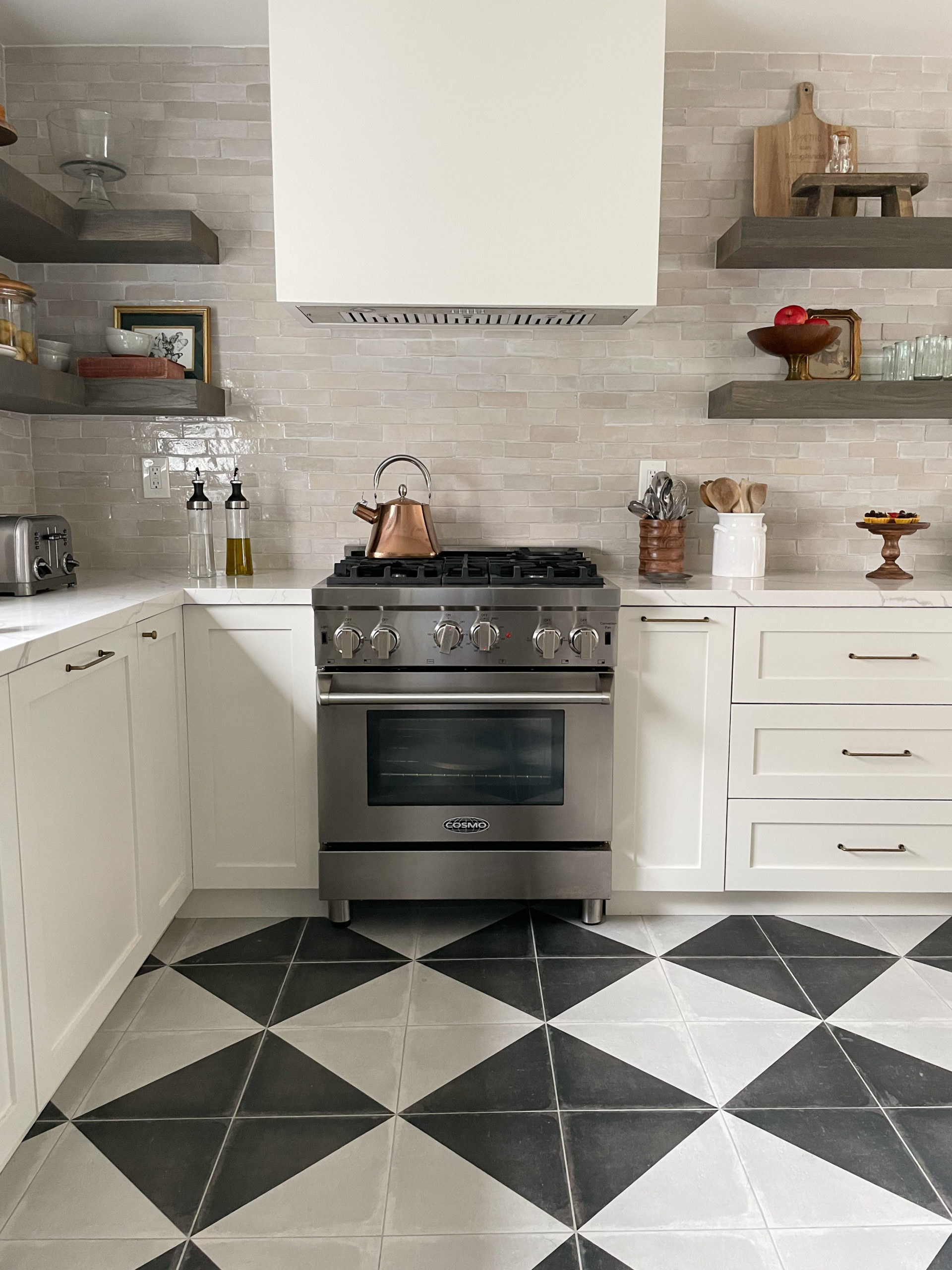
And the decision to do the tiles all the way up the ceiling made such an impact on the kitchen. I love the warmth and grit these Zellige tiles brought in to the space. Everything felt so new, and these tiles felt aged and old in the most wonderful way.
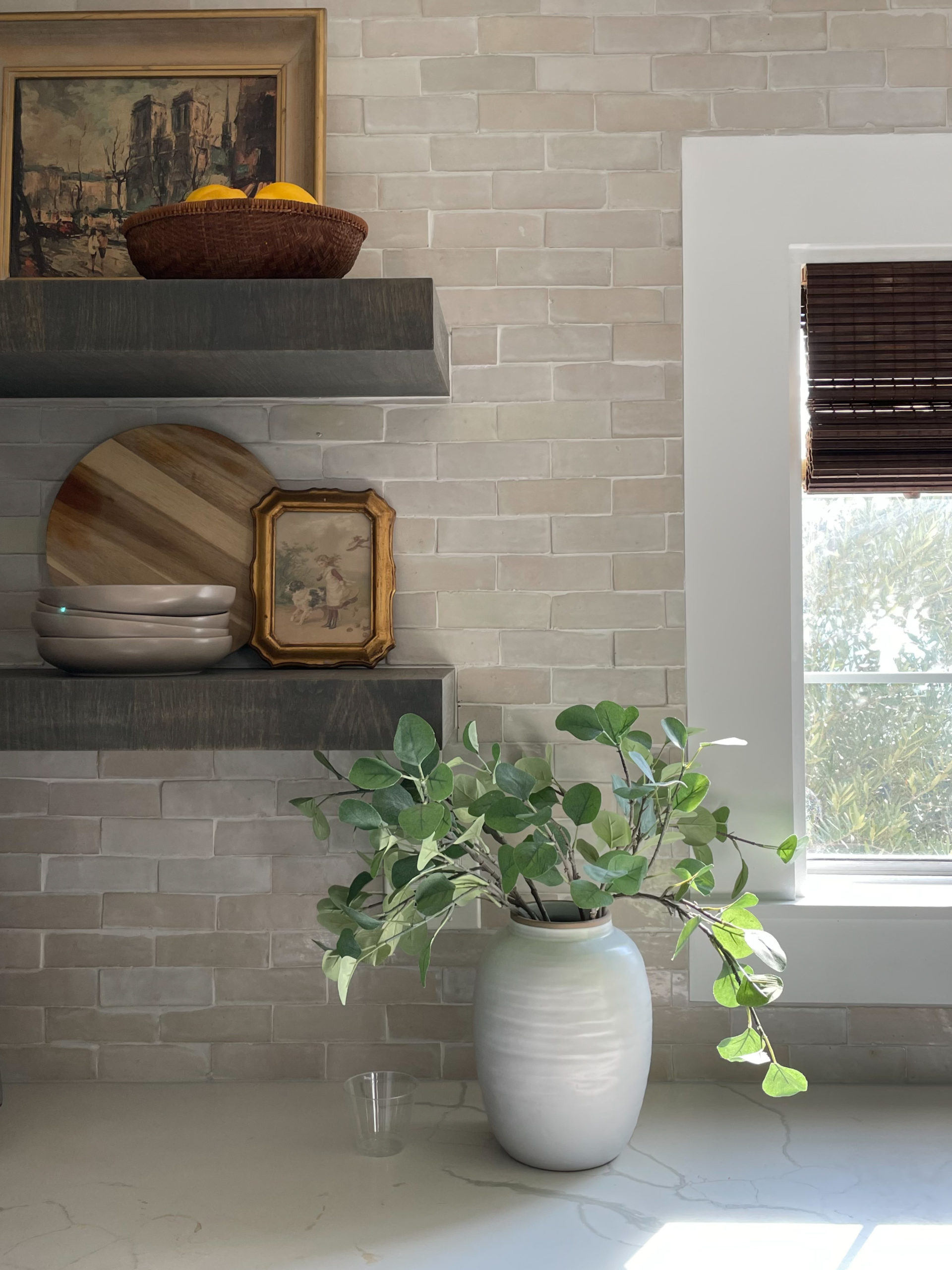
Another angle..
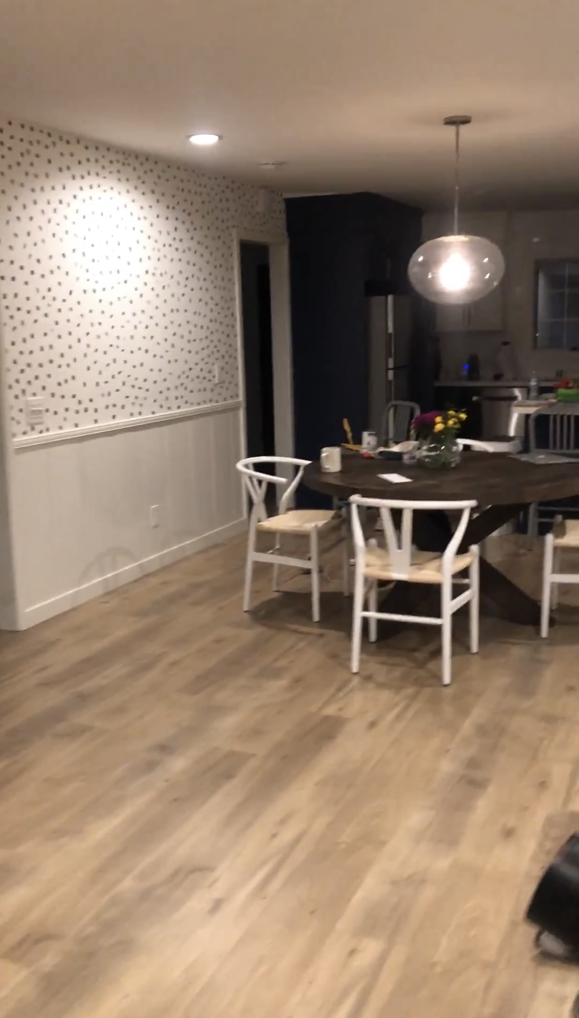
God I love it now.
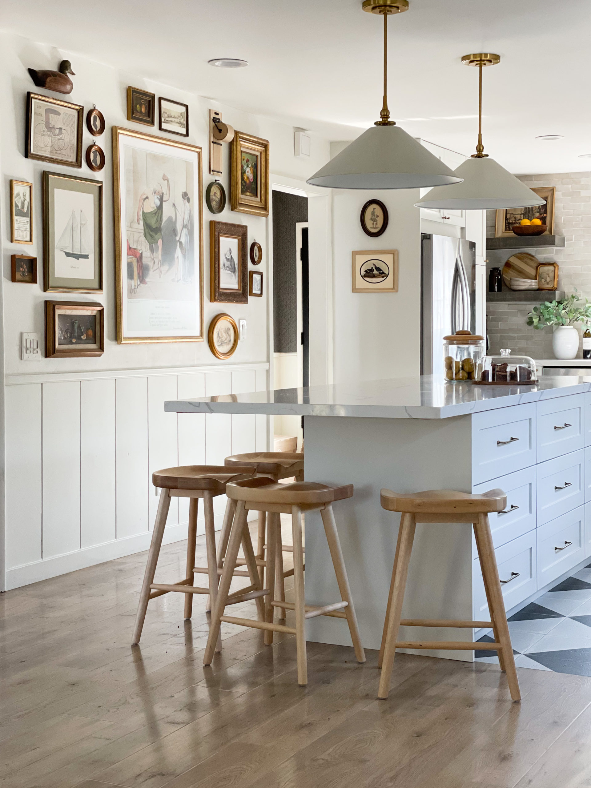
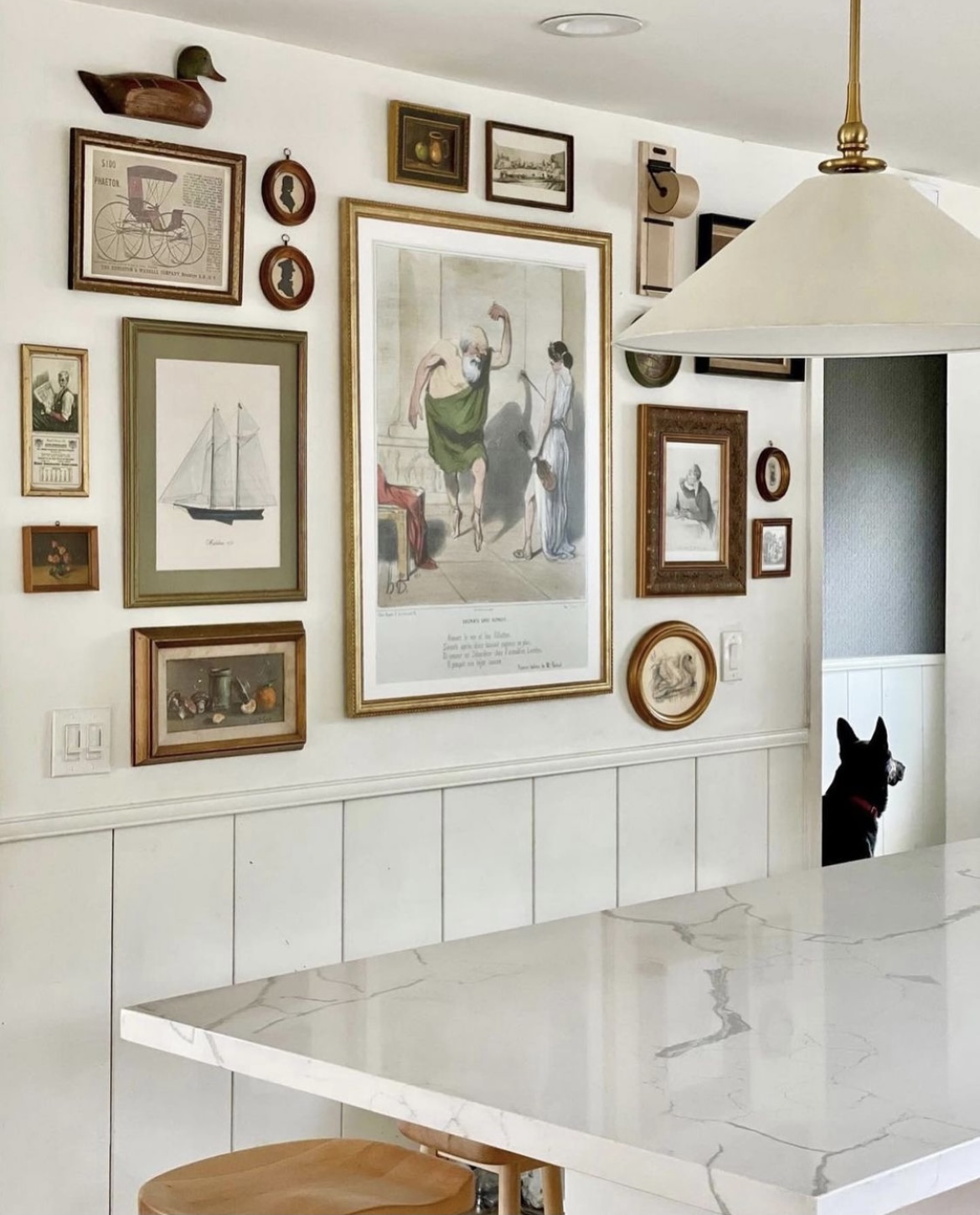
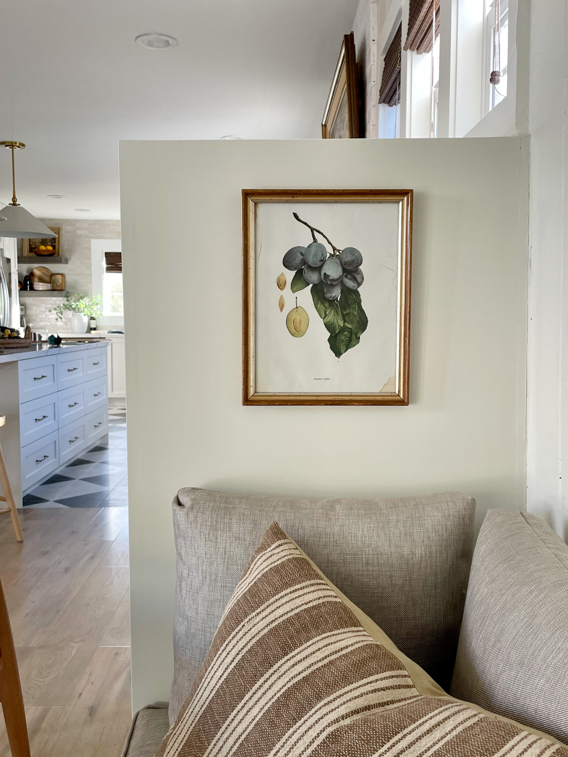
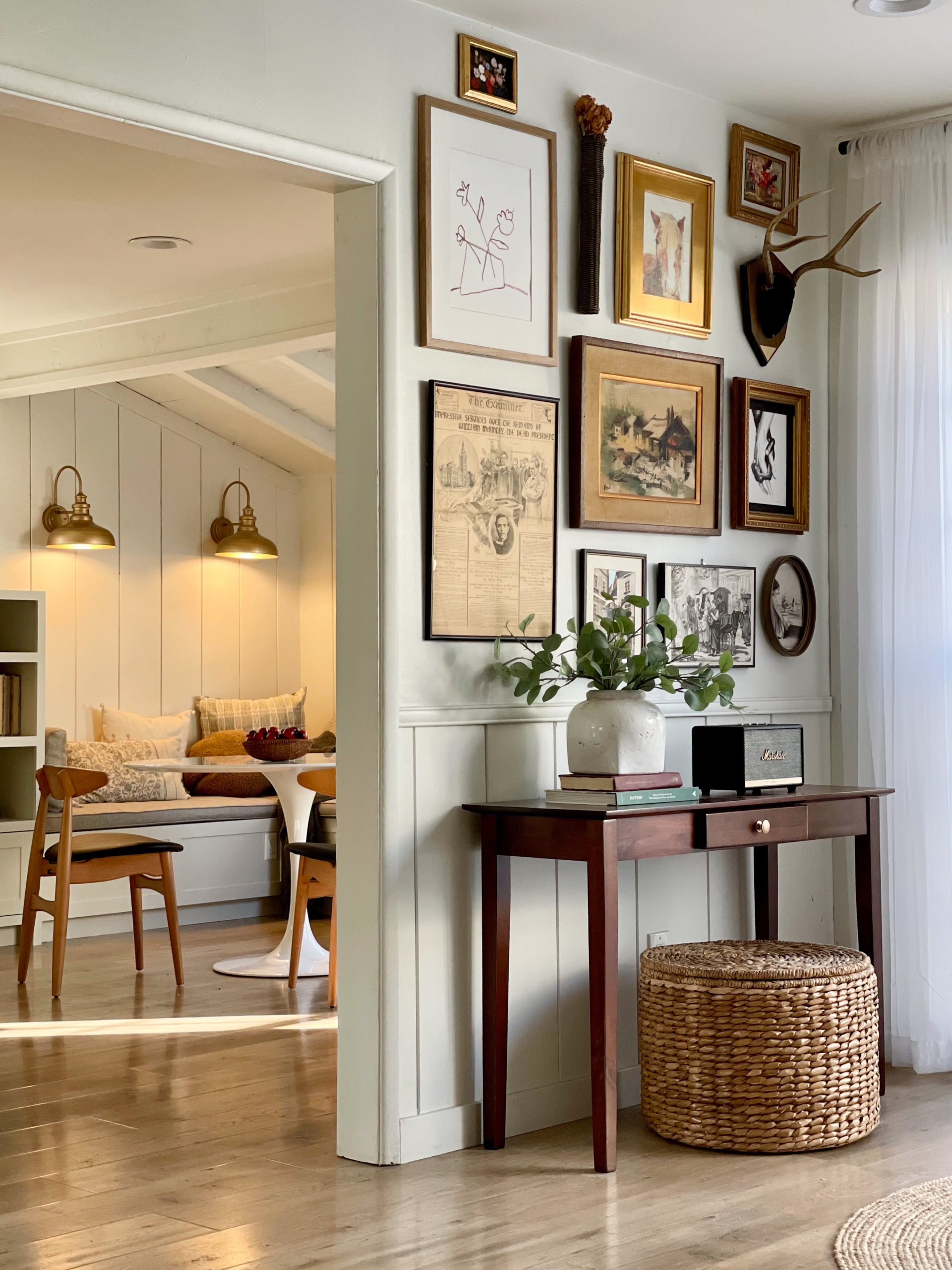
This gallery wall may be my fav wall in the house. And it added so much SOUL to this kitchen.
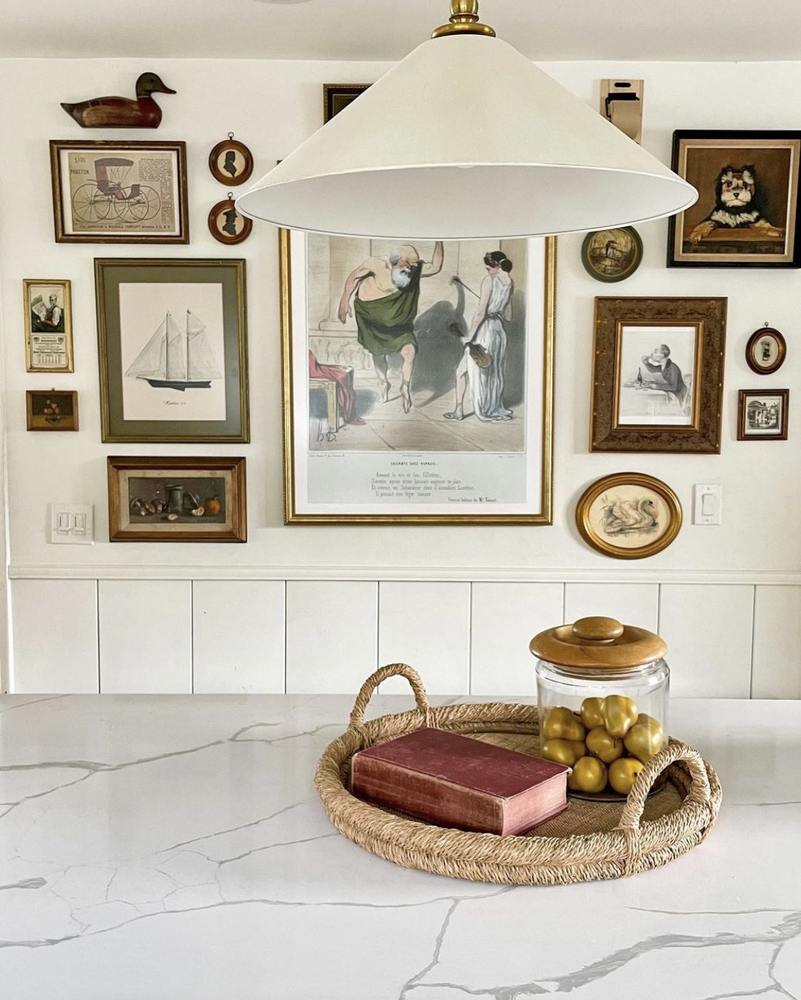
Another before..
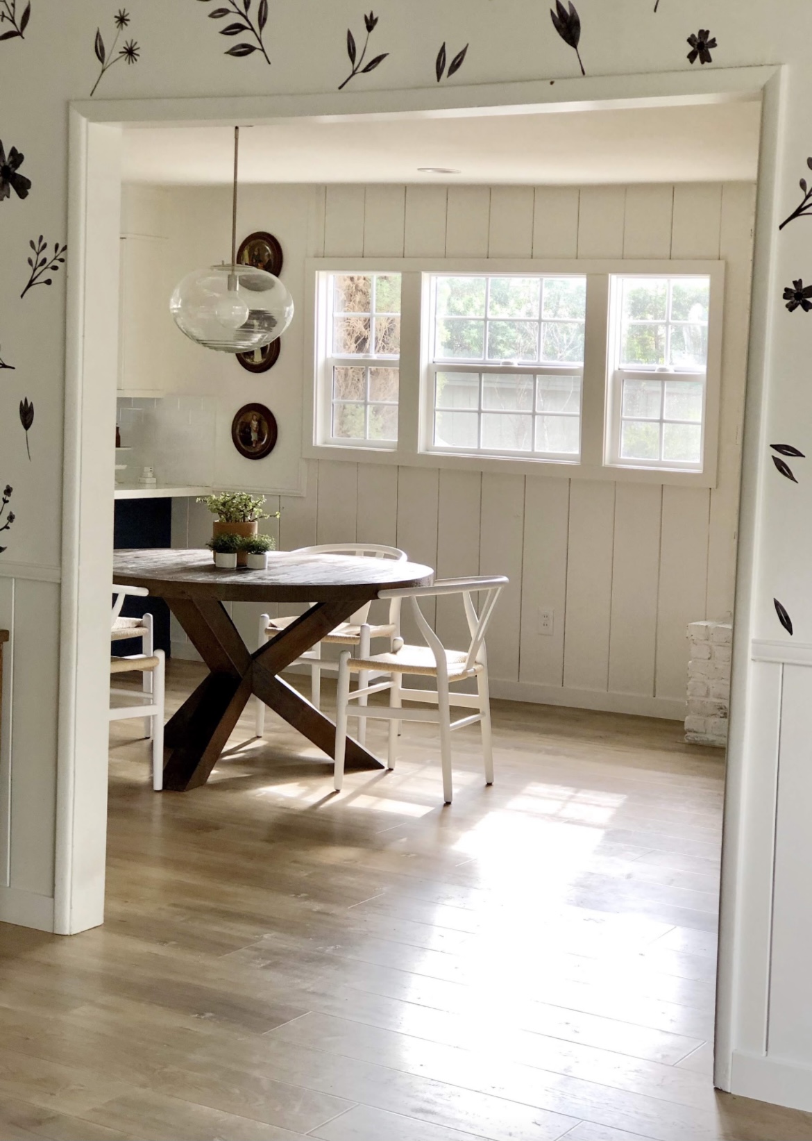
And those pendants may not look large in the photo, but they are two feet wide. I was told over and over again to get glass pendants because my ceilings are low (8′ and dip to 7.5′ in the center), but I knew the key was to get wide but not tall pendants. And they look so good!
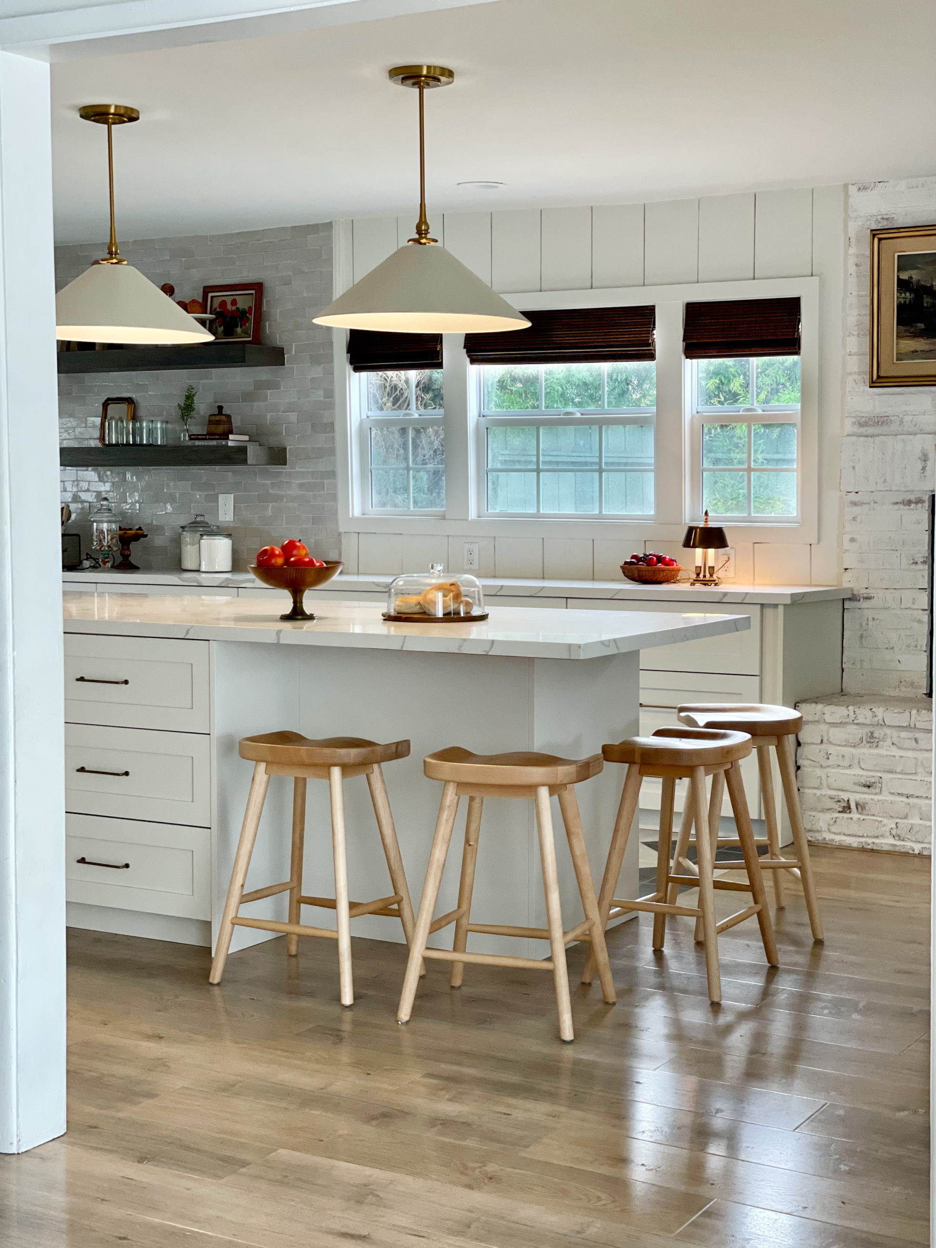
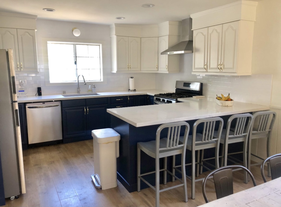
Another before..
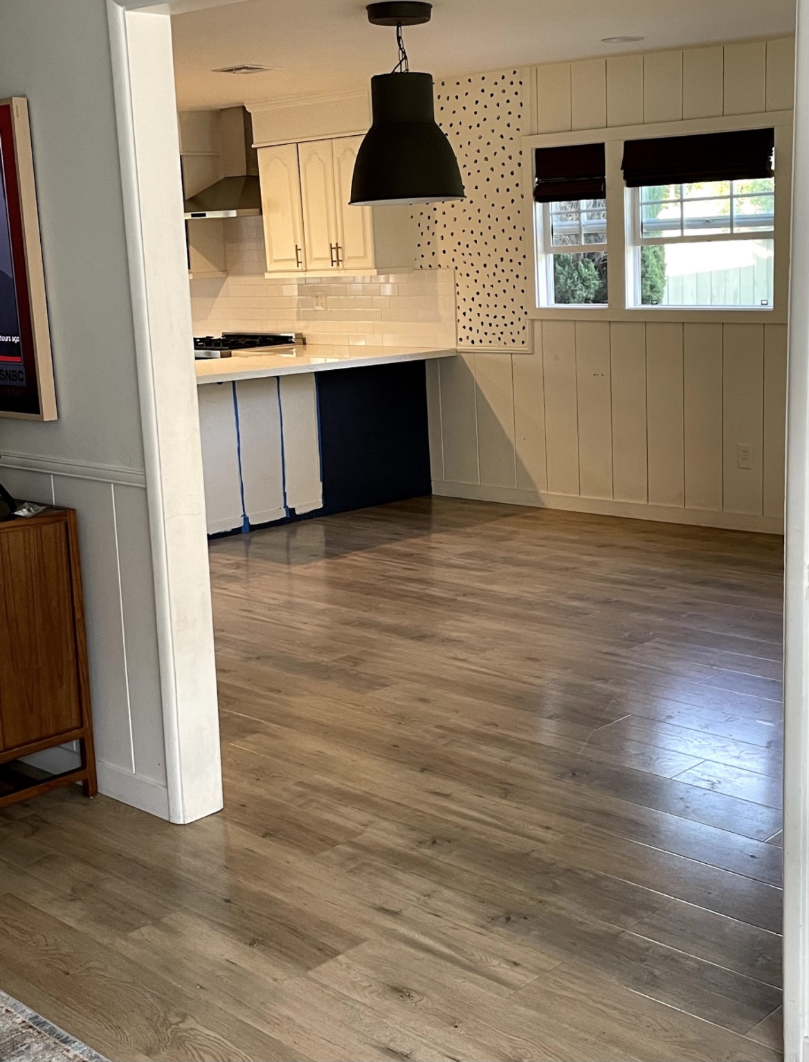
And after.
And so many other storage details I’m happy about. Look where our trash was before (below).
Ikea has so many storage solutions like this. We now have our trashcans inside of a cabinet.
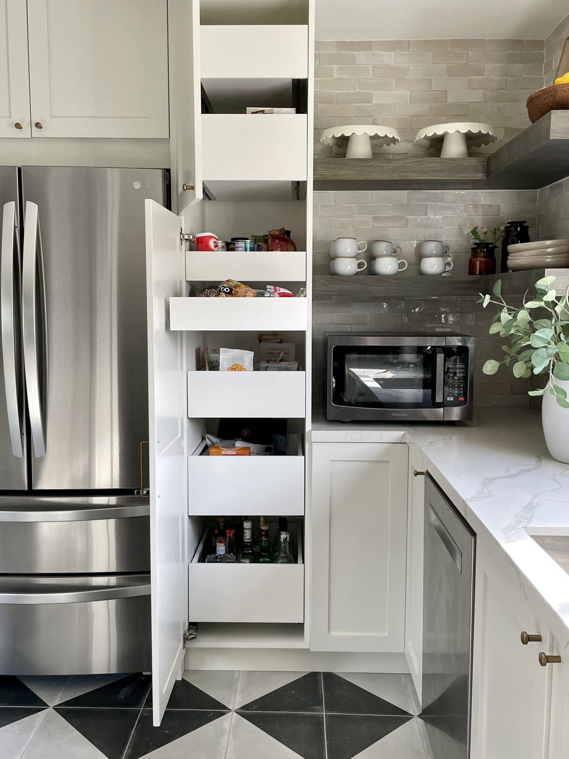
Before our pantry was a nightmare. We always had to reach in the cabinet and couldn’t see what was behind anything.
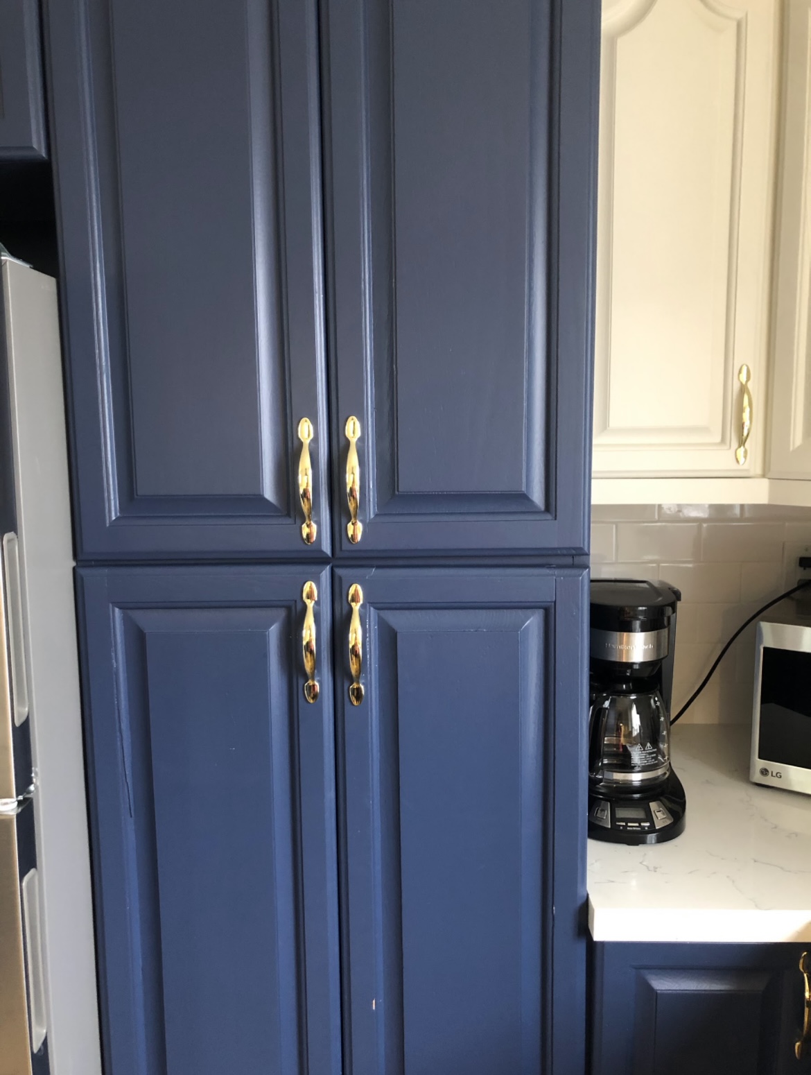
And now everything has a drawer that pulls out.
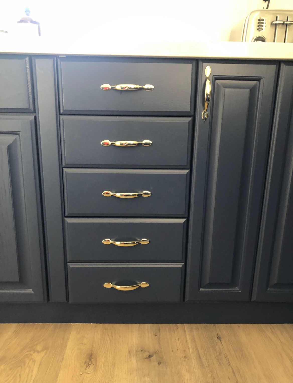
Our drawers were so tiny and impractical before.
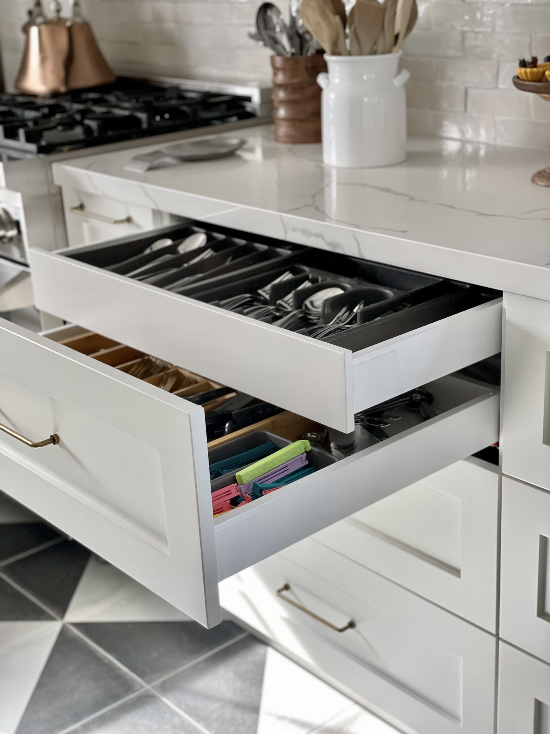
And now we have drawers inside of drawers! Ikea has so many storage solutions its amazing.
And look at that spice rack.
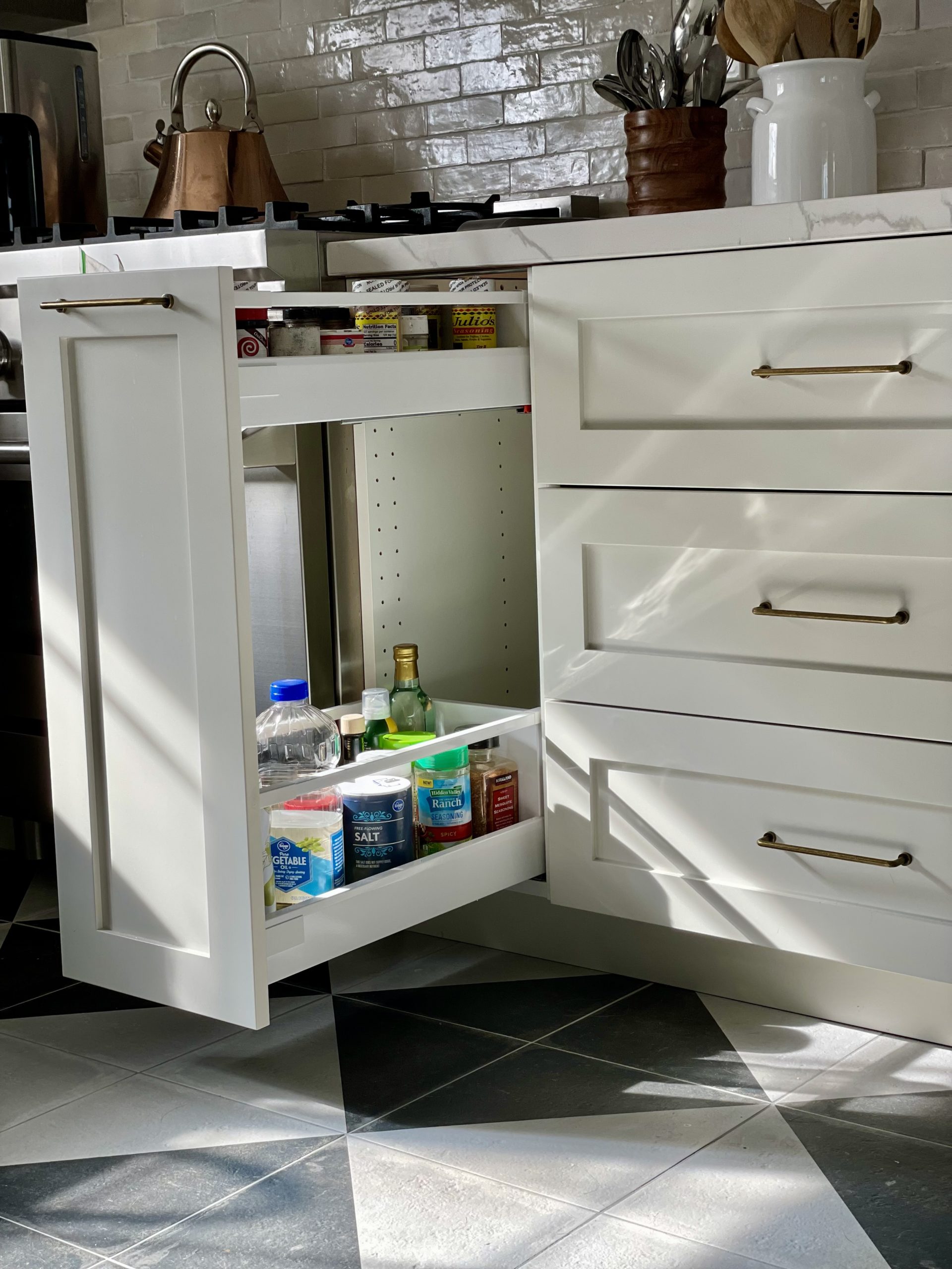
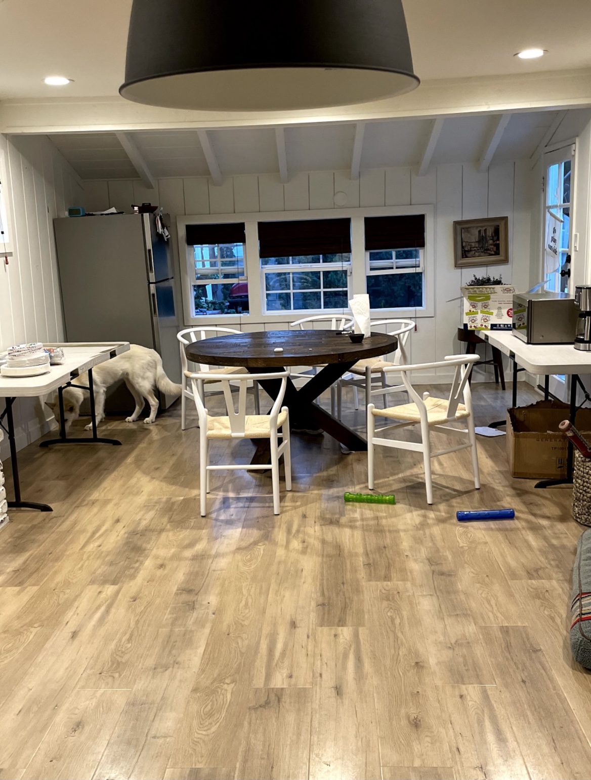
I just can’t believe how everything looked before.
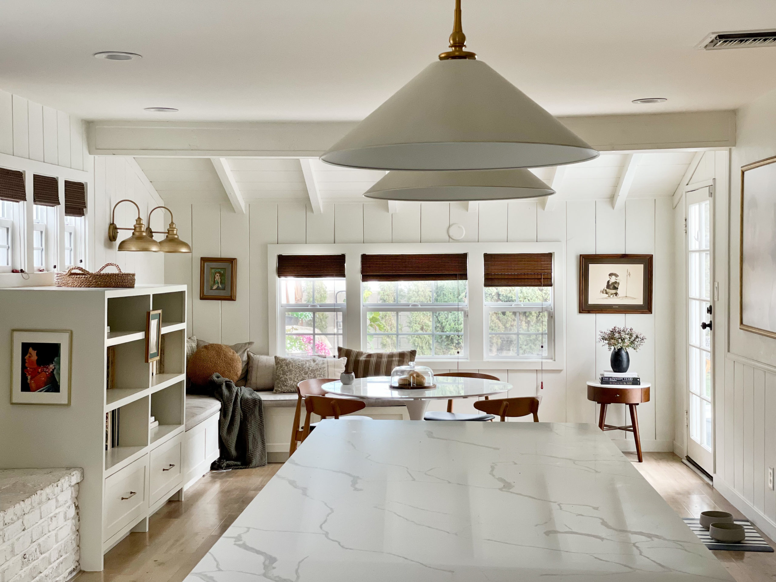
And how it looks now.
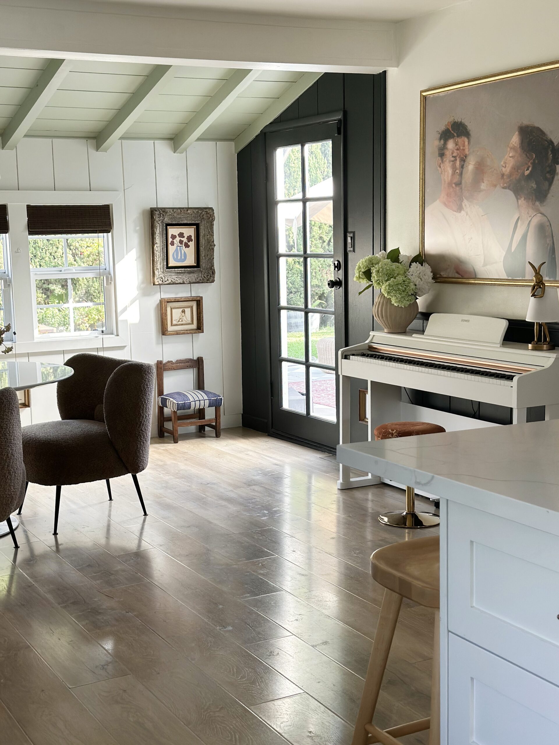
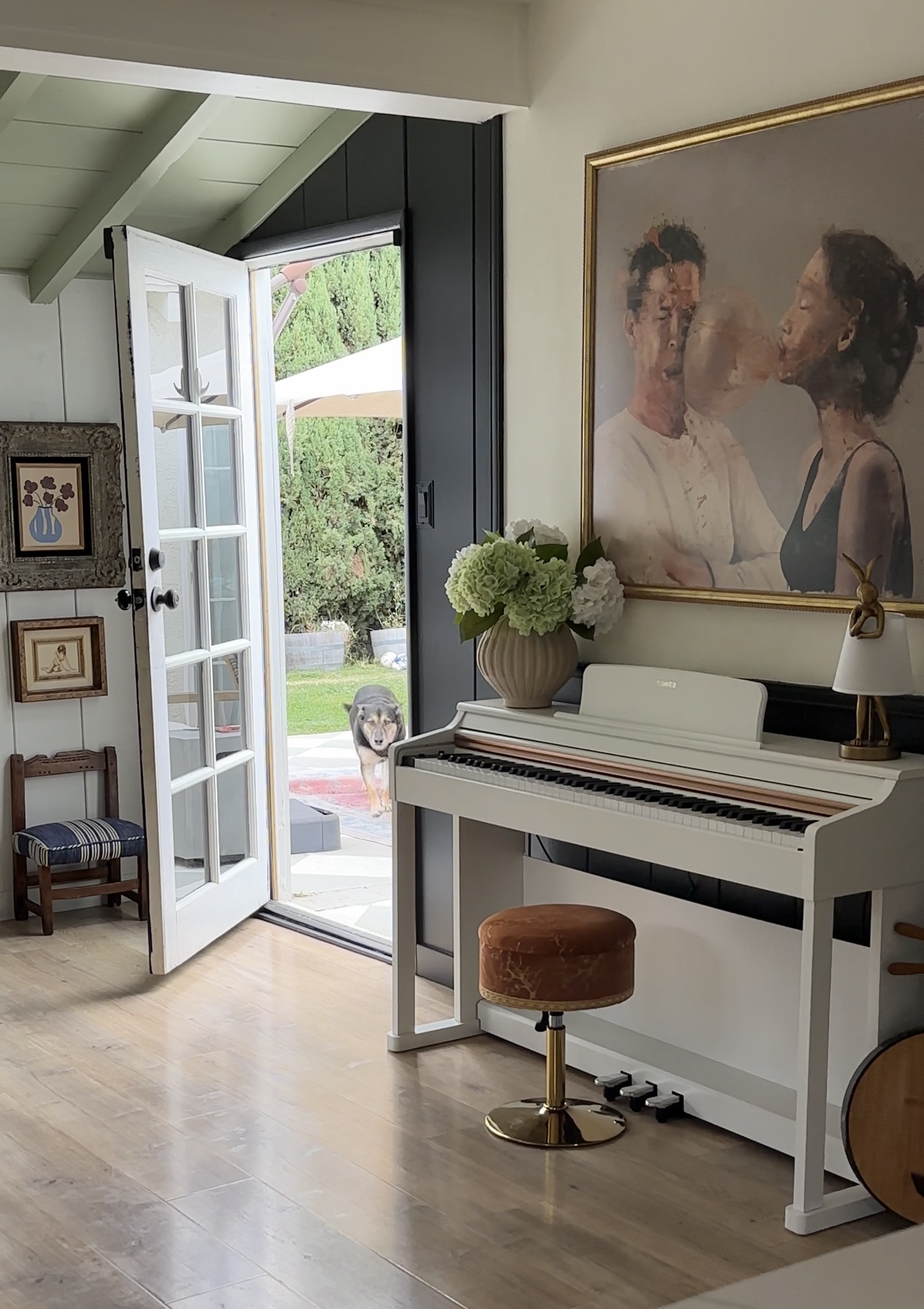
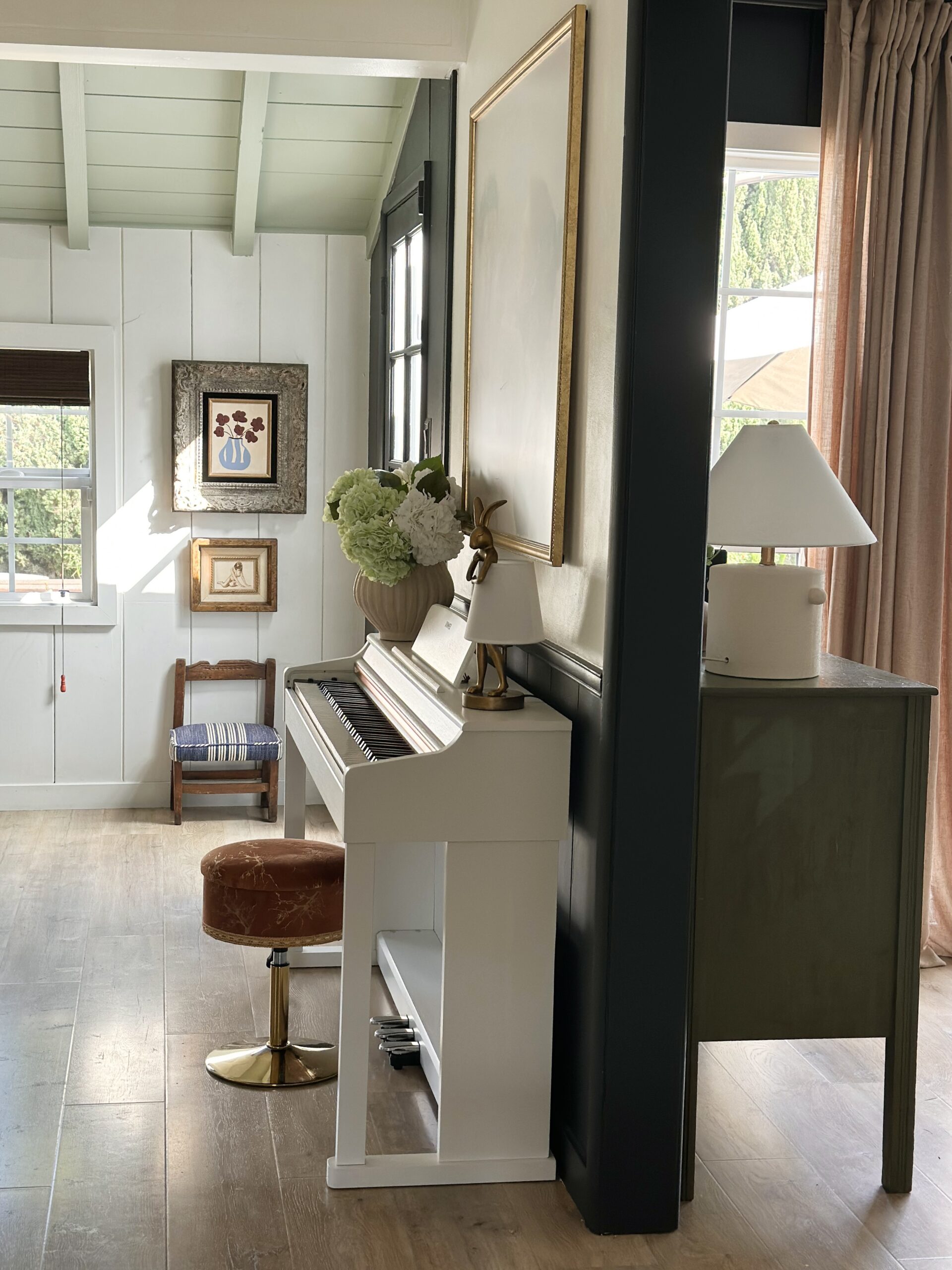
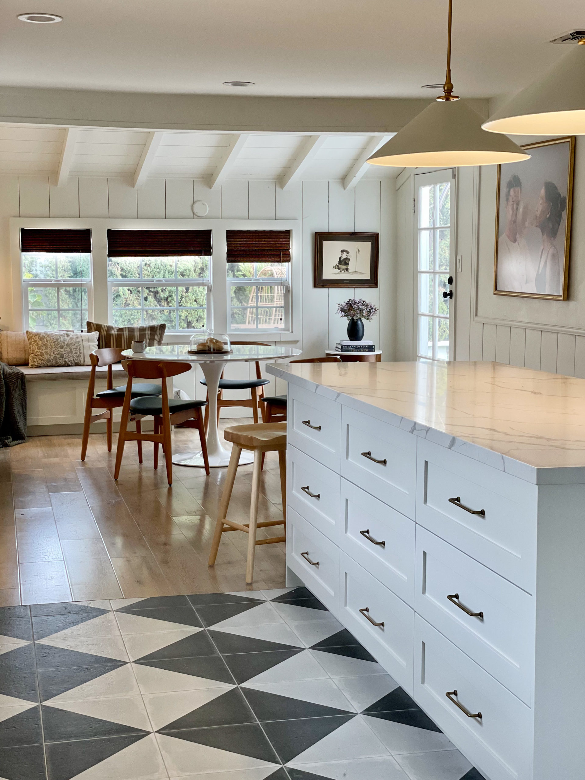
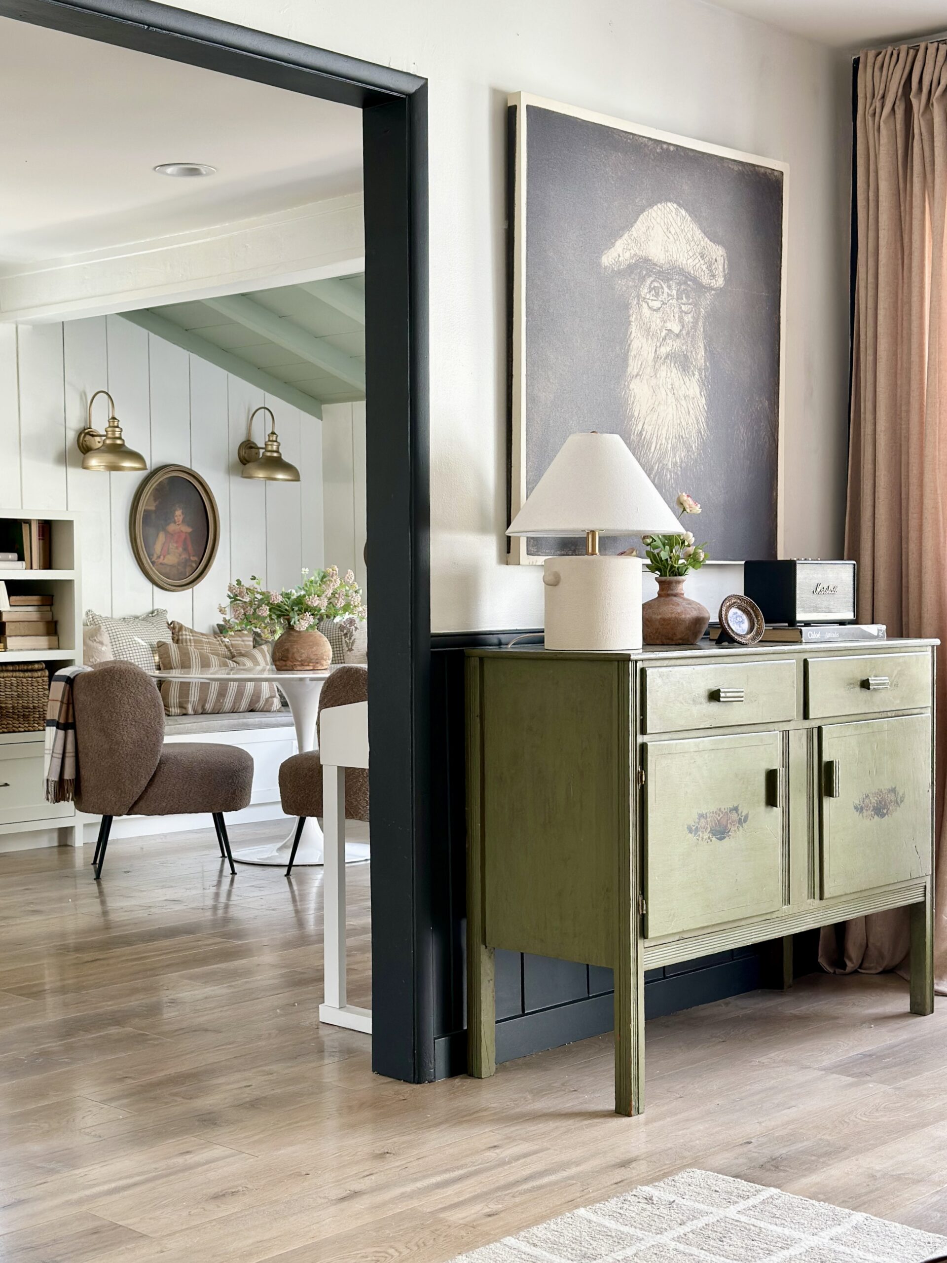
And I love the view from the living room..
I want sources and links!
Cabinet boxes/drawers: Ikea
Cabinet fronts: Unfinished shaker from Semihandmade
Floor tiles: Palazzo 12×12″ Decorative tile in Castle Graphite Villa from Bedrosians
Hardwood floor: (from previous owner, I don’t have details)
Wall tiles: Zellige tile in Natural White from Riad Tile 2″x6″ (I used frost all-in-one sanded grout)
Cabinet paint color: Wind’s Breath from Benjamin Moore
Wall paint color: Swiss Coffee from Dunn Edwards
Hardware: From Wayfair (Knobs) (Drawer pulls)
Slab: It’s Quartz, it’s the “new” Calacatta Laza from MSI Surfaces
Floating Shelves: Custom made, stain is Weathered Oak
Bookcase and Dining banquette: Custom made (same paint color as kitchen cabinets)
Island pendants: 24″ Capri Pendants from Lamps.com
Gas range: 30 inch” 3.9 cu ft w/ 4 Italian Burners from Cosmo Appliances
Fridge: LG Counter-Depth fridge (take advantage of the financing at Best Buy!)
Kitchen stools: From Amazon
Blinds: Wooden Woven Shades in Tibet Oak from Blinds.com
Lights in Dining nook: Amazon
Light above sink: Amazon (I got the 24″)
Dining Table: 47″ tulip table
Dining Chairs: Wayfair
Favorite plates: I LOVE this line. I have their plates, dessert bowls, pasta bowls and so much more from that brand.
Favorite glasses: I love these!
Measurements
Overall space: The entire renovated space is 36.5 feet (L) x 13.3 feet (W) including the dining nook/library area. The kitchen alone is 20 feet (L) x 13.3 (W). My ceilings are 8 feet high, however, they dip to about 7.5 feet in the middle.
Island: 8’10” (L) X 3’10 (W) 2’11 (H)
Walkway (both sides of island): 3’10”
Floating Shelves: 12″ (Depth) 3″ (thick)
Banquette: 22″ (depth) x 16″ (H) (w/ seat cushion: 19″)
Drawers: 30″ wide
How much did all of this cost?
If you follow me on Instagram, you know we ran into some hiccups. Specifically, we discovered a crack in the slab under the hardwood and had to pause the renovation. I’ve included the cost of that too. If you don’t see something mentioned, it’s because we had it before the renovation (I.E. Blinds, stove, dishwasher..etc)
| KITCHEN AREA | |
| Demo | $875 |
| Electrical (Pendant/switches) | $925 |
| Drywall and patch | $575 |
| Kitchen cabinet Assembly/install | $4,699.54 |
| Finish painted panels | $650 |
| Cabinet door finish panels painting | $4,175 |
| Quartz and Fabrication | $7,492 |
| Wall tile Installation | $1,656 |
| Plastered vent hood install | $2,120 |
| Window Casing | $1,130 |
| Floating shelves | $3,925 |
| Tiling floor | $2,336.67 |
| Remov/install existing floor | $675 |
| Add 3 outlets | $250 |
| Painting ceiling | $150 |
| Adding lighting + outlet in nook | $465 |
| Patching ceiling | $485 |
| Custom pantry closet | $625 |
| Semihandmade doors | $4,442.69 |
| Hardware (for cabinetry) | $266.71 |
| Light above sink | $71.53 |
| Hood insert | $234.82 |
| Pendants | $981.92 |
| Extra paint | $100 |
| Fridge | $2,381.39 |
| Wall tiles (gifted) | ($3,343.75) |
| Floor tiles | $1,442.54 |
| Ikea cabinet bases | $4,795.83 |
| Total | $47,927 |
| NOOK/LIBRARY AREA | |
| Custom Banquette Seating | $2,500 |
| Custom Bookcase | $1,125 |
| Custom Banquette Cushion | $1,175 |
| Sconces above banquette | $99.21 |
| Total | $4,899 |
| FOUNDATION REPAIR | |
| Soil Engineer | $2,500 |
| Crack Repair | $4,900 |
| Total | $7,400 |
| FURNITURE | |
| Dining Chairs | $463.04 |
| Counter Stools | $317.12 |
| Dining Table | $644.30 |
| Total | $1,424.46 |
Timeline
The Kitchen + Dining/Library area (because keep in mind it was two spaces), was about 6-7 weeks. And this was one man doing the entire kitchen himself. However, the entire process including the repairs, quotes, analysis of our slab, (and the long a** waiting period) took 5 months.
Favorite things about the kitchen?
It’s tough to pick a favorite design element, but I’d say those Zellige tiles on the walls really gave the kitchen that aged look I was looking for. But beyond design, deciding to have only drawers (no cabinets) was the best decision I made. It’s just so much more practical now. Everything pulls out and it’s so much more convenient. Even the few cabinets I have (pantry, over fridge, under sink), all have pull out drawers inside of them. So no matter your design style, I’d highly recommend going with drawers I promise you won’t regret it!
I still have questions!
I have way more documented on my instagram (I have several highlights on my page), however, feel free to drop me a line below, or send me a DM on Instagram. Happy to answer anything else!
Best,
Deema
Feedback? Comment below, or email me: (Deema Tabbara Lopez) at prettyonfridays@gmail.com




It is perfect. I had a hard time imagining the angled tile and it is outstanding! I will put this in my bag of tricks for future use.
Thank you!!
It looks sooo good!!! Congratulations!!!!
Yay thank you!
Oh what a long and winding road it’s been! 😂 But it was worth the wait, I’m sure. Thank you for sharing your journey with us. It turned out beautifully.
Thank you!
Absolutely stunning!! I love every inch and every choice, even if I might have questioned some at the time 😉 Thank you so much for the cost breakdown, that is incredibly helpful. Beautifully done
Thank you for reading it!
Hi Deema,
Thanks for documenting and sharing the whole process including sources and costs. Also including the good/ugly times. The before and afters! Your kitchen turned out beautiful, enjoy.
Thank you!
It’s beautiful Deema. You make this feel so accessible for those of us who just want an updated, nice, functional kitchen!! Thank you!
I love that you said accessible, because that’s my intention!
I followed this kitchen reno so intensely, your style and mine are so different, but yet I love this so much! I’m calling it early but for me this is my favourite kitchen of 2022 (I reserve the right to change my mind of course) but there is nothing cookie cutter about this, your style shines through and it is good. So good. 🙂
That’s a huge compliment thank you!
Deema it’s incredible, you truly did an amazing job !
Thank you!!
It looks awesome Deema! I’m so glad that angle worked for you! Also, you are the actual queen of gallery walls.
Thank you so much!
Thank you for sharing all the deets! I think you did an amazing job. Love love love the wall tile and cabinet color! Timeless and cozy. Enjoy your new space!
Thank you!!
It turned out so beautifully Deema, you really brought your vision to life!
Thank you Erin!
It’s gorgeous, Deema! Love all the details and I agree with you, my favorite element is the wall tile. Perfect! Just wish I was closer and able to enjoy all the yummy food you’ve been making, haha.
Awwww Thank you!
Congrats. This is a beautiful, collected space. I have been considering the same cabinets/fronts. Did your contractor assemble all of the cabinets himself? What is the difference between these two expenses: Finish painted panels $650
Cabinet door finish panels painting $4,175. Thanks so much!
I asked him when I saw the invoice and he couldn’t remember. I’m assuming they were both for painting!
It turned out SO amazing! You did great mixing elements and textures.
Thank you!
[…] designers to add off-white in varying shades to all sorts of different spaces. This is exactly what Deema of Pretty on Fridays did in her own kitchen […]
[…] Credit: Pretty On Fridays […]